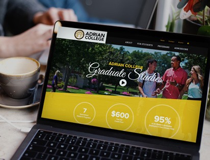
Website Design and Support
A solution and price point for every business
We offer website options for virtually any size business. These options start with our Standard Website option, which allows us to build you a website quickly and affordably. For those with an appetite for the best, or those with highly custom needs, we offer our Premium Website option. Rounding out our website offerings is the E-Commerce Website option, where we will custom build your website on one of a variety of e-commerce platforms, depending on your specific needs.
Already have a website and want to improve it? Through our Website Optimization and SEO Audit services, our usability and search engine optimization experts will analyze your website to find the most impactful ways to improve usability and search engine rankings.
We complete our website offerings with our coveted Website Support and Website Hosting plans, where our lightning-fast turnaround time and high-availability hosting is praised by our customers and envied by our competitors.
Not sure where to start? Contact us to start a dialog and we will help guide you in the best direction for your business.
Standard Website
Beautiful, custom website built quickly and affordably
Premium Website
High-end, highly-custom website built to perfection
E-Commerce Website
Built to generate sales and make management easy
Website Optimization
Optimize your website for users to increase leads and conversions
Website Support
Fast, responsive, expert support for website changes, graphic design, and more
Website Hosting
High-availability, managed website hosting with proactive maintenance
Download the Ebook
"The Path to Website Success"

A great website starts with a plan. If you haven't planned a website before, it can be intimidating.
That's why we've put together an e-Book titled, "The Path to Website Success."
In it, you'll find the major areas we take into consideration for each website design. This will make it easier for you to plan and design your next website!