Hero images have been used in web design for over a decade and continue to be popular in 2018. Hero images are excellent for website banners, because they’re beautiful, simple, and real. Hero images are effective because they engage website visitors by adding beauty, context, and interest. The best examples tell stories and connect with the viewer.
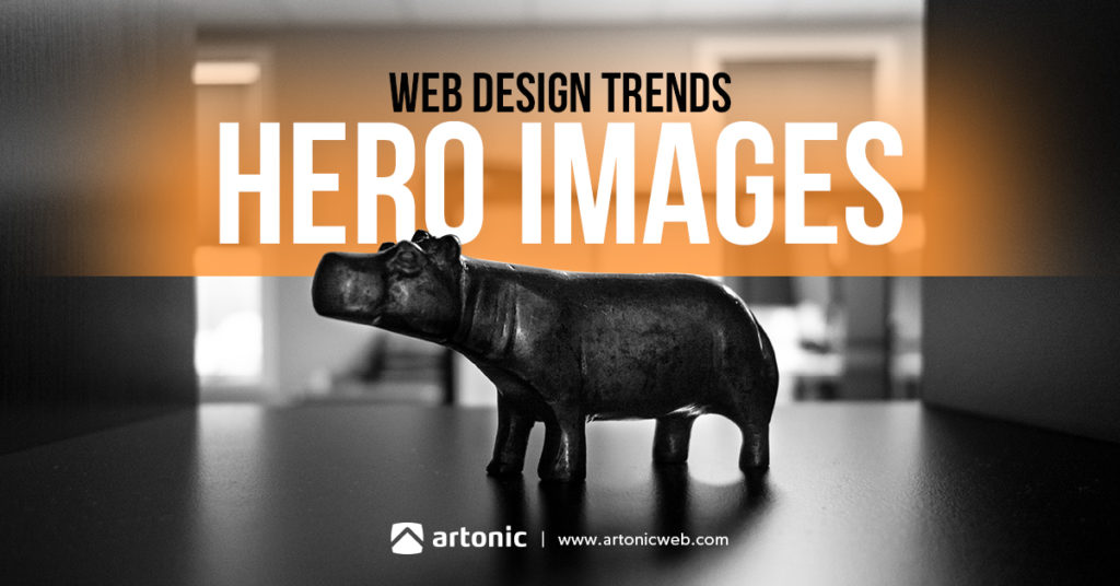
Hero Images: What Are They?
A hero image is a very large banner image used in website design. It can be used alone, beneath an overlay, under a text heading, or in other creative ways.
The following is an example of a hero image. It is a large photograph with text on top of it.
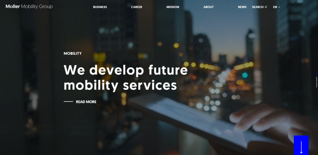
Why Use Hero Images in Web Design?
Designers and marketers alike are drawn to hero images, and the reasons are many:
“Since vision is the strongest human sense, hero images are one of the fastest ways to grab a user’s attention. Bold, graphic, and intentional imagery helps to engage the user. It draws the user in immediately, and provide a perfect centerpiece for minimalist apps and sites.” (From UX Planet: Best Practices for Hero Images)
Benefits of Hero Images
- Capture Attention
- Visual Appeal
- Create Experience
- Tell Story
- Communicate Message
2018 Examples of Hero Images in Web Design
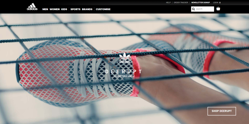
Currently in web design, hero images are a standard design element. The hero image usually consists of a photograph with text on top, button optional. Website navigation links are either placed on top of the image or placed in a solid-colored navigation bar.
Adidas Deerupt
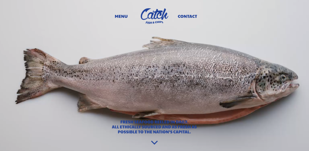
Catch Fish & Chips
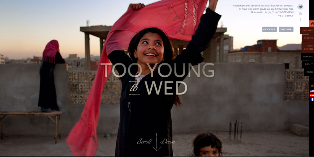
Too Young To Wed
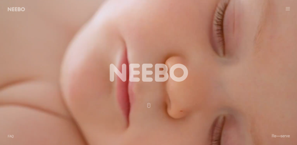
Neebo
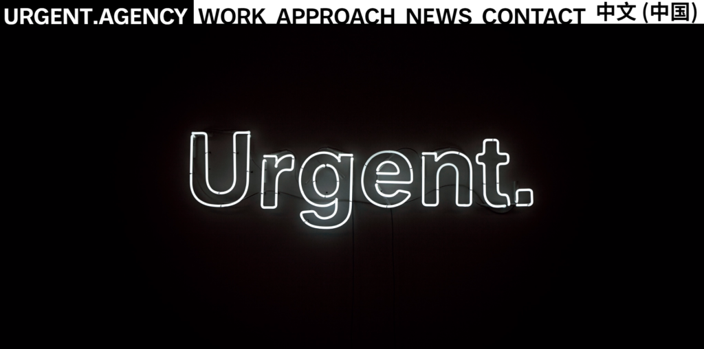
Urgent
Examples of Video Hero Images
Instead of using an image, the following websites use video hero images in their banner designs.
High Performance Sports NZ
Kitelement
Examples of Graphic Hero Images
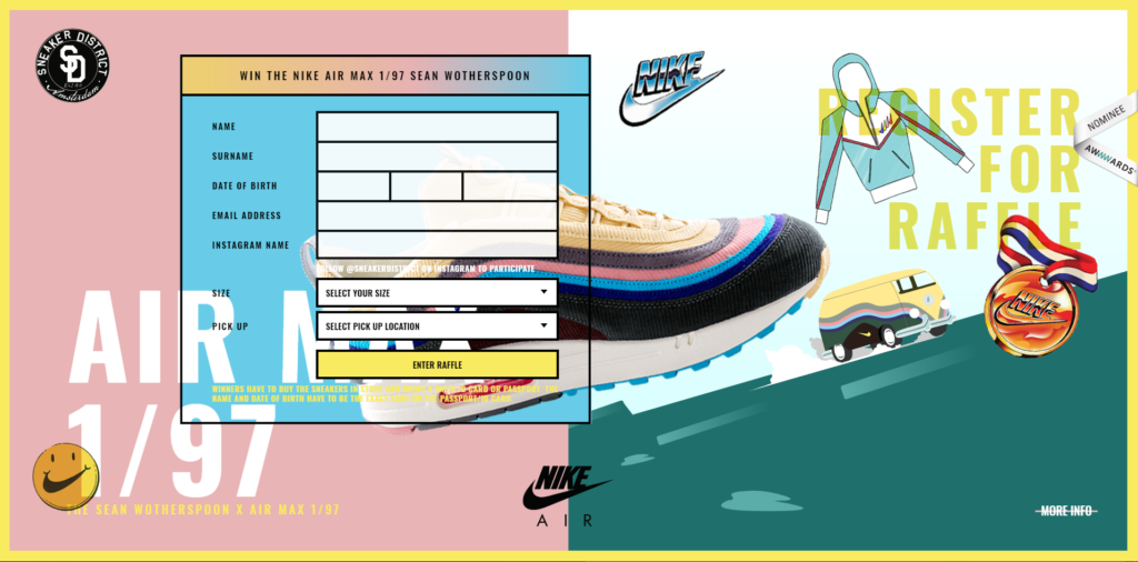
Another design alternative to using a photograph – use graphics.
Nike Air Max
How to Use Hero Images Effectively in Web Design
Like the look of a hero image? Use one in your website design – here’s how:
- Keep Text Legible
- Use Relevant Images
- Professional Images Are Best
Keep Text Legible
The purpose of your website banner is to communicate with your website visitors. To get your message across clearly, make sure the text is easy to read. Text is more legible when there is a strong contrast between the color of the text and the color of the background. Black text on a white background is a good example of contrast. Text is also easier to read if the font is large.
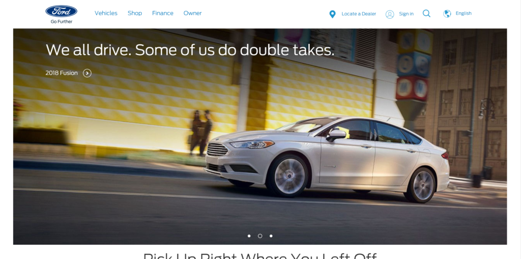
Good Example
Ford’s website uses hero images effectively by paring a dark background with light text.
Use Relevant Images
One way to communicate quickly with your website visitors is to use an image that connects your message to their lives in some way. Website visitors appreciate relevant images in your website design, because they make information easier to understand.
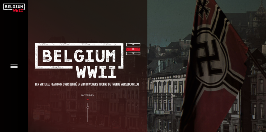
Good Example
The Belgium WWII website is a great example of how to use a relevant hero image in your banner design. The text is powerful, but the image really makes the message clear.
Professional Images Are Best
This isn’t a hard-and-fast rule, it’s more of a guideline. Professional images are more likely to be beautiful and impactful, therefore they make the best hero images. Remember, this is the first thing website visitors will see upon arriving at your website, so it needs to resonate with them.
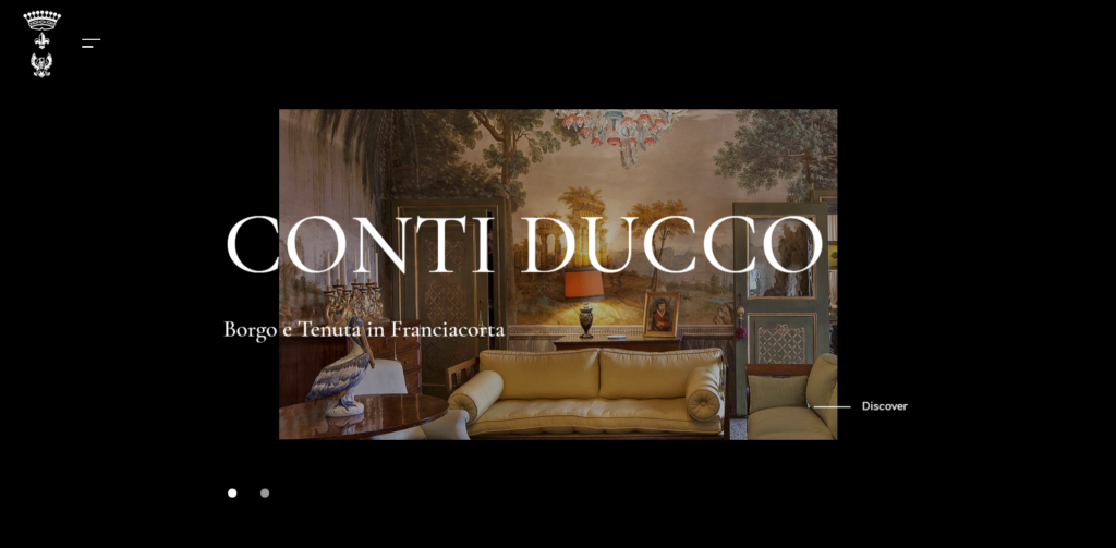
Good Example
Conti Ducco’s website uses professional images in its website banner to convey opulence and luxury.
History of the Hero Image
Online mentions of hero images started around 2010 – 2011. An article from envatotuts+ in March 2011 explores the hero image trend at that time.
“Apple’s current iPod site features a sliding hero image with three smaller ones positioned neatly below.” Here’s a screenshot of the image of Apple’s 2011 iPod website from the article:

Read How Apple Has Influenced Web Design Over the Years
In June 2011, DesignShack published an article about “rock solid website layouts” and included a simple layout with a hero image above two smaller images as one example. Here’s a screenshot of the image used in the article. (Read 3 Rock Solid Website Layout Examples: Coded)
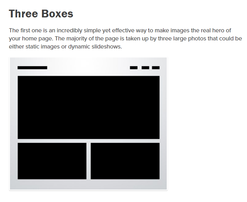
In 2012, the entry “Hero Image” was added to Wikipedia as a web design term. [Source] At that time, this was the definition on Wikipedia:
“Is a term used in web design for a specific type of banner image. A hero graphic is large banner image, prominently placed on a web page, generally front and center. The hero graphic is often the first visual a visitor encounters on the site and it’s [sic] purpose is to present an overview of the site’s most important content. A hero graphic often consists of image and text, can be static or dynamic (e.g. a rotating list of images and/or topics).
“The content presented varies with the purpose of the site: it can be relevant news about the site, specific site-links, or – in the case of e-commerce – the best-selling or strategically-placed products or services.” [Source]
In 2013, the hero images web design trend was described as “the number 1 trend in Web design today” [Source] and “the most beautiful trend of them all” [Source].
Since then, hero images have become a staple in website design.
Let’s look back at examples of website designs that use hero images, starting in 2011.
2011 Hero Images in Web Design
In 2011, Apple’s influential design style was streamlined, clean, and flat. Hero images as a web design trend was just starting to catch on.
Tapbots
The website for Tapbots, below, showcases a product image against a dark background with white text. It’s simple and straightforward.
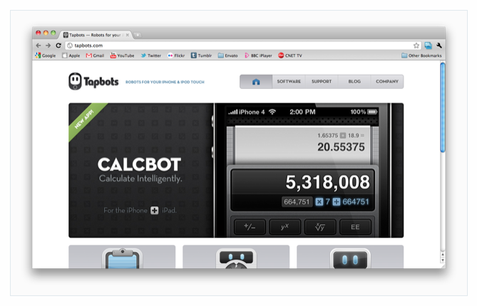
The image for Tapbot’s 2011 website design example is from How Apple Has Influenced Web Design Over the Years
2012 Hero Images in Web Design
In 2012, the hero images web design trend gained momentum. We saw the emergence of large photographs used in website banner design with simple typography.
The Great Discontent
This website design for The Great Discontent uses an interesting photograph as the hero image in its banner. The simplicity and scarcity of the white text is an excellent compliment to the dark photograph.
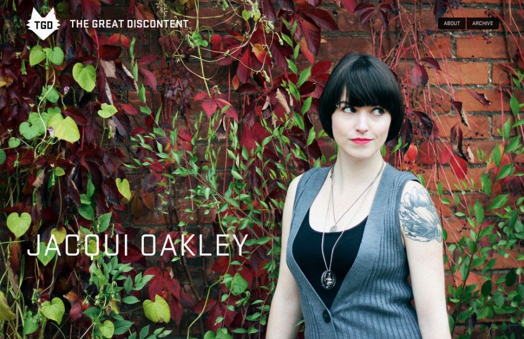
The image for this 2012 website design example is from Death to the Hero Slider
2013 Hero Images in Web Design
In 2013, the hero images trend was going strong. We saw more and more beautiful, large photographs used in web banners with minimal text.
Eye Am
The Eye Am website design makes excellent use of a hero image in its homepage banner, shown below. The photo is emotionally engaging and professionally shot, two components of great hero images. This banner places sans serif text on top of the photo, similar to the design for The Great Discontent (from 2011 above).
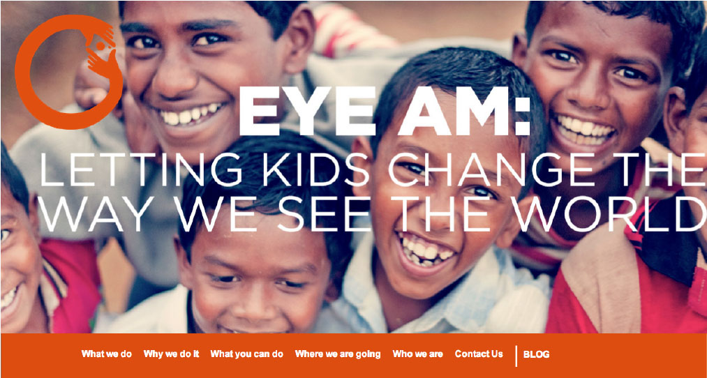
The image for this 2013 website design example is from The Best of 2013: Top 10 Web Design Trends
Al Taglio
The banner design for Al Taglio uses a shadowed photograph and white sans serif text to catch visitors’ attention.
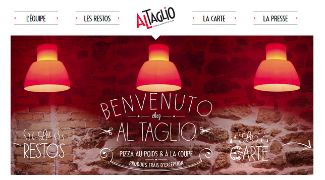
The image for this 2013 website design example is from Modern Food-Related Website Designs – Best Examples
Student Guide
This website design uses a colorized photograph as the backdrop to a rotating, mini text-only banner to create interest and promote events. Again the design is simple and uses a white, sans serif font. The white navigation bar stands out against the saturated image and balances the darker colors.
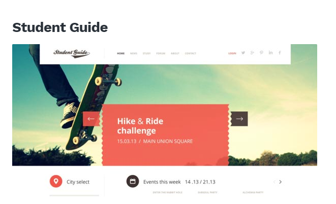
The image for this 2013 website design example is from Flat Web Design: Beautiful Examples of Websites
Rebel8
The photograph used in the banner design for Rebel8’s 2014 website is striking. Not only is it visually appealing, it also personifies the brand in an authentic way. (Oh, the power of authentic photography in web design!)
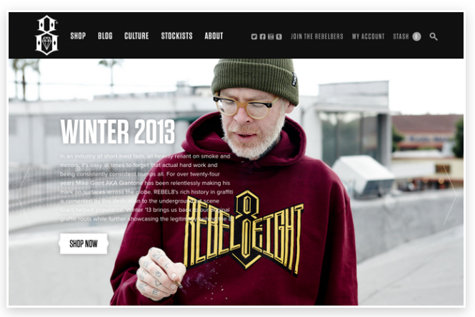
The image for this 2013 website design example is from 30 Beautiful and Creative Ecommerce Website Designs
2014 Hero Images in Web Design
In 2014, website design continued to be simple and clean. Elegant imagery and plain text was used widely in web banner designs, as shown in the two 2014 website design examples below.
Pencil 53
This website’s banner is very large. The image is simple and works perfectly in the banner. Colors are neutral with a hot orange accent that compliments the woodgrain in the photograph.
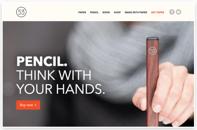
The image for this 2014 website design example is from 30 Beautiful and Creative Ecommerce Website Designs
2015 Hero Images in Web Design
By 2015, hero images were common in website design. Most were used with text overlaid on top. Balancing a colorful banner with a neutral palette and clean content areas was the norm.
Mint
Mint’s website design from 2015 uses a hero image effectively in its banner. As per usual, the banner uses a sans serif font on top.

The image for this 2015 website design example is from 15 Examples of Brilliant Website Homepage Design
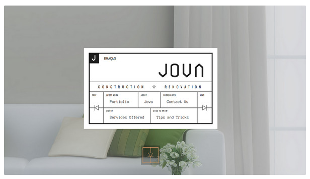
Jova
This website design from Jova goes against the norms by placing its navigation front and center. A clean, neautral photograph with a shot of leaf green creates a lovely background for the navigation menu. A dusky overlay mutes the photograph to allow the navigation menu to take center stage.
Visit Brazil
This inviting website banner design uses the hero image to add texture, interest, and content. A vibrant yellow door contrasts nicely with squat white text.
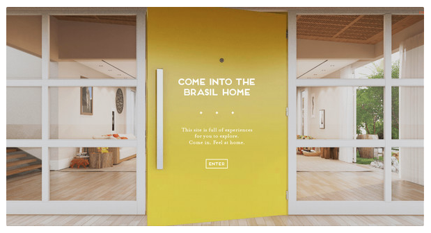
The images for the two 2015 website design examples above are from Interesting Navigation Examples in Website Design
2016 Hero Images in Web Design
In 2016, hero images continued to be on trend in web design. In the examples below, breathtaking photography adds not only beauty, but context as well. In the best examples of hero images, the photography and text tell a story.
Bucketlistly
This website banner uses a hero image as a background to important text, buttons, and logos. The beautiful photograph pulls the website visitor into the experience and creates context for the banner message.
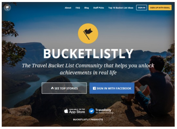
The image for this 2016 website design example is from 28 outstanding examples of CSS
2017 Hero Images in Web Design
Designed To Move
This website is an engaging example of an effective hero image used in banner design. The image creates a dark backdrop for white text and green buttons. It also adds context to the message and makes it more authentic.
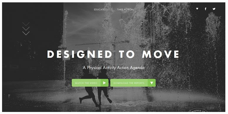
The image for this 2017 website design example is from 50 Perfect Examples of Flat Web Design for Inspiration
Controversy with Hero Images
The large, full-page hero images common on today’s websites were not universally welcomed when they first became a trend. Why not? Because many people questioned whether website visitors would scroll past the large image.
It may seem silly now, but there was quite some debate about scrolling past the fold on websites. (Read Below the fold if you’d like more information about what “the fold” and “below the fold” means.)
In 2011, one agency wondered: “The concept of designing for the fold has always been a focus for web designers, but as technology continues to grow and diversify, is it an outdated principle?” (Read Above the Fold vs. Below the Fold: Everyone Scrolls)
Here’s some insight from UX Myths: “Although people weren’t used to scrolling in the mid-nineties, nowadays it’s absolutely natural to scroll.” (Read Myth #3: people don’t scroll for tons of stats and studies.)
The Future of Hero Images in Web Design
Looking back on the website design examples from the last ten years or so shows that the hero image has changed very little in terms of web design.
Variations include the size of the hero image – you may see very large images or you may see images that stop before hitting the bottom of your screen.
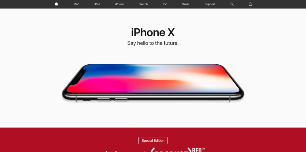
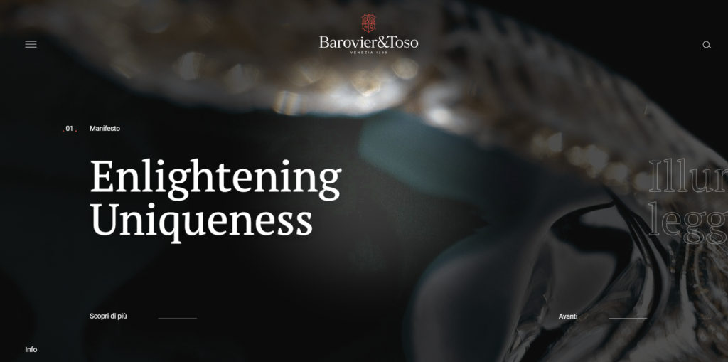
Another design variation is the website navigation bars – they are frequently removed to show even more of the hero image. The website below uses a hamburger menu on its desktop website design.
For now, hero images are here to stay and you’re likely to see them used in website banner designs for years to come.
Learn More About Responsive Design
Interested in a website design for your business, corporation, or e-commerce store? You’ll want to check out our free e-book all about Responsive Design:
Say Hello!
Give Artonic a call or email us if you’re interested in website design, development, or marketing.
Michigan, USA


