Ready to create a website? Let’s build its skeleton first.

Skeleton Before Skin
A prototype “lays out the skeletal structure of a website, so you get a better idea of what will go where and how a user will navigate.” (Read Why Build Wireframes and Prototypes for more information.)
When we talk about the skeleton of your website, we mean the prototype. Your website prototype is the “skeletal structure” beneath the skin or surface of your website. Like the bones in your body, your prototype is what gives your website form and must be in place before the outer layer is made.
 A Skeleton by Any Other Name
The word “skeleton” is used by Jesse James Garrett in Elements of User Experience to describe one plane of a website design:
Beneath that surface is the skeleton of the site: the placement of buttons, tabs, photos, and blocks of text. The skeleton is designed to optimize the arrangement of these elements for maximum effect and efficiency—so that you remember the logo and can find that shopping cart button when you need it.
UX Designers have a variety of names for a website skeleton, like:
- Wireframe
- Prototype
- Blueprint
What a Website Skeleton Looks Like
A website skeleton can take many forms, from a rough sketch on a napkin to an interactive prototype. At Artonic, we use prototyping software to create functional skeletons that our clients can view, use, and comment on.
This is what a website skeleton looks like:
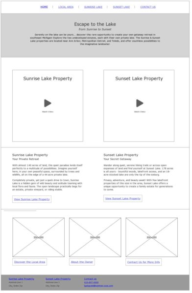
This is another image of a website skeleton:
Kind of boring, right? Well, this is what your website skeleton looks like – it’s not pretty, but it is functional.
There’s a reason we keep the skeleton from looking too good. It’s so that we can focus our attention on user experience, instead of graphic design. Only once the elements are placed most effectively can we move into design.
Building Your Website’s Skeleton
The when building your website’s skeleton, we are concerned most with Information Design and Navigation Design.
Information Design – how information is presented so that it’s easy to read and understand.
Navigation Design – how the navigation of the website is presented so that it’s easy to identify and efficient to use.
In other words, your design team needs to figure out two main things:
- the best way to display content on your website
- how to make it easy to find your website content
Your Information
First, let’s figure out what information you’re going to use on your website. This means content – text, videos, podcasts, images – that you want to make available to your website visitors.
For example, one of Artonic’s website pages includes a variety of information in the form of articles, podcasts, and videos.
When dealing with information, it can be overwhelming. Where do you start? We suggest you start by creating a spreadsheet of the content your company owns. Additionally, research your target market so you can give them what they’re looking for on your website.
Organizing Information
At Artonic, we follow a user-centered approach to website design. It includes five steps:
- Strategy
- Scope
- Structure
- Skeleton
- Surface
Once you arrive at step number four, you’re ready to create a website prototype. But if you haven’t gone through the other three steps, you may want to consider starting there.
Let’s Talk Website Strategy (It’s not as difficult as you think.)
How to Clarify Your Website Scope to Stay Within Budget & Launch On Time
What Your Website Structure Says About You & Your Business
Ideally, you’ve created a website strategy, have defined the scope of your project, and know how your website will be structured. Take care of these items first to create a user-centered website that’s made to succeed.
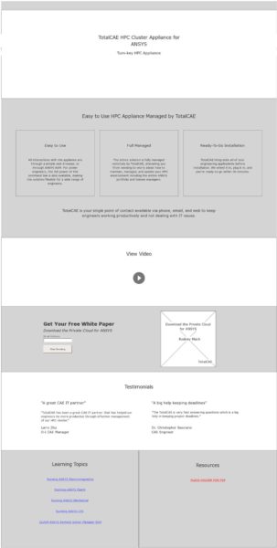
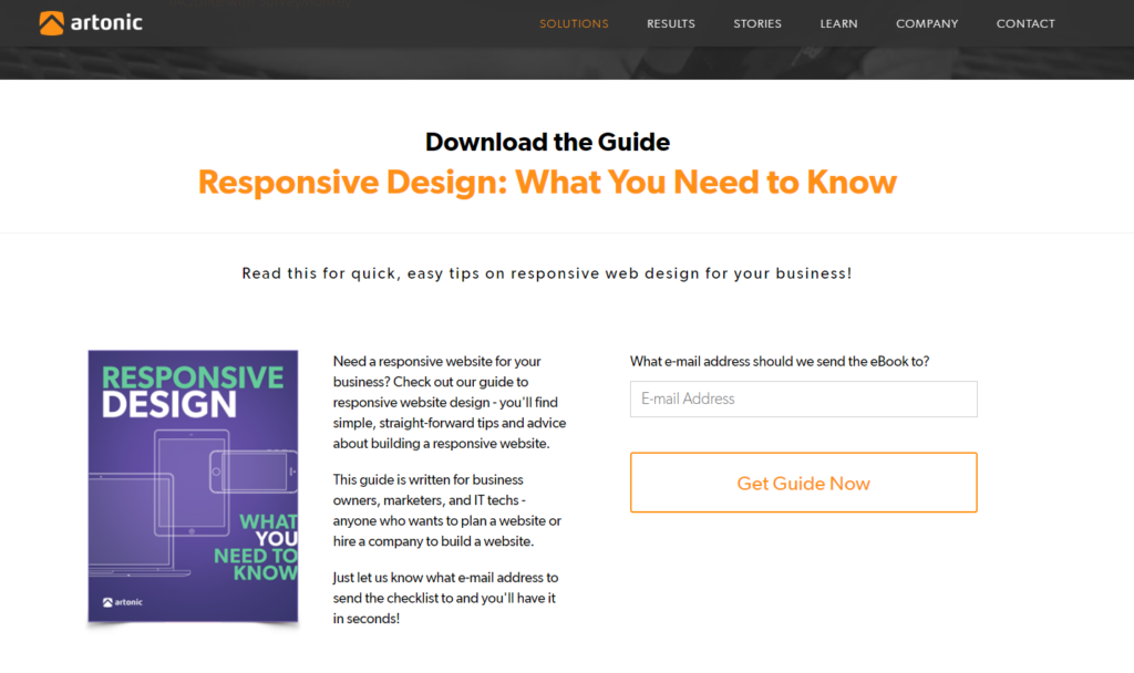
Below, a PDF is available to visitors. This is how a user-centered website design process works to create a great website:
The strategy is to generate leads; the scope includes a PDF, e-mail form submission, and additional functionality; the information is placed on a specific page, as determined in the website structure.
Organizing information on a website may require Information Architecture, a process to find the very best way to present information to users. This applies to a lot of things in website design, from a sitemap to a quote form.
Your Website Users
When designing your website skeleton, think about information and navigation from the perspective of your visitors.
How do you do this?
- You need to identify who will use your website once it’s online.
- Find out what they want through research and surveys.
- Investigate other websites to discover industry standards.
If your information isn’t designed in a user-centered way, confusion and frustration result.
“In the age of technology there is constant access to vast amounts of information. The basket overflows; people get overwhelmed; the eye of the storm is not so much what goes on in the world, it is the confusion of how to think, feel, digest, and react to what goes on.” (from Venus in Arms by Criss Jami, Poet)
Once you know what information you’ll offer on your website, create a structure (or sitemap) for your website. A website sitemap is a lot like an outline for a paper.
Navigating Your Information
Another vital element to your website skeleton is its navigation. A navigation link is like a doorway to information. When a designer determines how to best present information, she is really designing a connection between the user and the information.
“Eventually everything connects–people, ideas, objects. . . the quality of the connections is the key to quality per se.” (from Everything is Connected by Charles Eames, American Designer.)
Determining your navigation is like creating a path through a forest; you want the experience to be easy and enjoyable, from start to finish. Navigation design is very similar.
Let’s think about your website for a minute.
How will people get from one page – or one area – to another?
Links.
Links are what connect two pieces of information on the World Wide Web.
When we think about links, we consider:
- Text
- Placement
- Design
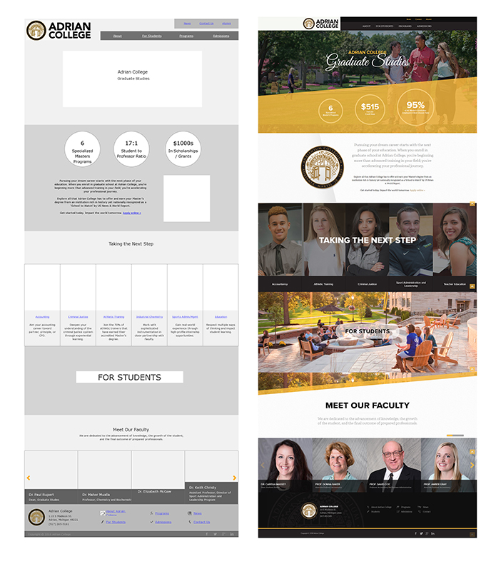
Below are some pages from Adrian Graduate Studies’ website design. The links are highlighted with red boxes.
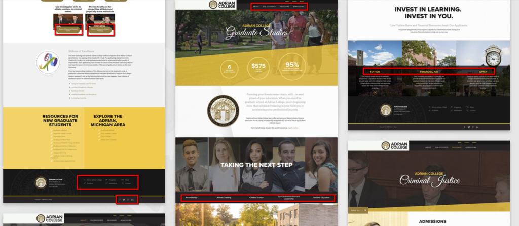
Look at all the links! There are links in the text, buttons that are links, social media icon links, and a menu in both the header and footer.
It’s a lot.
That’s why we have navigation design – so we can study and test the best way to help website visitors find what they want.
When thinking about navigation design for your website, keep your website visitors in mind. What words do they use? What things interest them? What are they looking for? How tech savvy are they? What about accessibility needs?
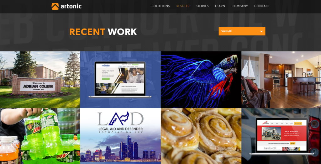
In the example below, user-centered information is presented to maximize visual appeal while aiding ease-of-use. Not all companies need a gallery, but web design clients expect to see a portfolio.
Let’s Go!
If you’re creating a website for your business, it’s important to get all the details right. Need help? That’s why Artonic is here – to support your goals and make your website a success.
Each website we build is completely custom. We do not use templates. (Find out why a custom website design matters). Every piece of your website is created specifically for YOU – your goals, your audience, your strategy, and your brand.
View videos and read case studies about stories from our clients.

Say Hello!
Give Artonic a call or e-mail us if you’re interested in website design, development, or marketing.
Michigan, USA