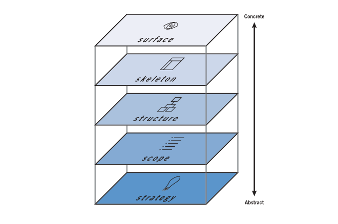
When we create a website, we follow a user-centered process to ensure the end product results in an enjoyable experience for people who visit and use the website. User-centered website design uses a process introduced by Jesse James Garrett and builds a website from bottom to top. The visual design – your Website Surface – is the final piece of this process.
The Visual Design of Your Website
Once we reach this stage, we’re ready to tackle the visual design. The Surface of your website is created based on your website skeleton (also called a website prototype). The skeleton is built after your website structure is determined. Structure is based on the scope and strategy behind your website.
Visual design is about beauty and function working in harmony. The design should appeal to end users as well as help them navigate and use the website.
Beauty & Your Website
Appeal is being attractive to someone. You want to appeal to your customers and target audience. Your website needs to appeal to them, too.
Don’t make the mistake of dismissing beauty or aesthetic; your end users care about it and you should, too.
Beauty grabs attention because people like to view beautiful things. Beauty stands out because it’s unique on an Internet cluttered with ugly websites, logos, images, and more. Beauty is vital to a strong brand identity.
A beautiful website helps your brand catch attention in a good way and boosts its perceived value.
Usability & Your Website
An enjoyable website experience usually hinges on usability – or how easy it is to use. Your website must be easy to use or people won’t use it.
The visual design of your website must be usable as well as beautiful. It should help visitors understand what your website is about and how to use it. The way a button looks – its visual design – is essential to usability. If a button doesn’t look like a button, people may overlook it or be confused by it.
These two elements – usability and beauty – must harmonize to create the best possible experience on your website.
How to Determine Visual Design
If your company is in the process of designing a new website, it’s usual to think first of the visual aspect, the website surface.
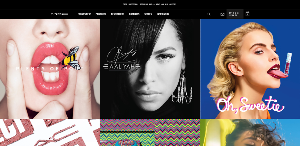
The co-owner of a fashion brand told me that she had designed her website based on MAC Cosmetic’s website.
And in fact the visual design of her website was a lot like MAC’s: striking photography, vivid spots of color in an otherwise neutral space. There was something missing, though…
Her website was hard to use. Pages were difficult to find, the navigation was confusing, and there was a distinct lack of brand presence. Hardly any text graced the homepage – and, unfortunately, the photo on the banner didn’t give enough information on its own. The result was a jumbled mess.
But it looked good – on the surface.
Compared to MAC’s website, however, it fell short.
MAC’s website looks beautiful, and it works well. The navigation menu is easy to use. A visitor can find the items she’s looking for, because the website is organized in a way that makes sense.
That’s the balance you desire: function and beauty.
Your Brand
The first consideration is your brand. Your brand identity is vital to your website design. This is the main factor many web design agencies use when determining a website color palette.
Your Goals
Next, consider the goals of your website. Do you want to increase traffic? Bring in more qualified leads? Expand brand awareness? The strategy behind your website will play a large piece in the way your website looks.
Your Users
Another major consideration in your website design is the end user – the person who will use your website. Your end users may comprise many different groups, like customers, current clients, investors, and your internal marketing team.
Website Structure
How your website is structured will determine, in part, the way your website surface is designed. The graphic design of your website should correlate with its structure. The navigation menu should be easy to find and read; links should be distinguishable from plain text;
Website Content
The way your website content is arranged should be supported by the graphic design of your website. Meaning, headings should be identifiable as should hierarchy. Different types of content – text, videos, audio – should be distinguishable from each other. Overall, content should look balanced and make sense to the reader.
Website Prototype
A prototype, or website skeleton, is like a blueprint – it tells the graphic designer where things go but allows her to make decisions about color, texture, and typography.
Breaking Down a Website Surface
Let’s look at a few website designs to determine what is part of the surface and what is part of the other layers – those things that lie beneath your website surface.
Slusarski
The website design for Slusarski, a local provider of integrated site development services, can be seen below.
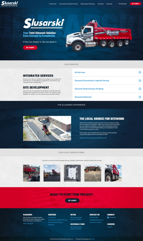
Notice a few things as you view this design, starting with the brand, content, and navigation.
When you view the logo and photography, you can see that Slusarski uses blue, white, and red in its brand. The logo font is simple, an element mirrored in the text on the website.
Look at the content – there are sections for each topic, denoted by color. Buttons are uniform and look like buttons. The navigation menu is legible and located at the top of the website. Links are identifiable from plain text.
The design is balanced, harmonious, and visually attractive. The photography is stunning, authentic, and real. Textures are used to enhance quality and identity.
Each element of the website surface is beautiful as well as functional. Overall, this design is very appealing – not only on the surface, but also when a closer look is taken.
Ken Rusk
This website, designed for entrepreneur and author Ken Rusk, is another excellent example of how your website surface should look.
As with Slusarski, notice the brand identity, content organization, and navigation. Does the website make sense? Is it visually appealing?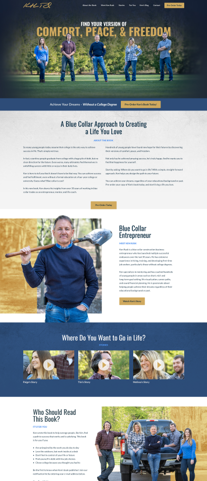
References
Build an appealing website that people like to use by following a user-centered process. We’ve broken down the process into separate steps for improved clarity. Take your time and learn more about user-centered web design (the right way to build websites):
Let’s Talk Website Strategy (It’s not as difficult as you think.)
How to Clarify Your Website Scope to Stay Within Budget & Launch On Time
What Your Website Structure Says About You & Your Business
Your Website has a Skeleton, and It Looks Like This
Get a Good Website Design
If you’re creating a website for your business, it’s important to get all the details right. Need help? That’s why Artonic is here – to support your goals and make your website a success.
Each website we build is completely custom. We do not use templates. (Find out why a custom website design matters). Every piece of your website is created specifically for YOU – your goals, your audience, your strategy, and your brand.
Find out what it’s like to work with an agency to create the website of your dreams: View videos and read case studies about stories from our clients.

Say Hello!
If you have questions about web design or digital marketing, let us know!
Michigan, US