Hey guys, my name is Maddie, and I am the new intern here at Artonic. At school, I learned about the importance of branding, and spent a whole semester creating a style guide. So, what is a style guide and why are they so important? “Essentially, it’s a document that describes, defines, and presents examples of what your brand looks like in various visual media such as print, Internet and broadcast.” (source) In other words, it’s a “rulebook containing specifications on everything that plays a role in the look and feel of your brand. It lets everyone know exactly how to present your brand to the world.” (source) If you don’t have a set of rules for your brand, make that an item on the top of your to do list. If your branding isn’t consistent across all platforms, your audience will be confused as to who you are. Think about it this way. “If you see someone change how they look and act all the time, you won’t feel like you know who they are, and you certainly wouldn’t trust them.” (source) Having a consistent brand will form your identity. So, now that we have that settled, what is in a style guide? Are you thinking about making one? Well you are in the right place. Here is a recipe for a perfect style guide!
Step One: Your Brand Story – Vision, Mission, and Core Values
Every brand has a story. What do you care about? What are your values? Who are you? This could describe the company’s personality as well. “Brand stories wrap up a company’s vision, mission, and core values in one nice little package.” (source) People like to hear how you started, what you believe in, and your goals. You are providing information that will help your audience make a strong connection with you. For example, look at Wolf Circus Jewelry’s brand guide.
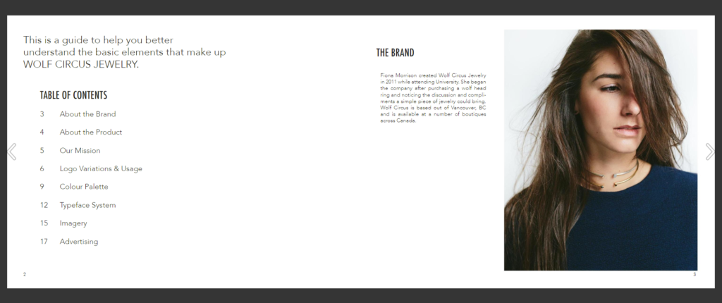
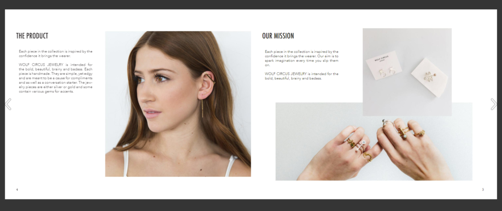
Brand stories can be composed in multiple different ways. Not all style guides are the same. Wolf Circus Jewelry split it up into “The Brand”, “The Product”, and “Our Mission”. In “The Brand”, they include how the company was founded, and where they are now. In “The Product”, they discuss how they are inspired by the confidence people get from wearing their jewelry. They also include some personality words, like simple and edgy, and they give some details about the look of the jewelry. Finally, in “Our Mission” we see that they are inspired by the confidence the jewelry brings the wearer and they want to spark imagination. Just reading their brand story makes you feel like you have a stronger connection with them, right? That’s the point.
Step Two: Logo
This is probably the most important part, so pay attention. Logos. Logos are the face of the company. It is how people recognize you, so it is important to have a set of rules to keep it consistent, so they know who you are. Let’s look at Scrimshaw Coffee’s style guide.
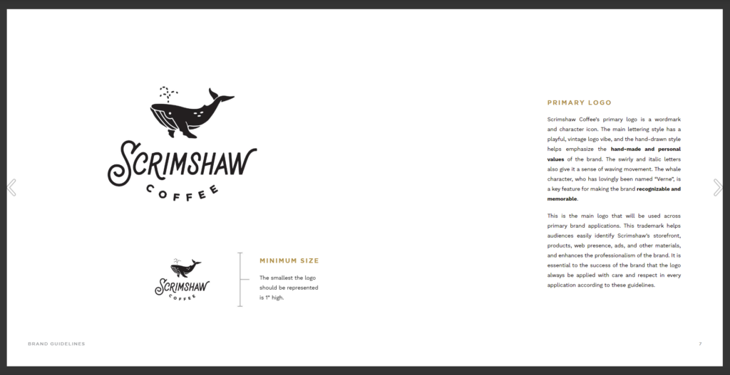
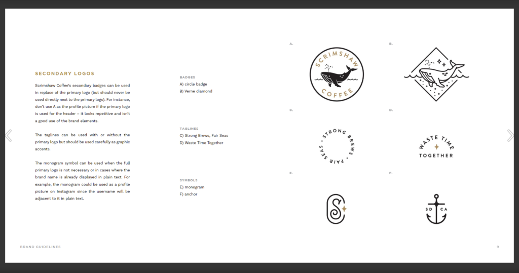
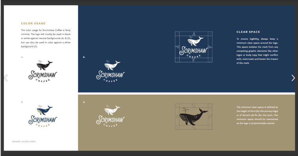
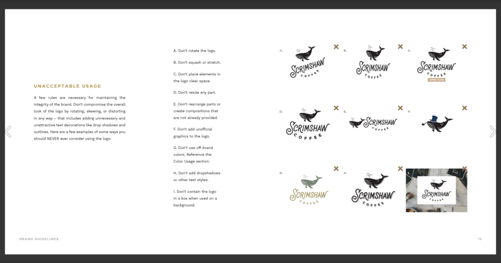
The first page shows their primary, or main logo. It is important to include the minimum size as well. Anything smaller than the size given will make the logo hard to read, or unrecognizable. To the right, is a couple paragraphs that break down the logo and explain why it looks the way it does. On the second page are Scrimshaw Coffee’s secondary logos. Not all brands need secondary logos, but it adds an interesting, unique twist to your branding. If you would like to make a secondary logo, just remember, like everything else, consistency is key. Use the same elements, like font, shape, and colors as you did for the primary logo. Scrimshaw coffee has badges, taglines, and symbols, all with different rules to go with them. It is important to have paragraphs such as these to make it absolutely clear how the logos are to be used. The third page is what I call the Logo Dos. It includes all the acceptable ways to use the logo when it comes to color and clear space. Now, I call the fourth page Logo Don’ts. It may be very clear to some people not to change the logo in these ways, but everything must be spelled out to ensure a neat, consistent brand. Are you starting to see how these style guides are almost like a rulebook for your brand? That’s it for logos, onto color.
Step Three: Color
Now the fun part, color. Color is a powerful thing. It can make you feel a certain way and can give off a mood or vibe. Now, it can be challenging to choose a color scheme that works well together, I struggle with it myself. That is why it is important to mood board, look into color psychology, and have some knowledge about color theory. When trying to decide on the look of your brand, look at other images for inspiration and save them all in a document. Do you see a common color or theme? There you go, that’s a good place to start. Color psychology is the study of color meanings. Here is a great resource for color psychology and how it affects your brand: https://www.oberlo.com/blog/color-psychology-color-meanings. For example, if your brand revolves around nature, use green, because it resembles growth and fertility. Color theory is also useful to know because some colors get along better with others. Blue and orange complement each other nicely. With these three things in mind, you will create an awesome color scheme that fits your brand. There are also tools to help you choose color schemes like Adobe Color. (source) Let’s look at an example of a color palette in a style guide. Thousand Below is a band that has developed their branding well.
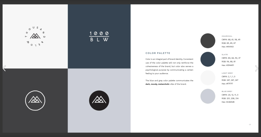
When choosing colors, remember to limit yourself. Here, you can see they only use four colors. The grey and blue palette give off a dark, moody feel which reflect the genre of the music as well. See all those crazy numbers and letters to the right of the image? Those are CMYK, RGB, and Hex codes. When designing for the brand, these codes are used within the program to get the same color every time. Pretty cool, right?
Step Four: Typography
Onto the next step, typography. Typefaces represent certain ideas. For example, a serif font, letters with little feet, looks more traditional. A san serif font, letters with no feet, is more modern. Scripts are fancy and handwritten is personal. So, it is important to pick a typeface that agrees with and compliments the brand you have built. Just like color, it is best that you limit yourself, but even more so. Let take a look at a more well-known company style guide, Skype.
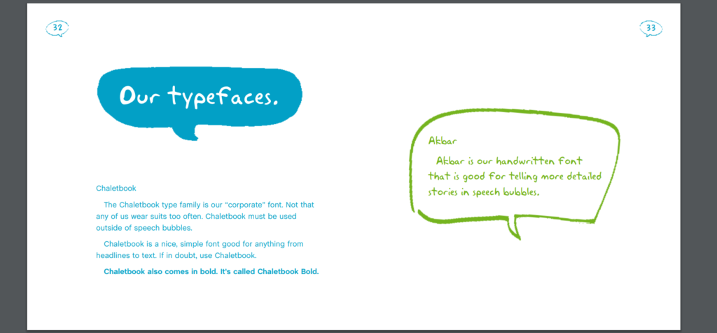
Here, the company picked two typefaces from different families, a common theme across the branding world. In this case, we have the font Chaletbook, a san serif, and Akbar, a handwritten font. These fonts speak to the branding of the company, modern and personal. It’s funny how the look of words speak just as much as the words themselves. You may not think to pick a typeface to include in your branding guide, but it is actually very important.
Step Five: Images & Photography
Let’s hop into images and photography. Using high-quality, personal photography done by a professional will make you stand out compared to other brands. Including a photography section in your style guide will demonstrate how they can be used. Let’s look at an example, Jamie Oliver’s style guide.
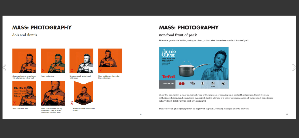
The photography section is broken down to Jamie, non-food, and food, along with do’s and don’t’s. I think you are getting the point by now. With each category of images comes a set of rules. For example, the photos of Jamie must always be on the bottom right, the product shots must be simple and clean, and the food must be freshly cooked and shot in natural light. Imagine in your style guide, you don’t specify how you want your images taken and displayed. There will be wacky angles, lighting, sizes and many other inconsistencies. Not good. It is best to be too detailed than not detailed enough.
Step Six: Voice
Now this might be something that you may not have thought of, but it is very important. Make sure to outline the voice of your brand. If your brand was a person, what would their personality be like? How do you want to come across to your audience? Once you have picked a few personality words, replicate them across all channels. Give your brand a voice. Let’s take a look at I Love New York’s style guide.
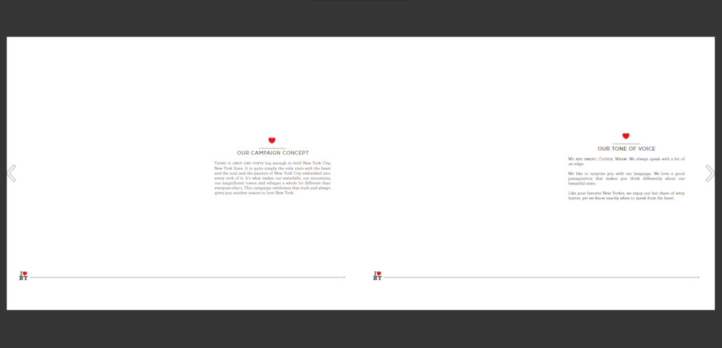
As you read through, you can pick out personality and describing words. Smart, clever, warm, edge, surprise, witty. This is the language that your brand will speak. Let’s say I Love New York is designing a new poster. The text on that poster could be something witty or clever. That is a brand voice.
Step Seven: Logo Placements
This is the last one, I promise. Now that you have everything outlined in your guide, it’s time to show the world what it looks like on real products! This shows people how you want your logo and imagery placed on different media, like stationary, buildings, websites, and billboards. A great example of this is Barnes & Noble’s style guide.
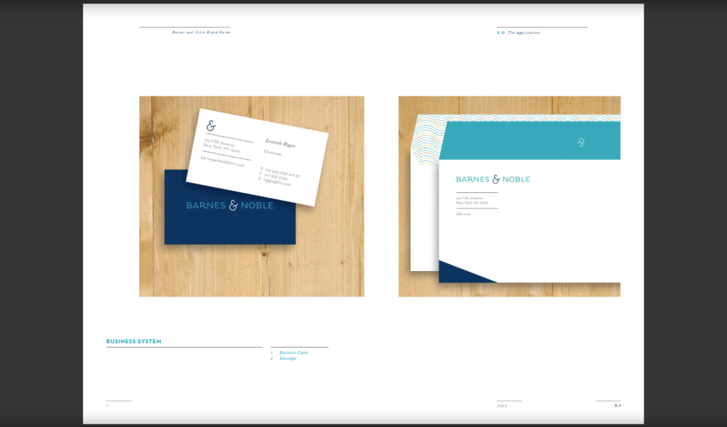
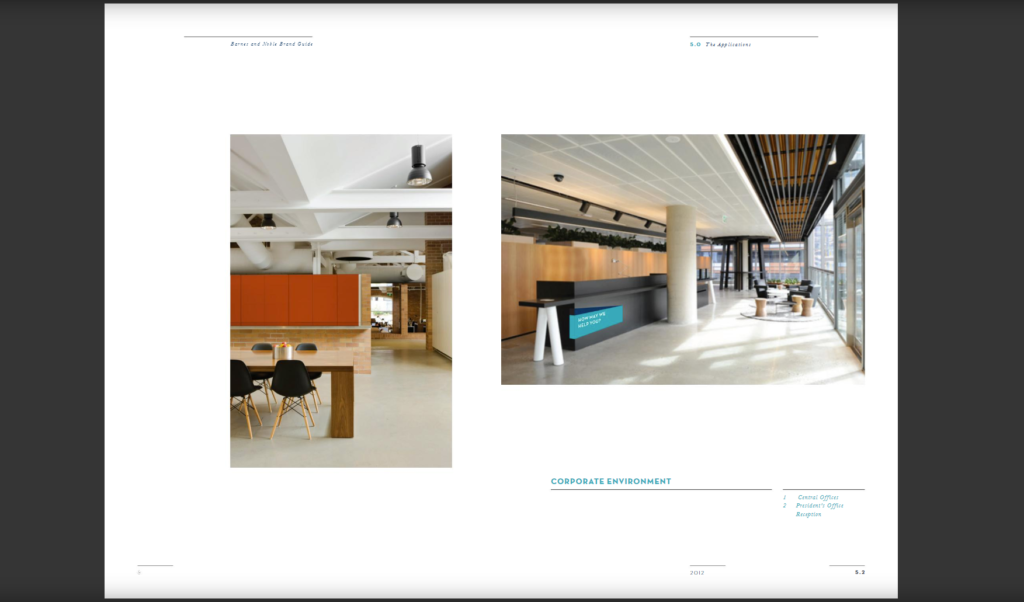
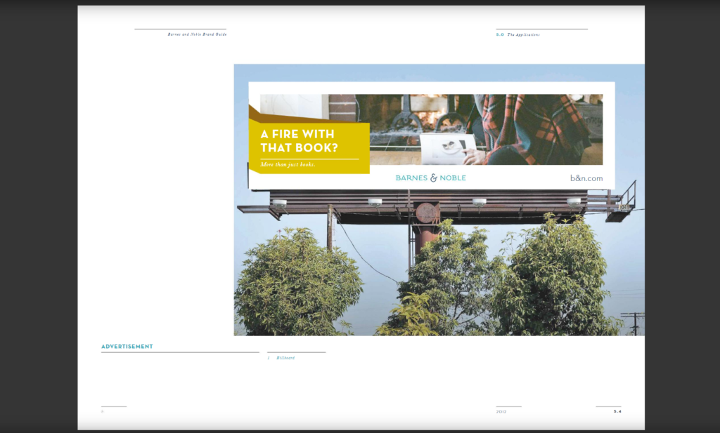
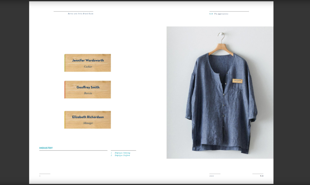
Their product placement section is very detailed and lengthy, so I encourage you to view the full brand guide. Pretty cool, right? All your decisions and hard work on your brand are now digitally placed on real life objects. Now the next step is printing your first business card and away you go!
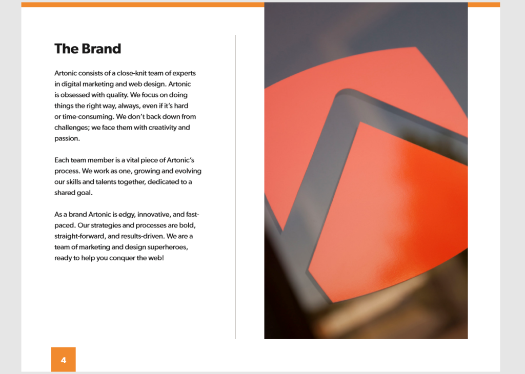
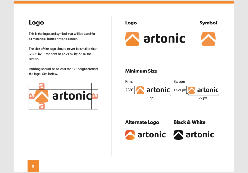
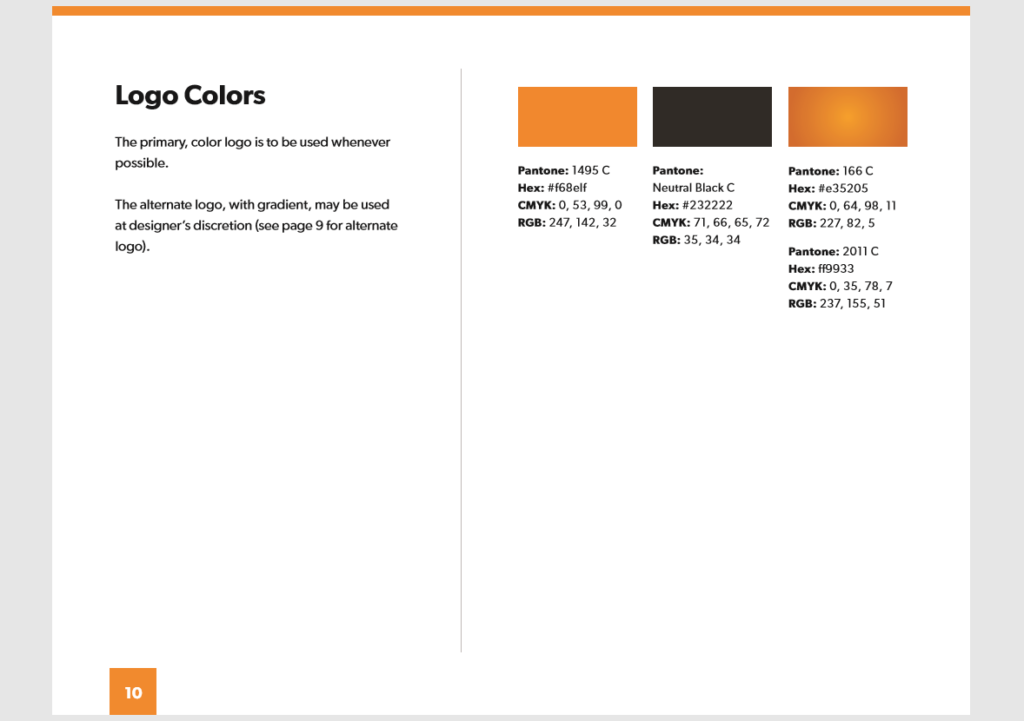
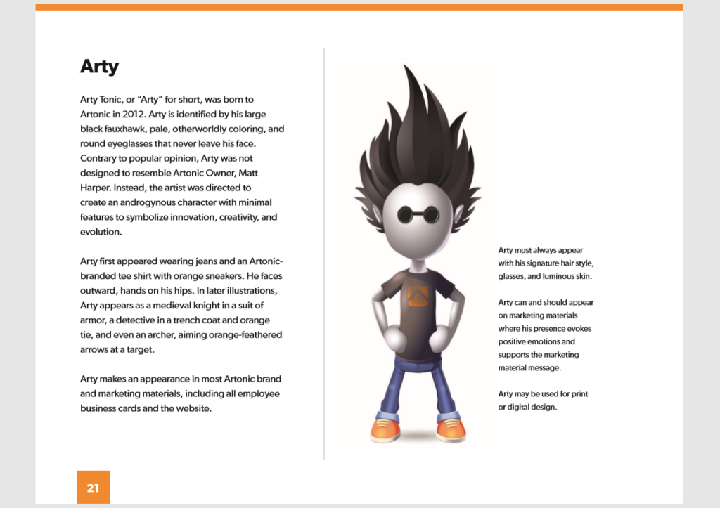
Now you know what a style guide includes, and if you want to make one, now you know how! Brand consistency is key. Our team is currently working on a style guide for Artonic. Here is a sneak peek of some pages from the guide!
Artonic’s Style Guide
Client Style Guides
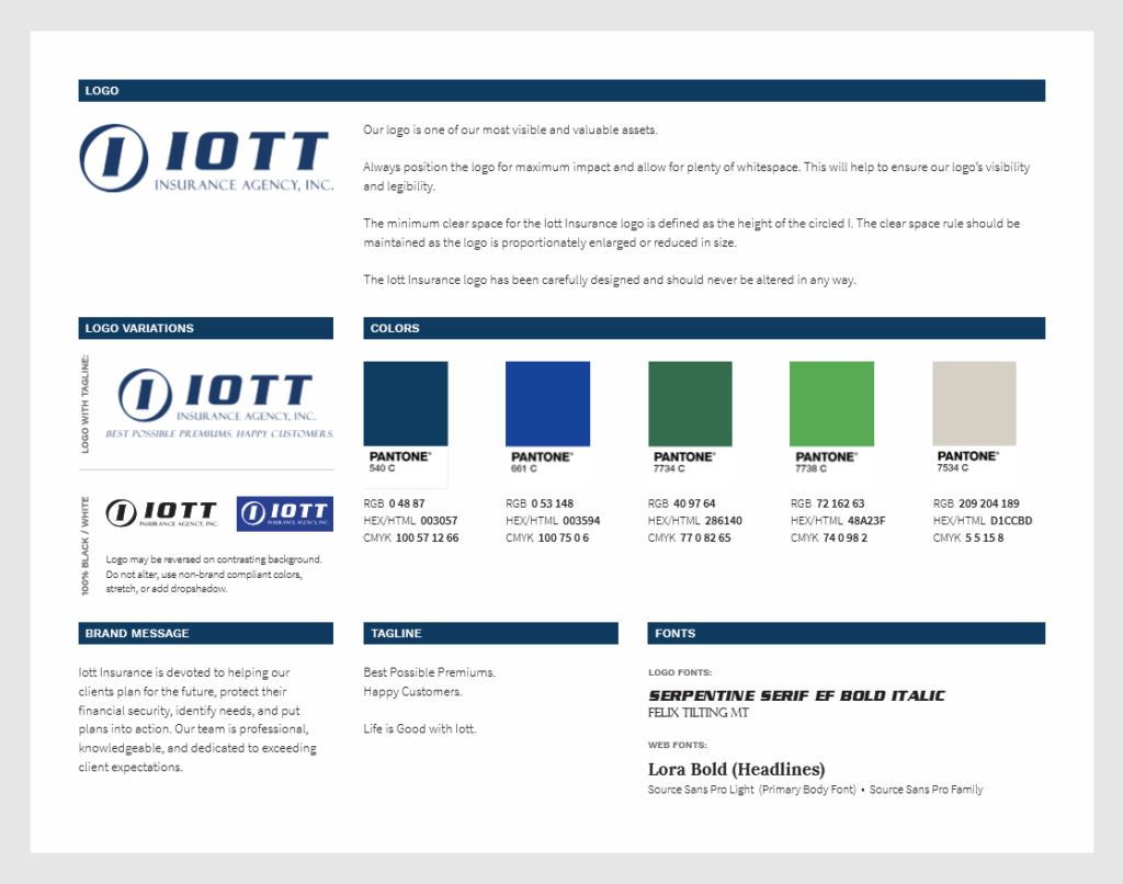
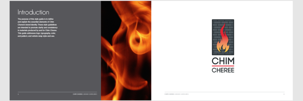
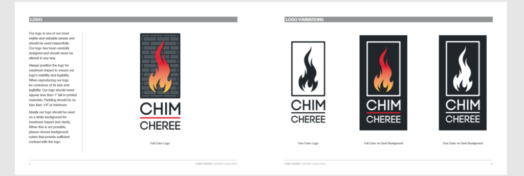
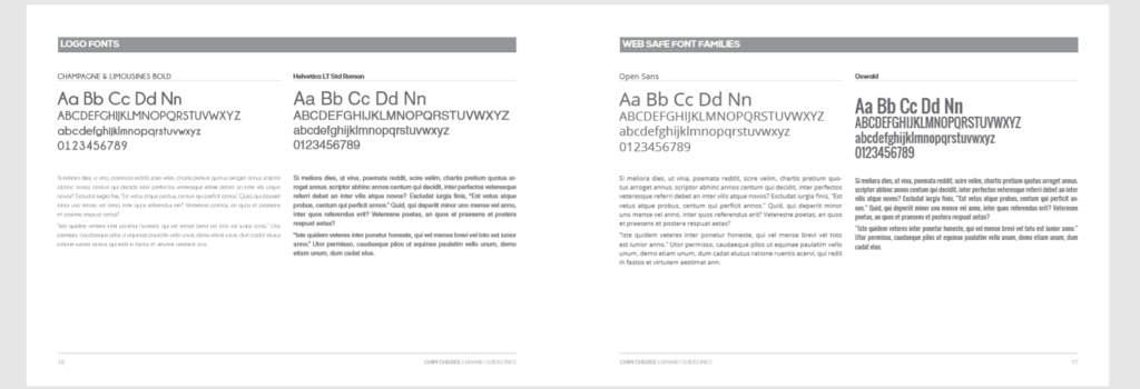
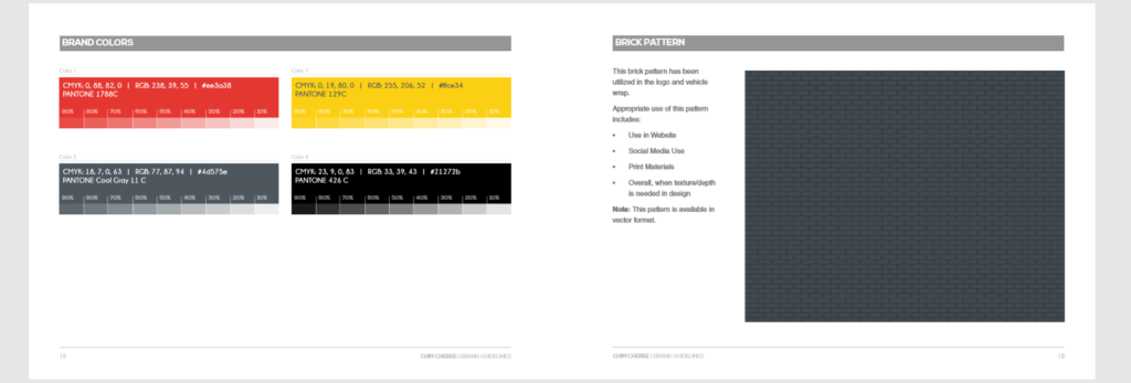
Artonic also designs style guides for their clients! Here are a couple style guide examples from our clients, Chim Cheree and Iott Insurance.
Chim Cheree
Iott Insurance