From light, pale Sky Blue to the depths of Deep Blue, this color remains popular in art and design – and websites are no exception. Blue website design is everywhere – from Finance to Travel to Healthcare and every industry in between.
The Color Blue
“Blue has no dimensions; it is beyond dimensions, whereas the other colors are not… All colors arouse specific associative ideas… while blue suggests at most the sea and sky, and they, after all, are in actual, visible nature what is most abstract.” – Yves Klein
“Almost without exception, blue refers to the domain of abstraction and immateriality.”- Wassily Kandinsky
“Blue is the only color which maintains its own character in all its tones… it will always stay blue; whereas yellow is blackened in its shades, and fades away when lightened; red when darkened becomes brown, and diluted with white is no longer red, but another color – pink.” – Raoul Dufy
“The color blue – that is my color – and the color blue means you have left the drabness of day-to-day reality to be transported into – not a world of fantasy, it’s not a world of fantasy – but a world of freedom where you can say what you like and what you don’t like. This has been expressed forever by the color blue, which is really sky blue.” – Louise Bourgeois
(Want more? Check out Art Quotes.)
Blue Moods
How many moods does blue have? As many moods and expressions as people have. It seems there may be a shade of blue for everyone, from intense to serene.
When it comes to websites, you’ll find blue everywhere in design. Shades of blue go on for days, so we’ll focus on five groups:
- Intense Blue
- True Blue
- Deep Blue
- Sea Blue
- Sky Blue
Intense Blue Website Design
“The world is blue.” – Yves Klein
Yves Klein was an influential French artist whose “chromatic devotion was so profound that in 1960 he patented a colour of his own invention, which he called International Klein Blue.” (Yves Klein: The man who invented a colour from BBC)
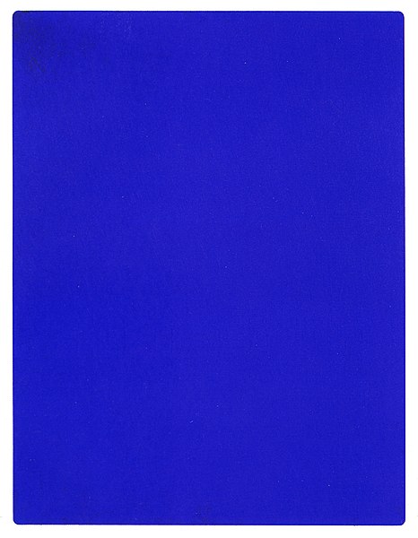
International Klein Blue, or IKB, is similar to ultramarine; it is bright, expansive, and deeply affecting. This blue is an experience.
IKB is brilliant and deep. Almost otherworldly, this color is capable of transporting viewers to another realm. Mesmerizing in its intensity, it simultaneously arouses and calms emotions.
Words to describe this Intense Blue shade include:
- Spiritual
- Abstract
- Stirring
Use Intense Blue to capture attention, instead of more visually fatiguing colors like red, orange, or yellow. Don’t be fooled into thinking this blue is basic; instead, this bright, luminescent shade affects people in a profound way.
Use Intense Blue to make your visitors feel:
- Uplifted
- Inspired
- Awakened
Intense Blue Website Design: Loopring
Meet Loopring, “…a unique project in the world of decentralized exchange.” (For more, visit Loopring’s Reddit page.) Loopring concerns itself with digital crytocurrency trading.
Its website design utilizes bright blue and white exclusively to create a clean, modern, minimalist vibe – one that probably appeals to its youthful, tech-savvy target audience.
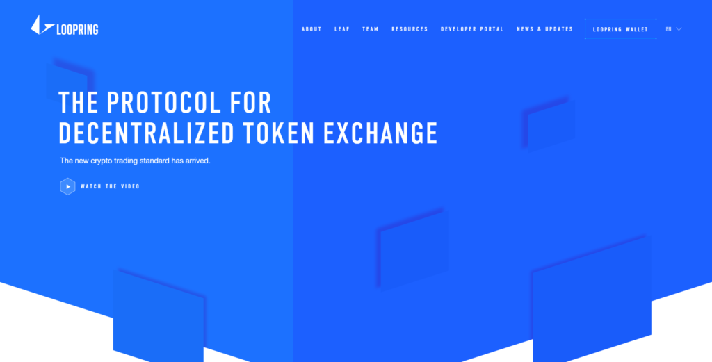

The color blue is used in this web design to evoke feelings of stability and constancy, common themes in websites centered on finance or financial services.
Intense Blue Website Design: Udeany
Udeany (pronounced “u-dean-e” according to the website’s About page) is a service to help students get out of debt. Udeany’s website design works with the three primary colors – blue, red, and yellow – to create a vibrant yet simple environment for its users. We see black and white throughout the design, too, as balance to and relief from all the bright colors.
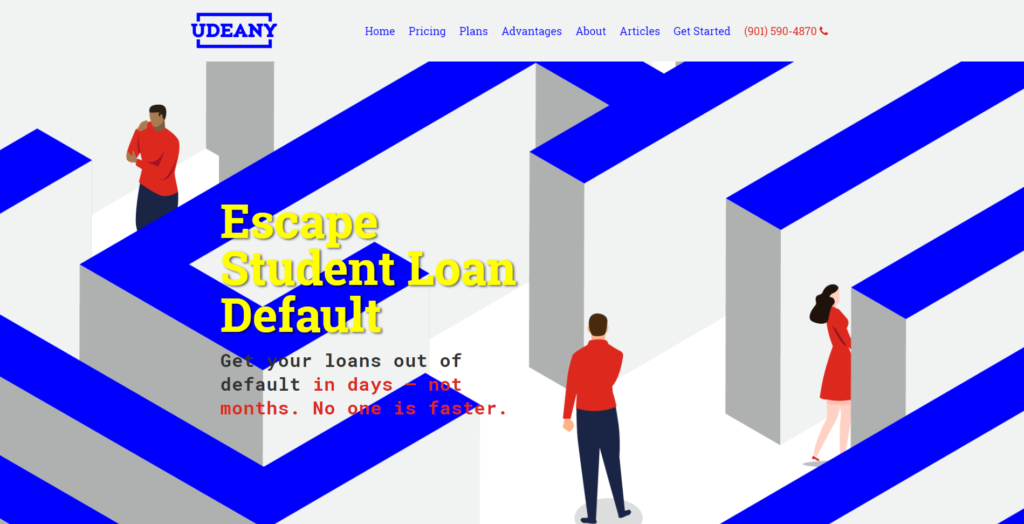
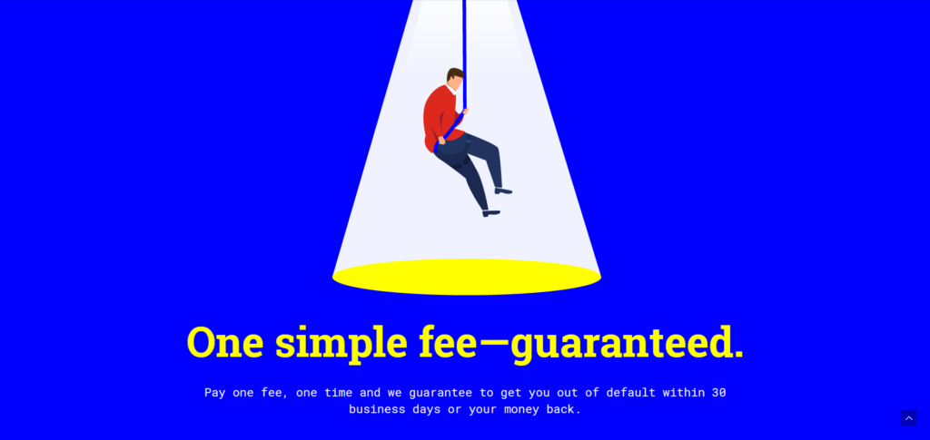
This website design is similar to Loopring’s in that it is modern and simple and employs lots of white and blue. Udeany, however, uses hot colors in addition to cool blue and brings in black for weight and leverage.
The overall mood created with Udeany’s design is energetic yet stable; modern and youthful, but also serious and focused.
True Blue Website Design
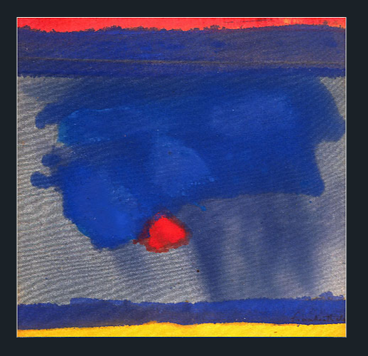
This standard blue color can also be described as “true” blue. An example from Helen Frankenthaler titled Provincetown is an example (notice the primary colors – blue, red, and yellow).
True Blue is a stable, dependable shade of blue. True Blue is used to evoke feelings of assurance in website visitors – to make them feel at ease and comfortable with your brand.
True Blue can be described as:
- Accurate
- Authentic
- Appropriate
Use True Blue to relieve doubt and create a sense of security in your web visitors. This color helps visitors feel that your website is safe and your services are credible.
Use True Blue to make your visitors feel:
- Calm
- Stable
- Secure
True Blue Website Design: Vexor
Vexor is a tool development teams use to continuously integrate their work. Its website uses a calm, strong blue as a solid background and clean white typography – two elements that allow the animated, striped graphic to take center stage.
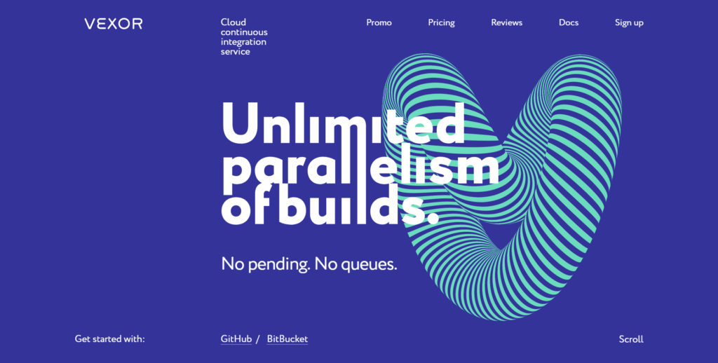
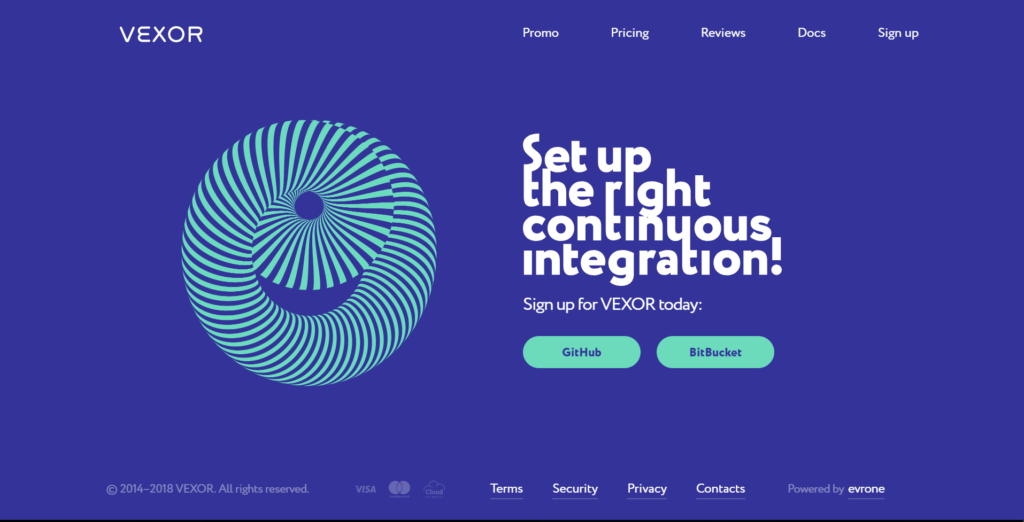
Vexor’s web design avoids plainness with most subtle of details: the blue that is just barely purple like a twilight sky, minty green stripes that undulate, and a quirky font that somehow ties it all together.
The feeling a visitor gets from this blue website design is like a very calm circus: things are moving and playful, but under control.
Web developers are technical and precise, yet possess an unconventional view of the world. This website design taps that peculiar, genius energy with more than a little help from the color blue.
Intense, True Blue Website Design: Block Collider
Similar in design to both Loopring and Udeany, Block Collider also uses a blue and white color theme and custom illustrations to create an aura that is both lively and sedate. Its homepage is painted first in ultramarine and gradates into deep, dark blue territory.
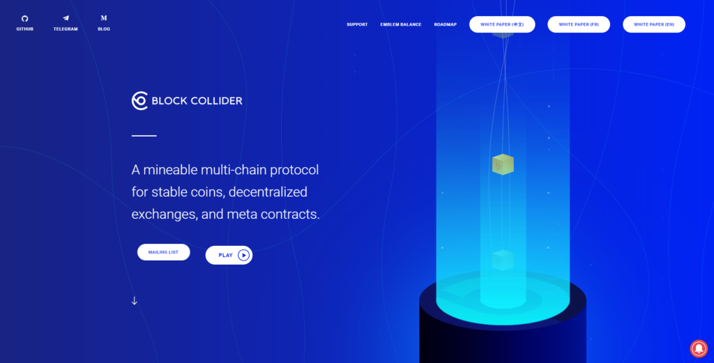
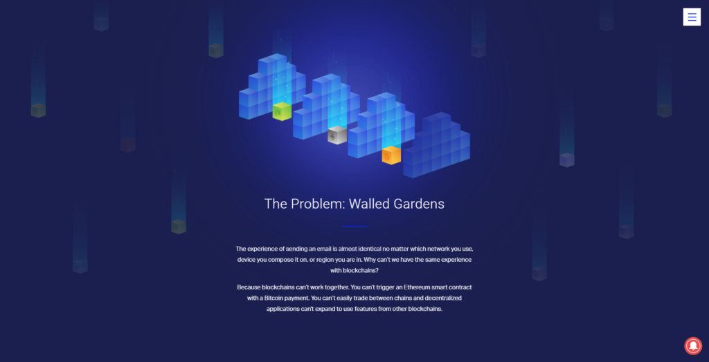
Block Collinder’s web design experience feels calm yet engaged, as though things are moving quietly behind the scenes. Yellow and orange add points of color to further enliven the mood, almost like candles in a cave.
The Deep Blue
“Vermeer’s blues are silent, but they touch your soul.” – Jonathan Jones
The Great Wave off Kanagawa, a woodblock print by the Japanese ukiyo-e artist Hokusai, creates a feeling of awe in viewers. This highly popular work showcases Deep Blue waves hugged with teal and topped with frothy white.

Deep Blue shades include Indigo or Prussian Blue, and provide a sense of mystery, awe, and power. When used in website design, Deep Blue is serious with a touch intrigue.
In Rooms by the Sea, Edward Hopper depicts the sky “Described as the view he would have seen out the back door of his studio, it was a literal representation of silence and solitude.”

Other words that describe Deep Blue:
- Somber
- Impressive
- Compelling
In your website design, use Deep Blue to create feelings of:
- Intimacy
- Intrigue
- Seriousness
Deep Blue Website Design: Digital Asset
Dark, deep blue – sometimes called Indigo or Prussian blue – helps create a professional, steady feeling on Digital Asset’s website. This is an excellent choice for the target audience: financial institutions that need to share data securely.
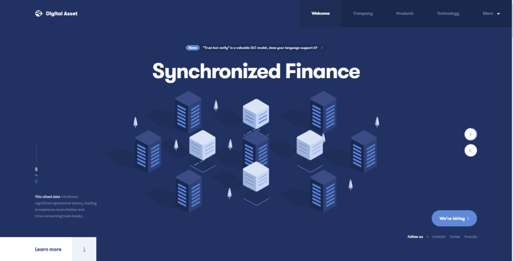
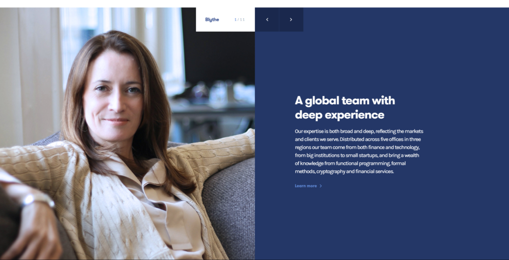
The website design uses beautiful authentic photography to elevate the level of trustworthiness. Notice how the colors in the photograph above are similar to the peach and ivory colors used by Hokusai in The Great Wave referenced above. (The bright blue lines striped along the dark blue server in the website graphics also remind me of the two blues in Hokusai’s wave – anyone else?)
Sea Blue
“Blue is the colour to choose when creativity is a priority. People are less literal and more exploratory with blue… Blue is open, free, and peaceful.” – Dr. Juliet Zhu
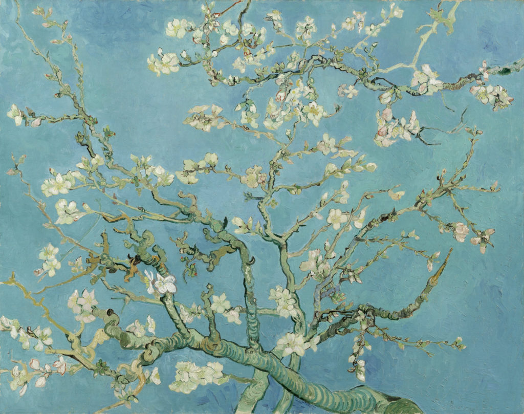
Blue with a touch of green is sometimes called Sea Blue. This shade is blue with yellow added to it to create a range of colors from teal to turquoise. A beautiful example can be found in Almond Blossom by Vincent Van Gogh.
This blue shade is described as:
- Tranquil
- Freeing
- Boundless
Use this shade of blue to create these feelings in your website visitors:
- Peaceful
- Adventurous
- Unplugged
Swim in Sea Blue with Habitas
The very blue website design for Habitas showcases stunning photography in deep teal and aqua. The experience on this website is luxurious, indulgent, and carefree – perfect for a travel or destination website like Habitas.
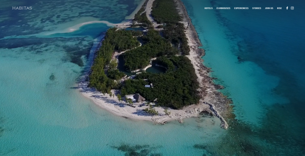
Thanks to its green shade, Sea Blue is earthier than more traditional blues. This color pairs delightfully with gray, ivory or sand, and brown.
Sky Blue
“How sweet to be a Cloud. Floating in the Blue!” – A. A. Milne
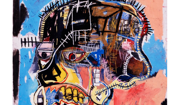
Sky Blue is both bright and light, a color that produces joy and delight. In Untitled (Basquiat Skull), Jean-Michel Basquiat uses this color as a backdrop to the hodgepodge face he colors with brown, black, yellow, and white. Using a carefree color like Sky Blue allows Basquiat’s creation to almost float in space. Additionally, it’s an excellent contrast to the deeper colors that represent darker, heavier themes.
When describing Sky Blue, you might use:
- Airy
- Cheerful
- Weightless
This is a great choice to use in your website design to produce feelings of:
- Optimism
- Excitement
- Freedom
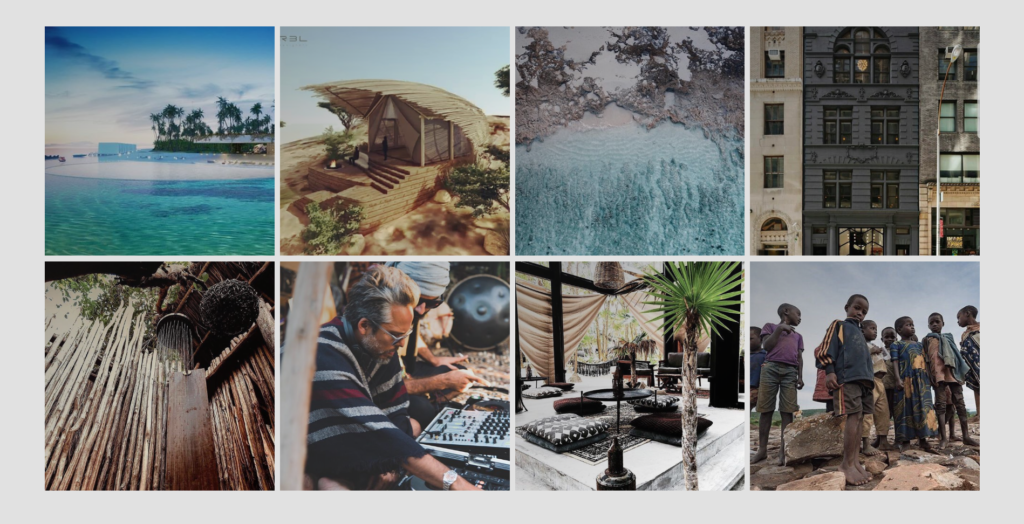
Sky Blue Website Design for Bold Earth
Bold Earth is a website for teenagers and their parents. It offers travel experiences that may include education or service. This web design uses Sky Blue to construct a high-energy design that takes you from the tops of a mountain to the depths of the ocean.
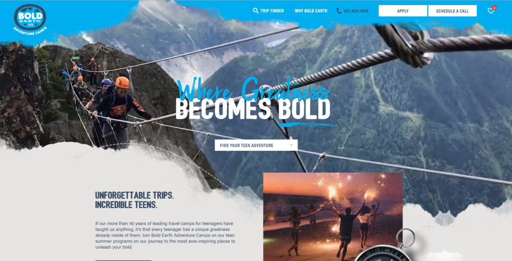
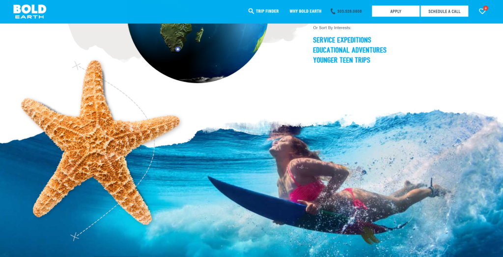
The feeling a visitor receives from Bold Earth’s website is one of fun and excitement. Gorgeous photography and professional content add a sense of quality and significance, giving users the impression that this is a serious website.
Blue Resources
10 Artists and Their Blue Periods – Schirne
A Brief History of Blue – Artsy
Blue – the color of constancy – Pantone
Helen Frankenthaler – WikiArt
#TheLIST: The 10 Female Artists You Need to Know – Bazaar
Eight blue moments in art history – Tate
Edward Hopper – edward-hopper.org
Say Hello!
Give Artonic a call or e-mail us if you’re interested in website design, development, or marketing.
Michigan, USA