Raisin Township
Logo
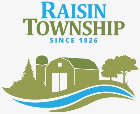
The local farming community of Raisin Township is well represented in this delightful logo design.
An earthy green is refreshed with true blue. Three lines at the logo’s base curve to create movement and represent the valley, river, and corn rows. Indigenous trees flank a barn and silo, a common and well-loved sight in the local area. A serif font reflects tradition while the sans-serif font adds a punch of modernity.
Homey and inviting, this logo design pleased our clients greatly.