Many prestigious healthcare website designs are easy to use and incorporate standard best practices. On the flip side, many web designs created for hospitals or medical centers lack differentiation, warmth, and creativity.
To find out more about healthcare website design in 2018, let’s review the web designs for the top ten hospitals on the U.S. News 2017-18 Best Hospitals Honor Roll:
- Mayo Clinic, Rochester, Minnesota
- Cleveland Clinic
- Johns Hopkins Hospital, Baltimore
- Massachusetts General Hospital, Boston
- UCSF Medical Center, San Francisco
- University of Michigan Hospitals and Health Centers, Ann Arbor
- Ronald Reagan UCLA Medical Center, Los Angeles
- New York-Presbyterian Hospital, New York
- Stanford Health Care-Stanford Hospital, Stanford, California
- Hospitals of the University of Pennsylvania-Penn Presbyterian, Philadelphia
The hospitals on this list are considered among the “best hospitals” in the United States.
Let’s Compare Healthcare Website Designs
The image below shows the first thing a visitor sees – the banner on the Homepage of the website.
In the image below, you’ll see banner designs for each of the ten healthcare facilities, hospitals, clinics, or medical centers listed above.

We see a few similarities in color scheme, layout, and “feel” (or personality) in several of the website designs above. Website designs in a specific industry, such as healthcare, often share common elements.
But think of these web designs from the viewpoint of a visitor.
If a person in search of healthcare visits several of the websites above, would he have a difficult time distinguishing one from another? Or remembering which hospital was which?
After viewing the websites above, do any individuate themselves in your mind with a unique look and feel?
If logos and names were removed, could you match the website design to the hospital? Or are they interchangeable?
If a hospital or medical clinic calls itself “revolutionary,” shouldn’t its website design also be “revolutionary?” Or should we expect medical websites to play it safe in shades of blue, white, grey, and red?
The homepage of Mayo Clinic (below) is so simple that it appears cold despite the fact that there are two smiling faces in the banner. 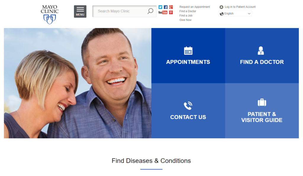
Blue & White Healthcare Web Designs
The most common color scheme for healthcare website designs is blue and white.
True blue and purple-toned blue shades are used most often.
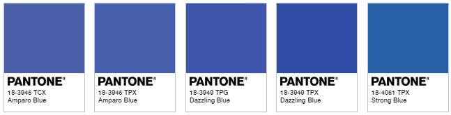
Sometimes the blue moves toward sea blue with the addition of green. This softens the clinical feel of some healthcare web designs. Compare true blue, above, to sea blue, below.

The image below show is the homepage banner of The Johns Hopkins Hospital website. This design uses blue, teal, white, and gold.
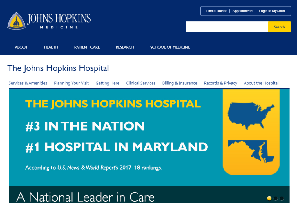
The accents most used with blue are white and sometimes gold, as we can see from the comparison above.
Deep Red & White Healthcare Web Designs
If you compare the top hospital web designs in the United States, the top 10 include mostly blue and white color schemes. Another common color scheme for healthcare websites is red, deep red, or maroon and white.
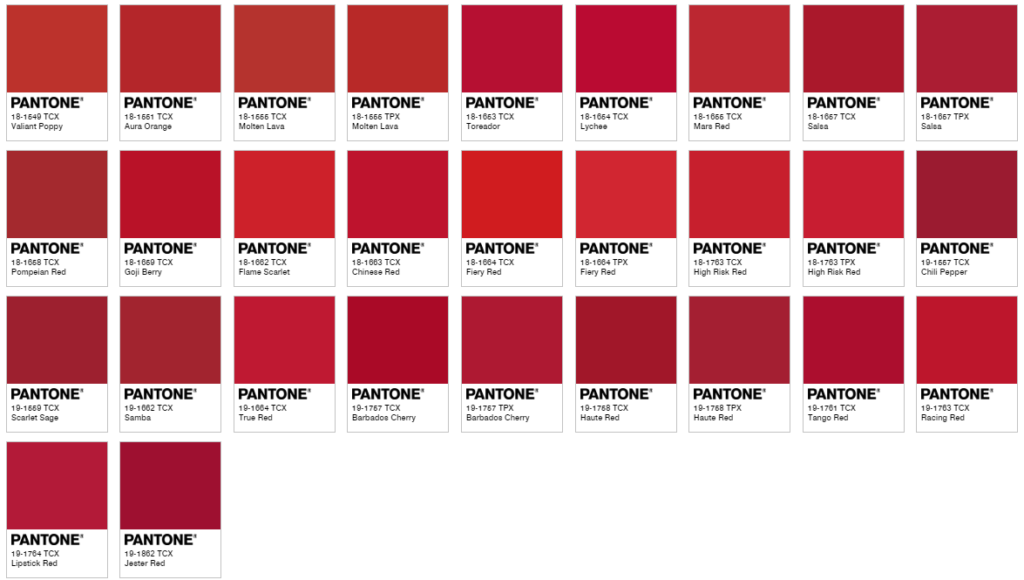
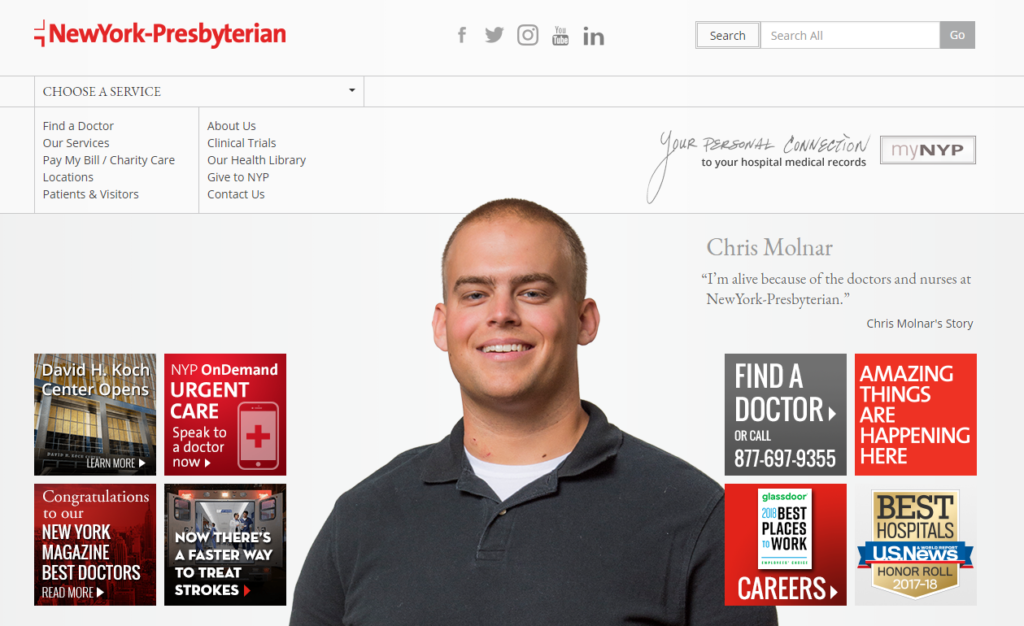
New York-Presbyterian Hospital incorporates red and maroon shades into its design. To balance these hot colors, the designer uses a pale grey background.
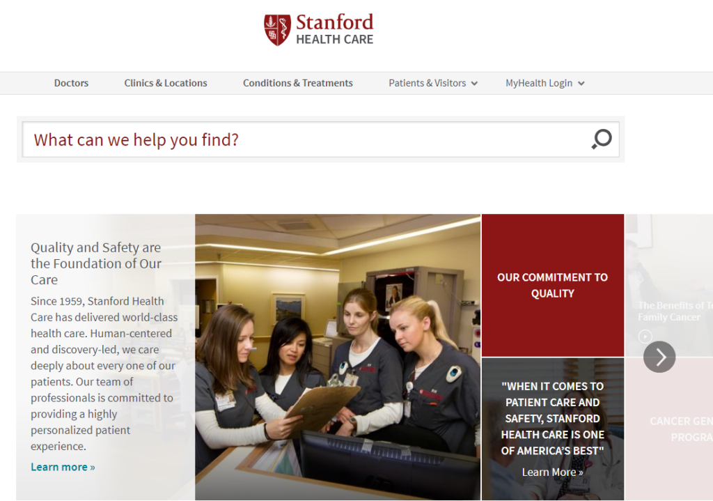
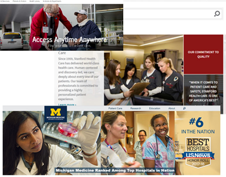
Similarly, Stanford Health Care uses the same colors – even the people in both banner images wear the same shade of dark grey.
Standout Healthcare Website Designs
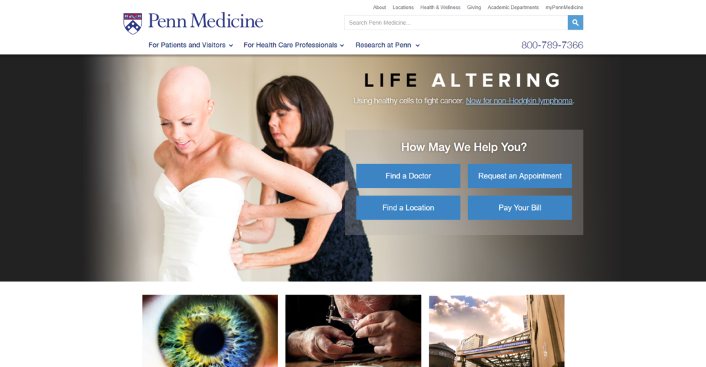
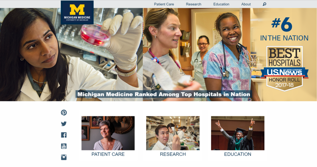
There are two designs that stand out from the others: University of Michigan (no bias!) and Penn Medicine. These two website designs are unique and pop with personality – the homepage images are brave and authentic.
Penn Medicine captures your attention and your heart with an image of one woman helping another into her wedding dress. The bride is beautiful, but the photo is much more than attractive – it’s also very moving. The bride has undergone chemotherapy and lost her hair. However, here she is, getting married. The text, “Life Altering” resonates with hope when paired with the image.
University of Michigan has two women of color in its homepage banner, something none of the other websites include. It’s clear that the women in the banner are real healthcare professionals within Michigan Medicine, and their authenticity shines.
Usability in Healthcare Website Design
There is a lot to like about healthcare website design, especially when it comes to usability – or how easy to use the websites are.
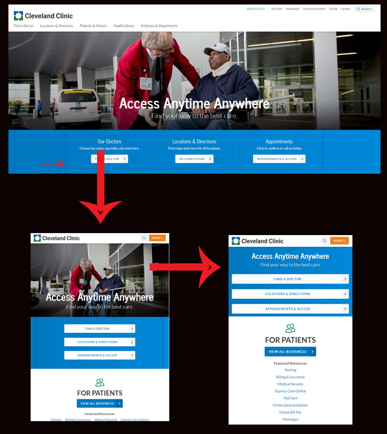
Below you’ll see Cleveland Clinic’s website is responsive (meaning that the website responds to the user’s screen size and changes accordingly). A visitor can view Cleveland Clinic’s website on her smartphone, her laptop, or her tablet – the website’s appearance is optimized to be easy to use in each scenario.
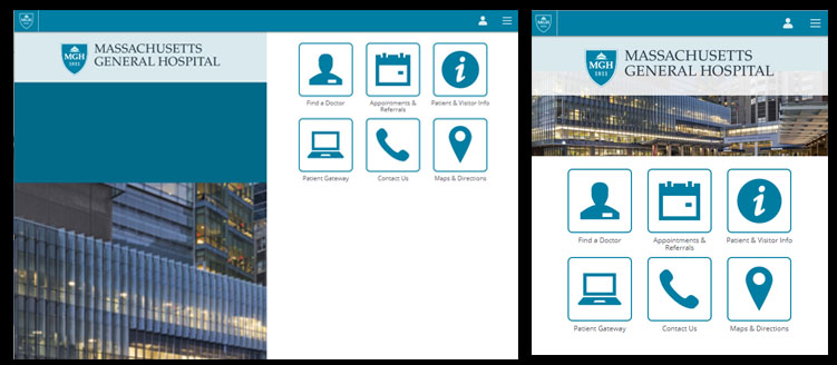
Usability is vital to web design, and many healthcare websites hit the mark on this. Massachusetts General Hospital even has a mobile-specific website to cater exclusively to small screen sizes. The image below shows the mobile-specific website at two screen sizes.
All the healthcare website designs reviewed are mobile-friendly, which is excellent for visitors and search engines. (Google considers mobile usability as part of its algorithm.)
Photography in Healthcare Website Design
Let’s look at photography used in healthcare website design.
In our review, we see that the photography used on the homepage banners of top healthcare websites can be divided into three categories by topic: (1) patients, (2) team members, and (3) hospital buildings.
Images of Patients
Five (half) of the top ten healthcare facilities use photos of patients on their homepage banner.
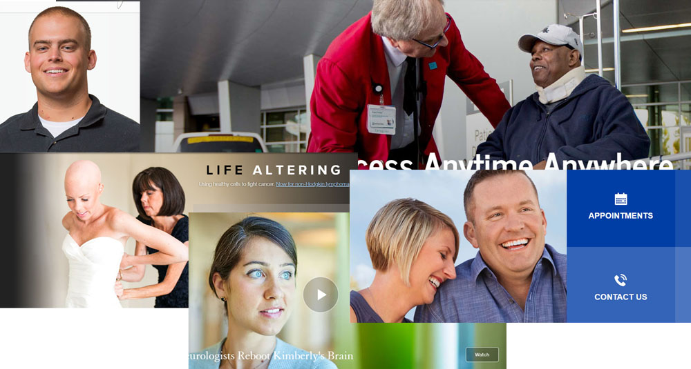
The four website designs that show only patients include Mayo Clinic, USFC, Penn Medicine, and New York-Presbyterian. Cleveland Clinic uses a photo of a patient and a team member.
Mayo Clinic and New York-Presbyterian use isolated faces – (if an image is isolated, that means it’s separated from the background) – in their website banners. These banner designs also use text and visual elements to guide users to information on the website.
USFC has a video banner of one patient’s story on its website banner, Cleveland Clinic shows a patient being admitted to the hospital, and Penn Medicine uses a photo of a patient on her wedding day.
Authentic photography, like these images of patients, speaks to and connects with your target audience. Showing patients in real situations engages visitors and makes a visual impact.
Images of Healthcare Team
Several website designs use an image of their healthcare team on the homepage banner.
These designs include Cleveland Clinic, University of Michigan, and Stanford Medicine. In the designs below, we see healthcare team members working and interacting with others.
Images of the Hospital
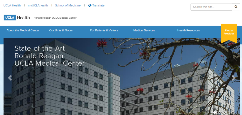
The third topic of the homepage banner frequently in healthcare website design is the hospital building. Mass General Hospital and UCLA Medical Center use photos of their buildings front and center.


Additionally, both banners above use terms that indicate “cutting-edge” healthcare (“revolutionizing” and “state-of-the-art”), yet neither website design reflects this trait.
Inspiration for Healthcare Website Designs
Healthcare websites can embrace creative, uncommon design and still remain trustworthy and respectable. The following websites are great examples of modern, beautiful designs that maintain professionalism. Though most of the following examples are not in the medical industry, they are great representations of trustworthy, aesthetic website designs.
Different is Good
The design for Florida Hospital is more artistic than the average healthcare website, yet still manages a professional appearance. It uses blue and white and employs a white sans serif font, like most healthcare website designs. The difference is in the use of a blue partially opaque overlay and isolated image, beneath which is the remainder of the image.
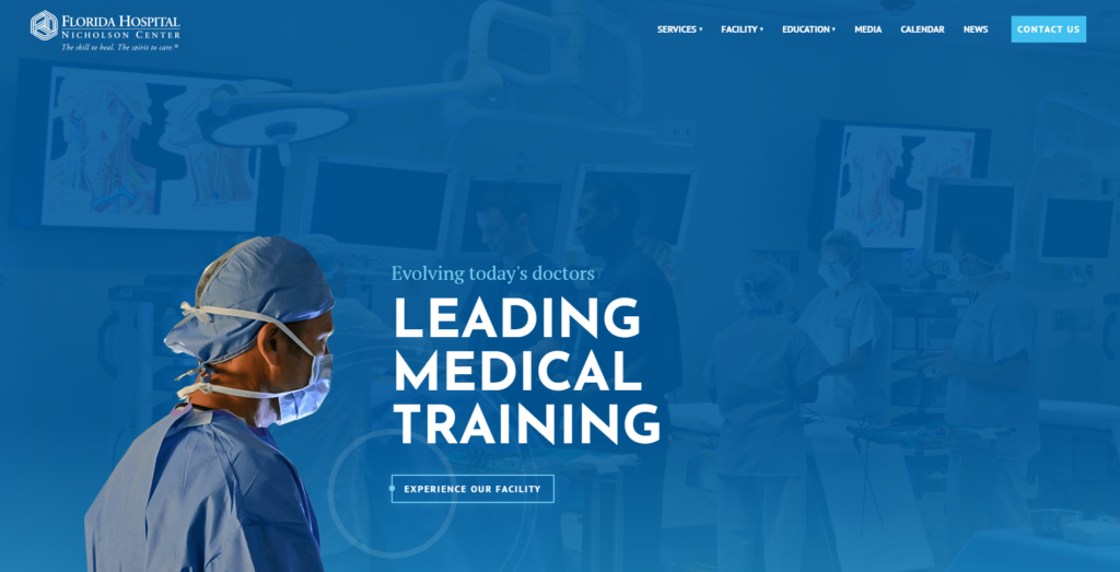
This technique serves to isolate the image, but keep the context by showing the rest of the image behind a semi-transparent layer of blue. The contrast between the background and the text is high which brings our eyes right to the main headline, “Leading Medical Training.”
Go Dark & Dramatic
The colors blue and white look striking when paired with a black background.
The website design below is highly professional, a vital element of healthcare website design, but also brings massive appeal with action-oriented images.
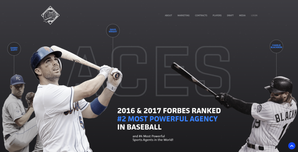
Notice the word “powerful” in the headline – it’s blue and, when paired with a black background, it draws your eye immediately. Next, you look at the other elements in blue: the players’ names and the arrow in the lower corner. Those elements represent navigation, and using bright blue to guide the visitor’s eye to them is smart design. (This is one way that professional website design agencies use graphic design to support the goals of the website.)
Add Warmth & Connection
Warm tones can make your website feel inviting. The Hunger Project uses dusty blue as the central color, then adds warmth and personality with lime and magenta accents.
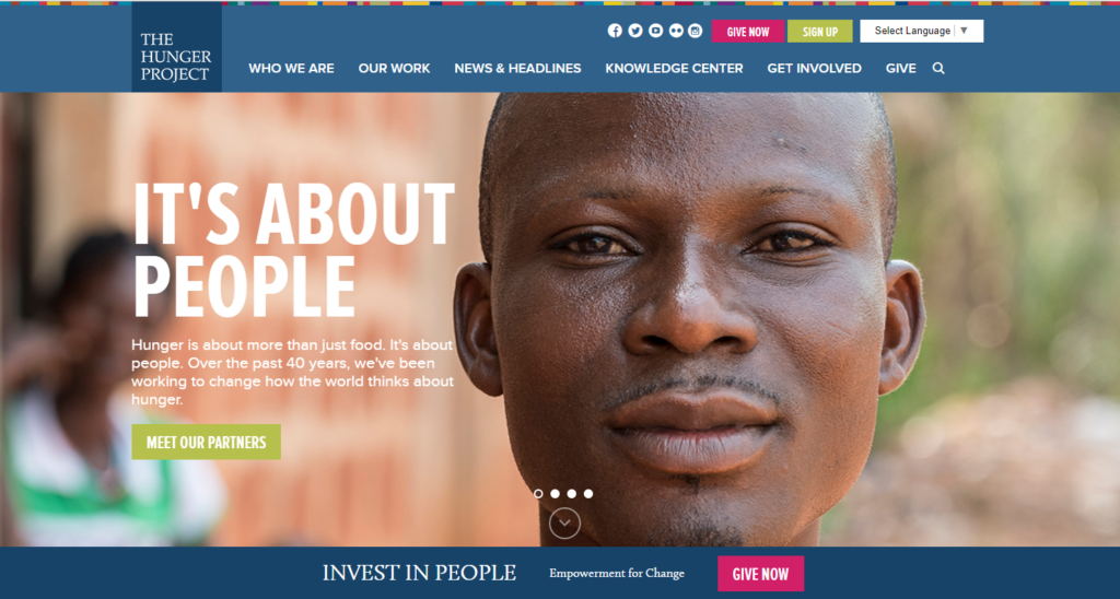
In contrast to the cool, dark website design for sports agency ACES in our previous example, The Hunger Project is soft and warm.
Like many healthcare website designs, this design also uses a lot of blue. However, the blue shade used here is earthy instead of clinical. This is accomplished by using colors accents in peach, caramel, and golden-hued green.
In many healthcare website designs, the use of white as a central color contributes to the sterile, cold feel. To create a warmer, more inviting mood, use white as an accent color instead.
Showcase Your Philosophy
The New School uses a minimalist website design that focuses attention on a series of thought-provoking quotes.
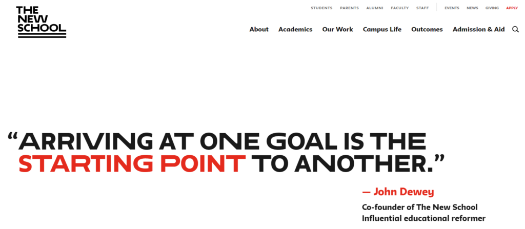
Medical websites could take this idea and use quotes from patients or its mission statement on its homepage banner.
This website uses a lot of white in its design, but the overall look and feel is not clinical, cold, or sterile. How? By using a distinctive font that manages to be both quirky and sharp at the same time.
Boost Appeal with Graphics
The next website example targets the medical industry and uses a similar color scheme to many healthcare web designs: deep red, white, and grey.
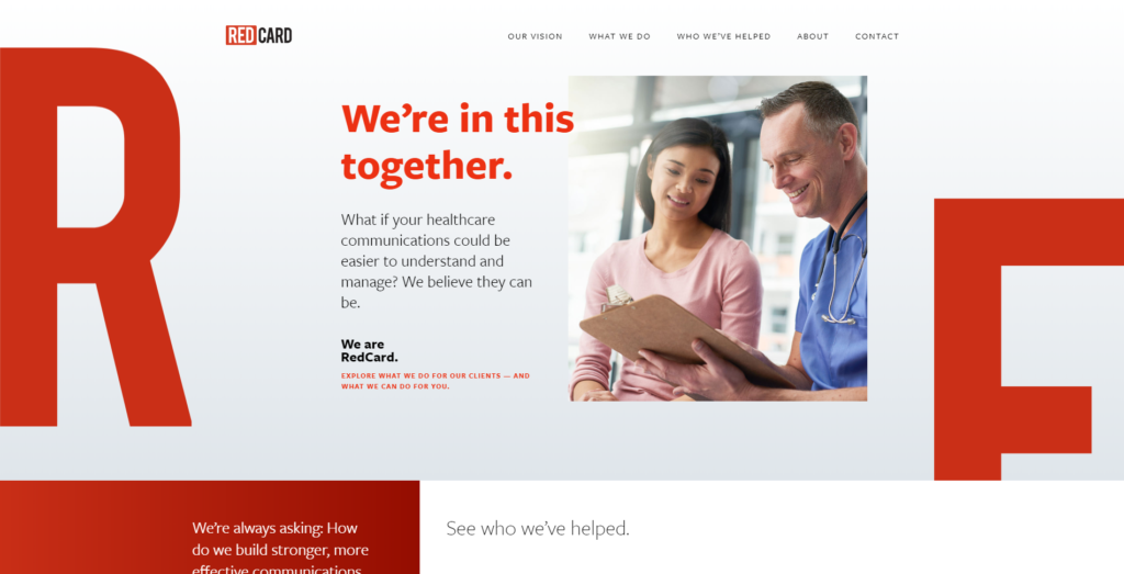
The difference in the website design above and many hospital web designs is the use of graphic elements. The enormous letters “R” and “E” are decidedly artistic and notice the grey gradient in the banner; these elements add creativity, moving this website design further away from the impersonal look and feel of many healthcare websites.
Captivate with Photography
Wyss Institute has a beautiful, impressive website design.
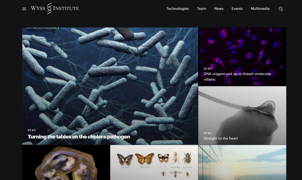
The distinguished look and feel is created with dark colors and clever photography. This website design uses shades of blue and white accents, but when viewing this design, “clinical” is the furthest thing from anyone’s mind.
Deep, dark colors create an intimate, profound look and feel on this website.
The Future of Healthcare Website Design
Healthcare website design could certainly be more alluring with the use of the elements above. As you can see, the websites in the given examples are highly professional and credible – even with the addition of artistic elements, strong colors, and imaginative photography.
Say Hello!
Give Artonic a call or e-mail us if you’re interested in website design, development, or marketing.
Michigan, USA