Safesend
A Smart Investment for This Accounting Software’s Future
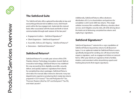
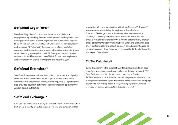
The Problem
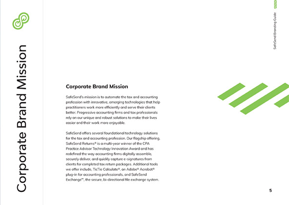
SafeSend was facing a major challenge in terms of branding. As a niche company that seeks to automate tax and accounting tasks, they needed to find a way to differentiate themselves in a crowded market. Their icon-heavy website also needed a refresh to look modern, crisp and consistent.
To tackle these challenges, SafeSend sought the help of the marketing company Artonic. Artonic worked with SafeSend to identify the key issues that were holding back SafeSend's branding efforts and creating a disjointed visual identity that didn't align with their messaging. With these insights in mind, Artonic set about creating a branding strategy that would help SafeSend achieve their goals.
The Process
The first step in Artonic's process was to conduct a thorough analysis of SafeSend's existing branding efforts. This involved researching the competition, reviewing SafeSend's messaging, and examining their visual identity. Artonic compiled a plan of improvements that could be made, including a clearer value proposition and a more cohesive visual identity.
Once these areas for improvement had been identified, Artonic hopped to work, developing a whole new brand for SafeSend. This involved rejuvenating the company’s logo, refining the look of the company's website, and making sure it all came together in a consistent package that would better align with their messaging and resonate with their target audience.
The Solution
Through their work with Artonic, SafeSend was able to achieve a more cohesive and effective branding strategy. The new brand logo helped to refresh the company’s aesthetic. The newer, refined icons for the website helped to establish themselves to their audience make understanding their value proposition easier.
The new visual identity was designed to be more modern and professional, with a modernized feel that highlighted SafeSend's position as a state-of-the-art solution in the accounting industry. Additionally, Artonic created a comprehensive brand style guide that provided clear guidelines for how the new visual identity should be used across all marketing and branding efforts.

Branding Overview
The rebranding project for SafeSend involved several elements to not only revamp their current brand, but to help them stay on target for the future. This included a comprehensive style guide that encompasses the company's new image, tone, and messaging. The guide serves as a reference for all branding elements, ensuring a cohesive and consistent brand image.
In addition to creating a style guide, Artonic also updated SafeSend's website to reflect the new branding elements. The new website design features a clean and modern layout that highlights the company's core values and services. Additional branding elements such as shareable graphics that quickly promote SafeSend’s unique offerings were added as part of the overall process. Through these efforts, SafeSend was able to establish a strong brand identity and enhance its market presence.


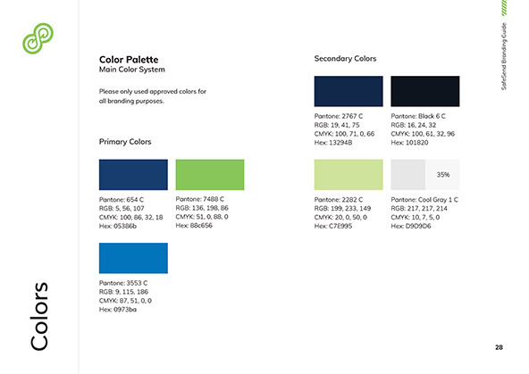
Style Guide
Artonic is no stranger to style guides! As branding experts, our team knows the importance of having an easy-to-reference guidebook for current and new employees to follow. The brand guidelines contained within cover everything from explaining the products, clearly defining typography, and establishing the exact color options available for all promotional purposes.
By having a style guidebook on hand, SafeSend can efficiently create new marketing materials for years to come, taking full advantage of being instantly recognizable through consistency.
Website Design You Can Count On
The existing SafeSend website was in dire need of a refresh. With the new era of web design, old ideas don’t just look bad, they can actively turn away new customers by reducing trust and being confusing. Artonic’s plan for the updated website is built from the ground up on best practices that looks beautiful and creates a frictionless user experience.

Wireframe

Final Design

Additional Branding Elements
The concept of “easy to understand” may seem antithetical to taxes and accounting, but through clever design and concise language, Artonic was able to work with SafeSend to create additional branding elements usable across the web to promote their services. The resulting items were fully consistent with the new SafeSend look and made it even easier for them to succinctly share their unique value to potential customers.

See More Case Studies
Artonic works with all types of industries! Check out some similar website projects we’ve completed to learn more about our work and our process.