Techferno
A Brand That’s More Than a Flash in the Pan
The Problem
Getting a foot in the door for a new SaaS product is a serious challenge. Techferno, a state-of-the-art password manager had extra work to do because the security industry is notoriously skeptical. Crafting everything from the right app to the right brand meant making something new feel trustworthy, while establishing its unique benefits to IT teams, accountants, and other professionals in need of a team-based password manager solution.
The Process
Strategizing for Techferno started with deep research into the existing password manager market. What makes a password manager unique? How descriptive were their names and logos? How recognizable and memorable were their brands under scrutiny? All these considerations and more kickstarted our path towards building the right look and feel for this new password manager. Our goal: quickly introduce the tool to potential customers and create a lasting impact for them to make the switch.
The Solution
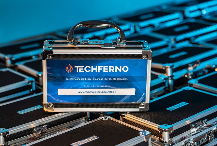
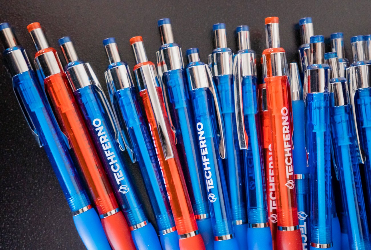
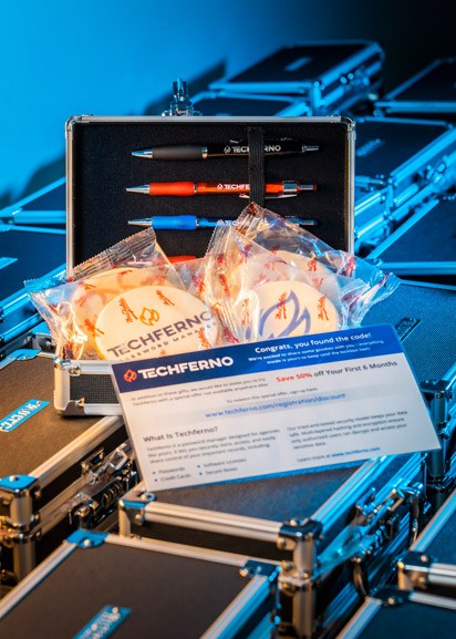
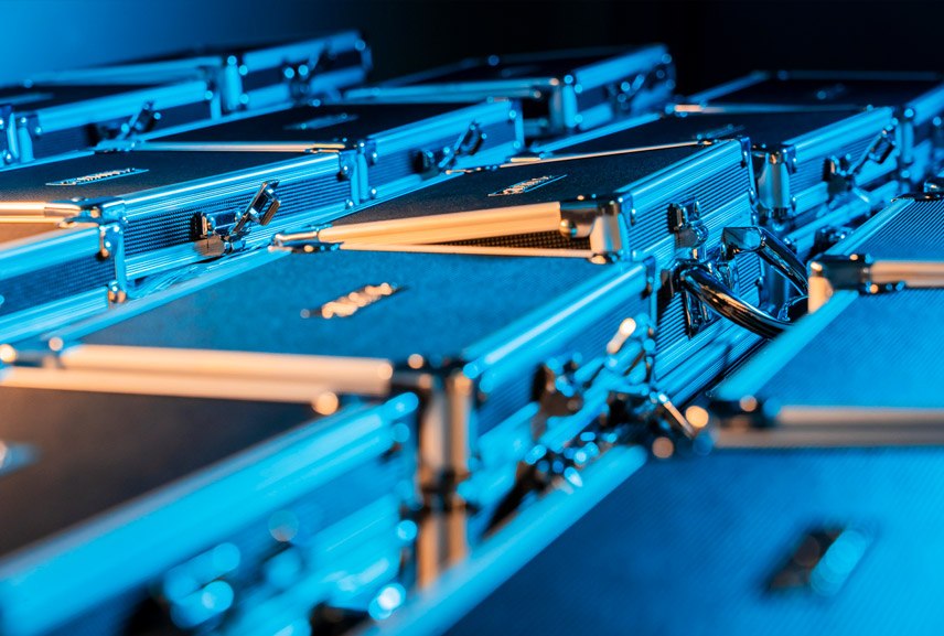
Artonic’s design team used their expertise to craft a complete style for Techferno that instantly conveys the most important parts of this new software: it’s sleek, modern, but still user-friendly enough for anyone to use. The logo was finalized with a contemporary design: stylized name and a clean, minimalist fire visual to fit the brand. A variety of marketing and branding materials soon followed, from business cards to unique lockboxes ready to introduce the brand to its target audience.

Branding Overview
Locking down the brand for Techferno wasn’t easy. In a market full of established companies, you need to be unique. But it’s also an industry built around security and trust, so it needs to be familiar. Our designer set out to find the perfect middle ground. The result? A brand utilizing a popular SaaS color scheme, a name that’s new but easy to pronounce, and a logo that’s instantly identifiable but with a sleek, techy touch.
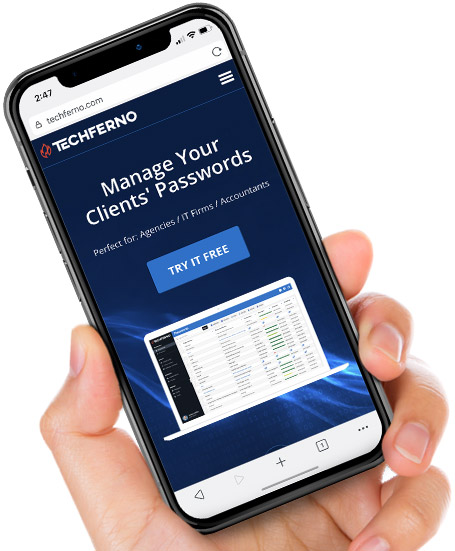
Locking Down the Perfect App
Password managers need to be accessible. With the average user having dozens of passwords or more, and businesses being able to have hundreds (or thousands!) we knew the app needed to be as friendly as possible.
Leaning on the ever-useful style guide built for Techferno, the app was designed to match every bit of the brand identity down to the pixel. Flipping through the app felt just like using the website; making the experience seamless for those used to working exclusively from their desktop. Artonic is no stranger to mobile design, so it was easy to translate this deep software into a portable app!
A Trailblazing Website
As a new software launch, Techferno had no online presence. That meant a website built from scratch – a specialty of Artonic’s experienced design and development team. We looked at everything it needed to ensure the official launch came out punching.
The website incorporated the branding elements highlighted in the style guide built by Artonic. The site focused on the company’s dedication to accessibility and security. From layout to features and even customization options, the overall design was built to be intuitive and consistent. This means a quality user experience whether you’re a tech-savvy power user or logging on for the first time.
The technology that supports the platform was backed by dedicated developers who optimized the platform to make it fast without sacrificing a bit of security.

One Fired-Up Logo
Crafting the right logo for Techferno wasn’t easy. Discussions ranged from the overt, like locks and keys, to conceptual ones. Focusing on memorability and the unique position in the market, the team chose a logo matched to the brand name instead of one that simply joined the ocean of locks in the password industry.
Drafting through dozens of potential looks for fire, our designer landed on a beautiful concept that took the traditional and immediately recognizable look of an open flame and matched it with that feel of tech through a modern lens. The result was a gorgeous logo that’s unmistakable and perfectly paired to the brand.


Business Cards
Above all, a password manager needs to inspire confidence. That means no cutting corners when you’re introducing your brand! To make first impressions strong, Artonic recommended business cards that were weighty, eye-catching, and a little more unique than your typical card.
In addition to the standard features of a business card, the Techferno card stock was thick with an embossed logo that added depth to the touch and feel. Thanks to the lovely color scheme of the Techferno brand, the cards stand out to stay top of mind.

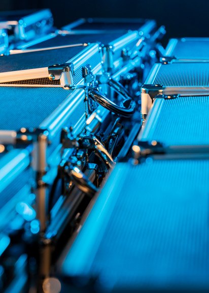
Photos & Video
Photography for software? You better believe it! To rise and separate the company from fly-by-night services, Techferno needed to show that the software had real investment behind it. Photography showing off the depth of the brand’s physical presence helped establish it as a real contender, along with adding a unique touch to the website that wasn’t purely conceptual.
No modern product is complete without video support, either! Techferno wanted a high-energy video to help get people excited about their product and to help quickly show off the incredible breadth of features it has to offer. Check it out below!
See More Case Studies
Artonic works with all types of industries! Check out some similar website projects we’ve completed to learn more about our work and our process.