It’s a Color Flashback
When it comes to color, it’s time for a FLASHBACK! In 2018 you’ll see your favorite color palettes from the ’60s, ’70s, ’80s, and ’90s pop up everywhere, including website design.
2018: Make Way for Color
“After so long investing in neutral colours… we’re seeing a resurgence in bright colours, illustrations and personality in all forms of design.
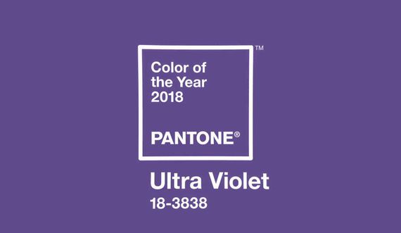
“Pantone proactively reinforced this idea by not just naming any purple, but by naming Ultra-Violet as the colour of the year for 2018. This bright hue takes on a larger stance, which will be reflected in all forms of website design and advertising in the months and years to come.” –Design expert and EIC of DesignRush, Stephanie Sharlow (Read the full article.)
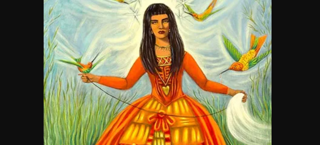
1960s Psychedelic Color Trends
The ’60s celebrated the colors of Pop Art, including:
- Hot Pink
- Orange
- Grass Green
- Lemony Yellow
- Cyan Blue
- Bright Violet
From Sweet ’50s to Moody ’60s
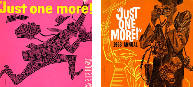
The color trends — bubble-gum pinks and lemony yellows — of the ’50s gave way to hotter, deeper tones and shades like rust and gold.
The following cover designs were both created for the same company. The first design, a peony pink with bright lemon yellow typography, was created in 1957.
Contrast the late ’50s design with this one, created for the same company in 1963, only 6 years later. It’s more realistic – no ‘dots here – and uses deeper, more serious tones like rust accented with gold, white, and black. (Check out more back issues of Just One More by Press Photographers Association of Greater Los Angeles.)
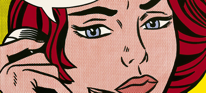
Design Trends 1960: Pop Art Explodes with Warhol, Lichtenstein
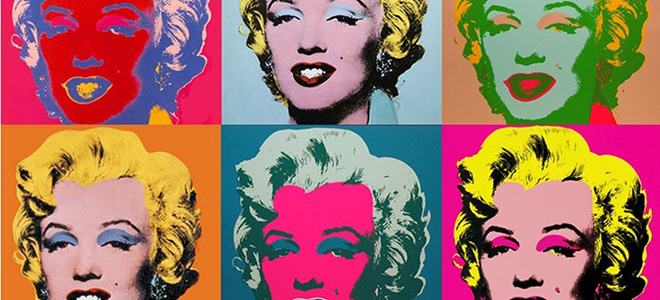
Famous pop artists of the time included Andy Warhol and Roy Lichtenstein. Pop art was one major art movement in the 1960s, and its impact on design can still be seen today.
Pop Art introduced the use of commonplace objects and celebrities in art. This was a big deal in 1960, because art up to that time had focused on themes of morality, history, mythology, and other ‘high-brow’ themes. Pop Art turned art on its head when Andy Warhol started painting soup cans and actresses in psychedelic colors like hot pink and cyan.
Here’s a great summary of color use in the ’60s from Speckyboy Design Magazine:
“The predominant colors used by Pop Art artists are yellow, red and blue. The colors used were vivid. In contrast to other art movements, pop art’s colors don’t reflect the artists’ inner sensation of the world. Instead, these colors refer to the popular culture. The culture that inspired American artist Andy Warhol to experiment with techniques such as silkscreen printing, which was a widely popular technique used for mass production.” (Read the full article.)
“The majority of Pop artists began their careers in commercial art: Andy Warhol was a highly successful magazine illustrator and graphic designer; Ed Ruscha was also a graphic designer, and James Rosenquist started his career as a billboard painter. Their background in the commercial art world trained them in the visual vocabulary of mass culture as well as the techniques to seamlessly merge the realms of high art and popular culture.” –The Art Story blog (check out the full article.)
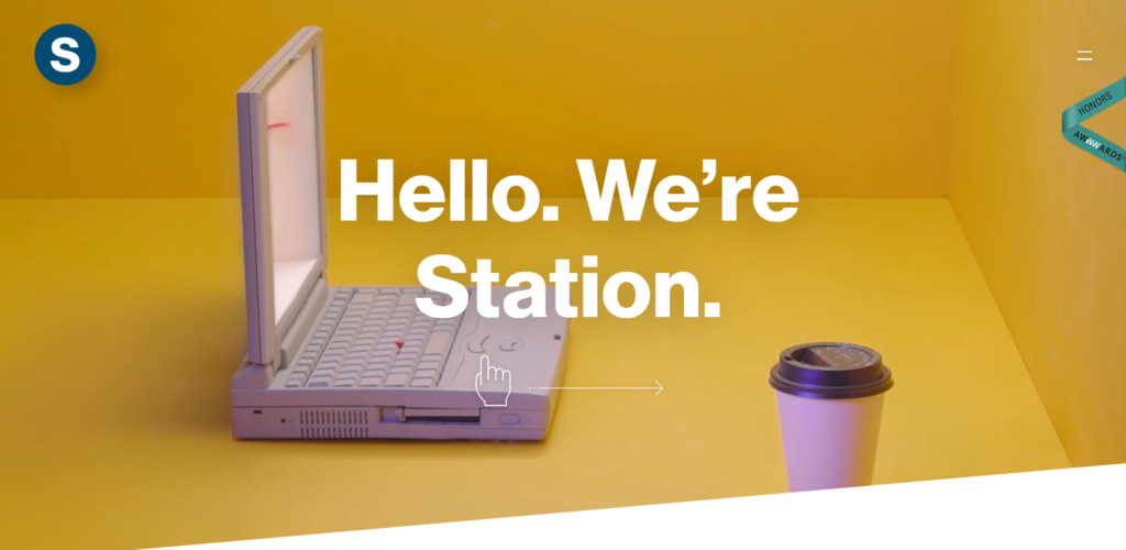
’60s Inspired Website Design Trends: Station
Regarding web design, we’re seeing the classic ’60s psychedelic color scheme making a reappearance.
Check out this website from Station, a design company in Switzerland. It uses a very distinct yellow shade for its homepage banner.
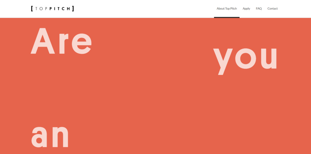
’60s Inspired Website Design Trends: Top Pitch
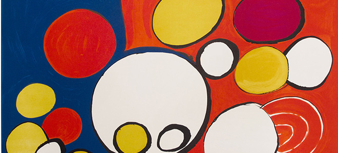
Top Pitch targets “the future leaders of fashion technology”, so its website better be the latest in design and tech. The homepage utilizes a fun paralax scrolling element to make the website come alive. The design is ’60s minimalist: white sans serif font against a deep orange (check out Calder’s work, above, to see the same shade).
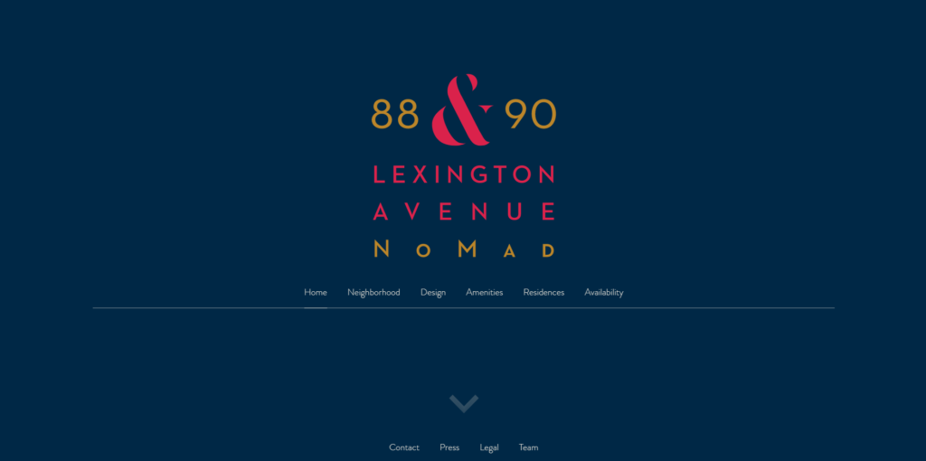
’60s Inspired Website Design Trends: 88and90lex.com
88 & 90 Lexington Avenue is a website from HFZ Capital Group, a real estate developer of luxury residential condominiums in Manhattan. The design uses ’60s minimalism, just like Top Pitch, and the colors blue (in this case, deep navy), red, and yellow.
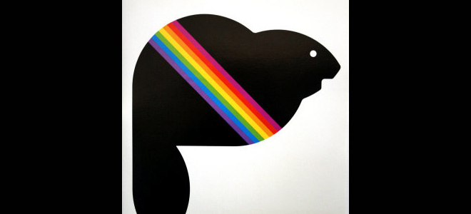
Explore Art TRENDS in the 1960s
How the 1960s’ Most Iconic Artists Made Art Contemporary from Artsy.net, a resource for art collecting and education.
Graphic artworks by Alexander Calder from Calder Foundation.
1970s Earth Toned Color Trends
In 1970, earth tones graced our culture, including:
- Gold
- Rust
- Sienna
- Avocado
- Coffee Bean
Bye, Bye, Psychedelic ’60s & Hello Earthy ’70s
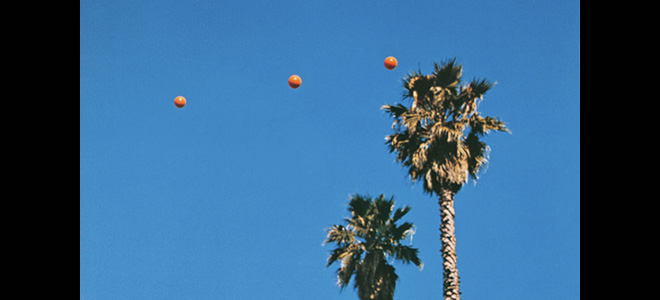
Color trends in art and design the 1970s moved from poppy colors to more sedated earth tones. In contrast to the vibrant colors of the ’60s, the ’70s turned to nature for inspiration, embracing browns, greens, and earthy reds and yellows. Check out this example of photography by John Baldessari from 1973.
This isn’t to say that colors used in art and design during this time were drab.
Design Trends 1970: Cornel Brudaşcu, Peter Saul, Gutai (Atsuko Tanaka)
Cornel Brudaşcu worked with energetic color choices, but balanced those colors with deeper, more somber shades. The colors used in Composition are reminiscent of those used by Warhol in his Marilyn works. Brudaşcu takes leave of Pop Art’s clean lines and diffuses his outlines and shapes to create a less distinct, more blurry image.
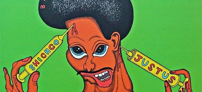
Peter Saul makes a statement about culture in the work SHICAGO JUSTUS. He uses avocado green next to a warm chestnut edged in black. We also see the classic red, yellow, and blue color theme in this work.
“I know it’s a bit of an awful thing to say, but I really just make things up. My main goal is to make a picture that people find interesting to look at and that has my name on it.”
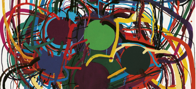
Atsuko Tanaka was part of the Gutai movement, and was known as a pioneering Japanese avant-garde artist. She uses dark earth tones (avocado, mustard, burnt umber) in her painting, Work. Like Alexander Calder, the Gutai movement used color, medium, and shapes to create beauty and movement.
The following excerpt is from an interesting article titled, The Gutai Group Movement, written by The Art Story:
“The word ‘gutai’ translates as ‘concreteness’, and it articulates one of the Gutai group’s most distinctive traits – their desire to physically engage with an extraordinary range of materials. The name also anticipated their investigations into the reciprocal connection between matter (paint, chemicals, tar, mud, water) and physical action (breaking, exploding, tearing, dripping). They wanted to create a new kind of art that explored the relationship between the human spirit and material, works that luxuriated in “the scream of matter.””
This type of artwork takes experience to another level. Experience, as modern web designers know, is key to good web design. Pioneering works such as those above pave the way for User Experience Design.
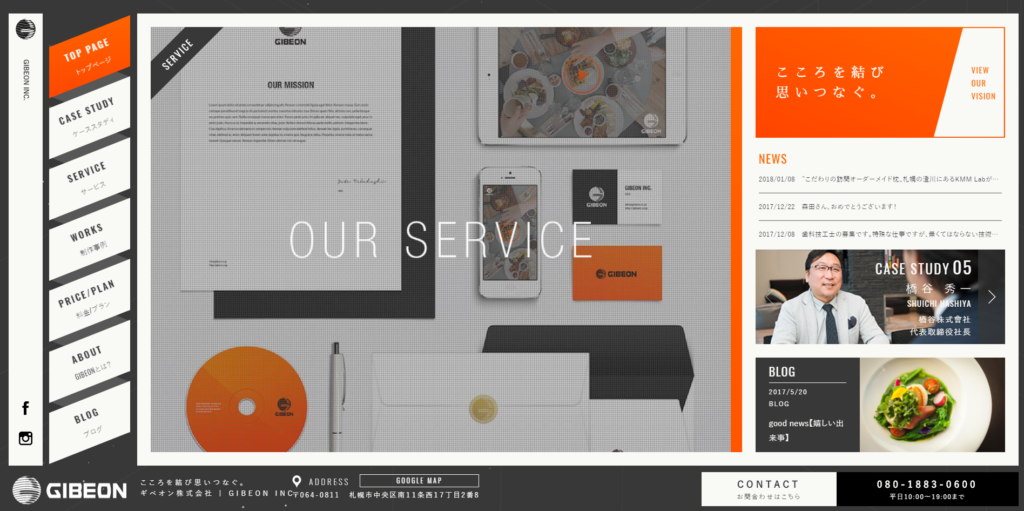
’70s Inspired Website Design Trends: Gibeon
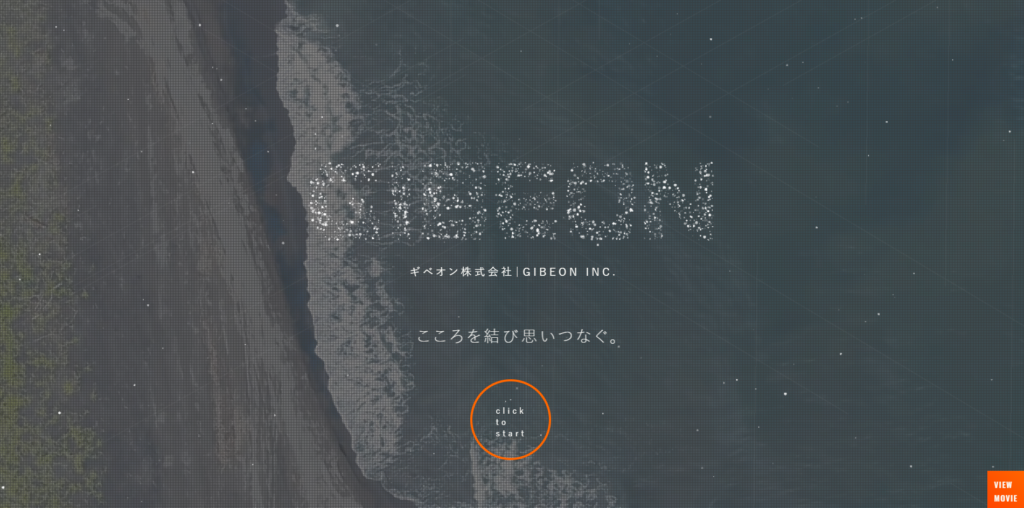
The video banner gives way to a super-seventies-inspired layout and color palette. Geometric shapes, a charcoal background, lots of white space, and minimalist photography really capture the essence of the ’70s.
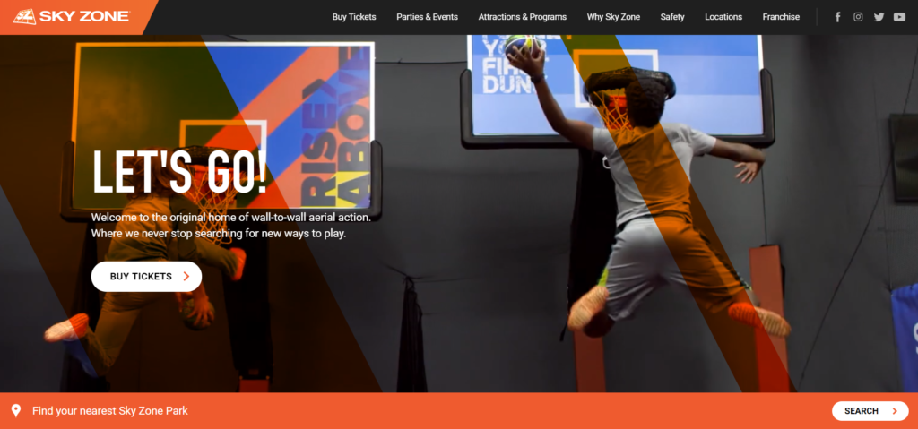
’70s Inspired Website Design Trends: Sky Zone
Another delightful example of ’70s design love is displayed in the hyper-fun Sky Zone website:
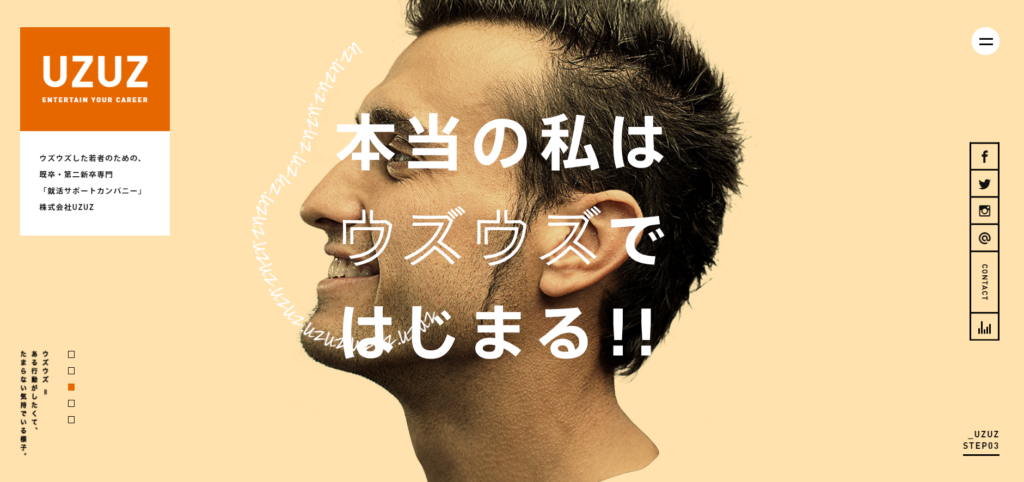
’70s Inspired Website Design Trends: UZUZ
Here’s another corporate website from Japan that uses earthy ’70s-inspired colors in its design:
Explore design trends in the 1970s
Artist interview: Cornel Brudaşcu – Tate Art Museum
The Most Iconic Artists of the 1970s – Artsy
1980s Color Trends
Get ready to PARTY!! Grab those leg warmers, turn up Madonna, and let’s rock out to the ’80s!
This enthusiastic color palette centers on purples and pinks, like:
- Orchid
- Mauve
- Ribbon Red
- Violet
- Lavender
Sedate ’70s Inspires Bright ’80s
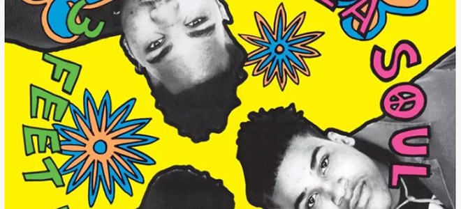
The ’80s ushered in bold, happy colors, like those found on De La Soul’s album, 3 Feet and Rising, released in 1989. These colors were a departure from the more demure earthy colors from the ’70s.
Design Trends 1980: Haring, Kooning, Basquiat
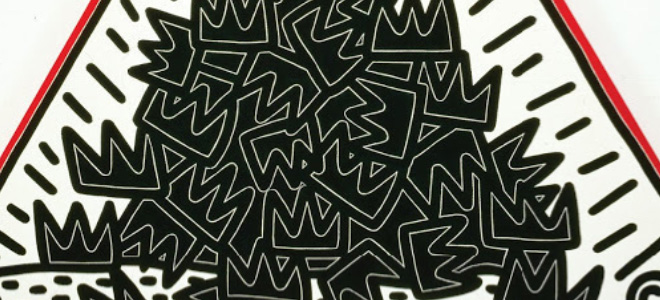
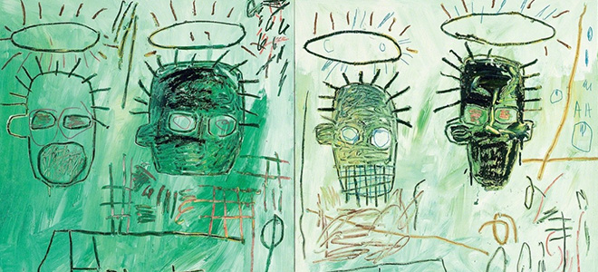
Keith Haring uses black and white and red in the iconic 1988 painting, A Pile of Crowns, for Jean-Michel Basquiat.
“Art should be something that liberates your soul, provokes the imagination and encourages people to go further.” ― Keith Haring
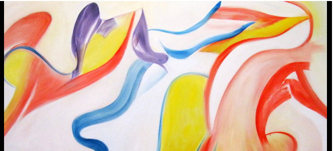
Willem De Kooning once said, “The past does not influence me; I influence it.” Kooning painted in the style known as abstract expressionism or “action painting”.
His work below uses shape, density, color, and perspective to create movement.
Basquiat created street art in the ’80s. He expressed themes of contradiction, history, black culture, and society. He uses a cool aqua color in this example of his artwork:
’80s Web Design Inspiration: Stroom
A glorious ode to ’80s greatness is the Stroom website. This Ukraine-based company’s website design uses lavender and gray, a classic ’80s color combo, to capture attention and stand out from competitors.
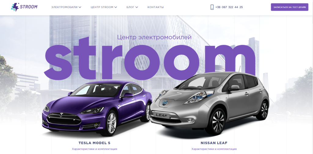
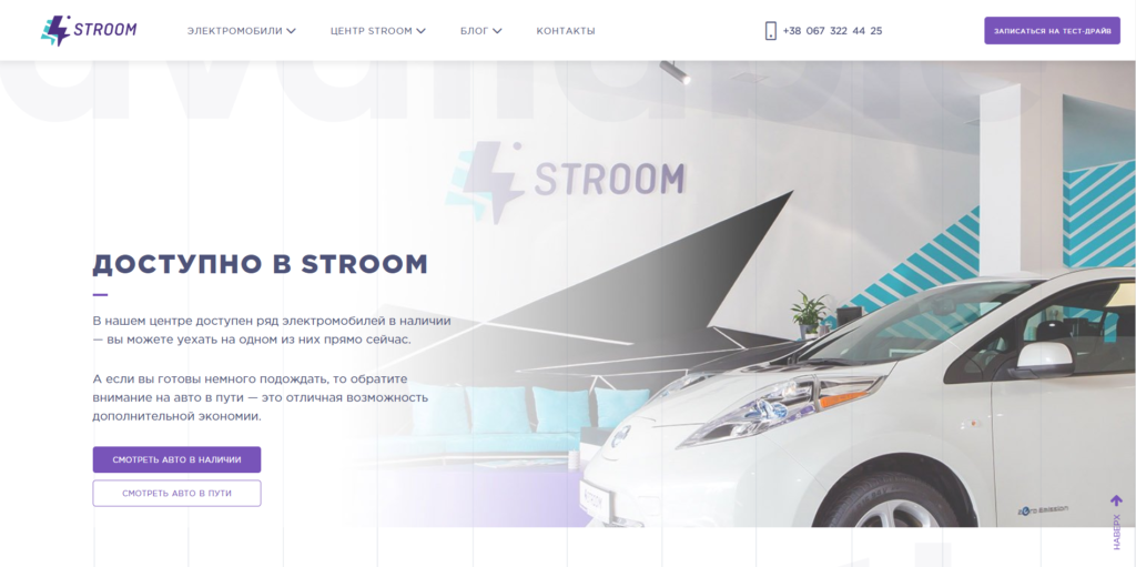
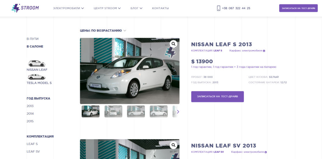 Even the product page, which professionally lists each electric car that’s for sale, is very ’80s. Yet the design remains modern with its intelligent use of whitespace. It’s clean, easy to read, and aesthetically interesting.
’80s Inspired Website Design Trends: Spallian
Another website design that pays tribute to the vibrancy of the ’80s is Spallian, a French tech company. This website uses ’80s neon brights with soft-edged graphics to create an entertaining yet professional design.


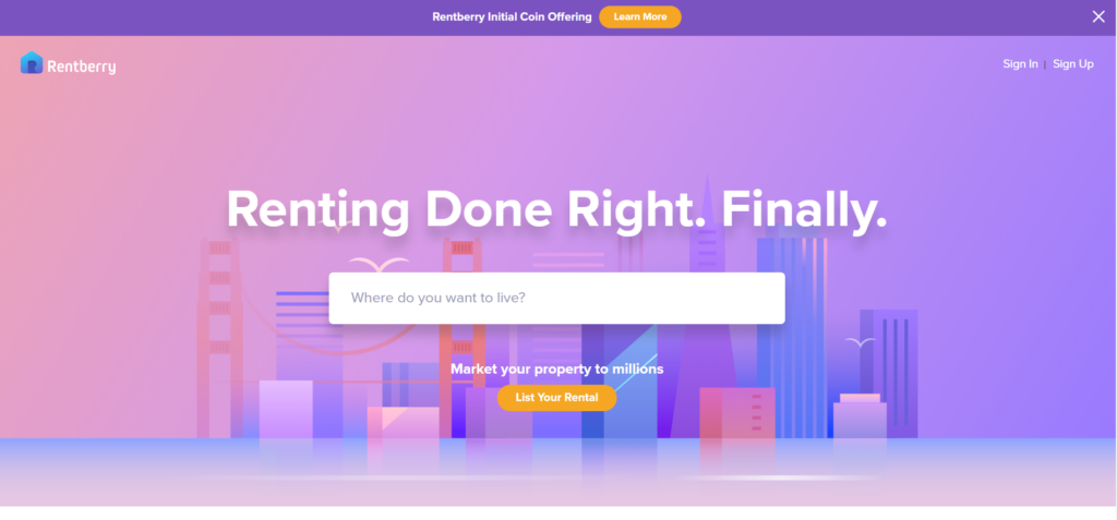
Inspired Website Design Trends: Rentberry
Rentberry’s design uses every purple shade in the color wheel on its website. The result? Soft, inviting, and definitely worth a look.
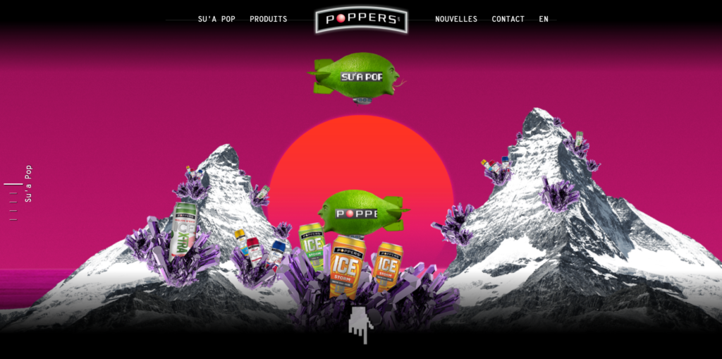
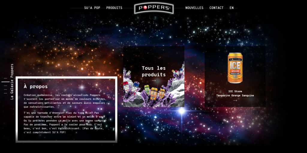
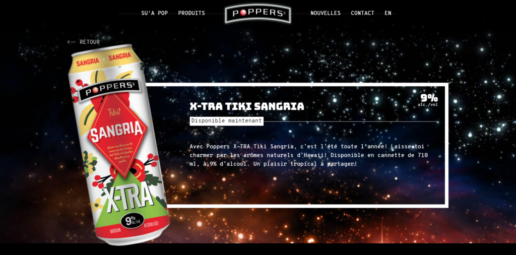
’80s Inspired Website Design Trends: Poppers Coolers
The following website design for Poppers Coolers uses a range of purples and reds, cooled a bit with bright green and lots of white, gray and black. Scroll down the homepage to find information floating among the stars – the galaxy background gives everything an other-worldly feel.
Explore Design trends in the 1980s
The Most Iconic Artists of the 1980s – from Artsy.net, a resource for art collecting and education.
1980s New York: 5 artists who defined a decade – Christie’s
In Hannelore Baron’s Art, a Voice of Defiant Hope and Survival – from Hyperallergic, a forum for playful, serious, and radical perspectives on art and culture in the world today.
Keith Haring – from The Keith Haring Foundation
1990s Color Trends
The ’90s: think “Saved by the Bell” when you visualize this decade’s color palette.
- Powder Blue
- Dandelion Yellow
- Honeysuckle Pink
- Dove Gray
- Moss Green
- Beige
![]()
From the Brilliant ’80s to the Sleek ’90s
“By the late Nineties, we had become a more visual nation. Big-money taste moved to global standards – new architecture, design and show-off contemporary art. The Sloane domestic aesthetic – symmetry, class symbolism and brown furniture – became as unfashionable as it had been hot in the early Eighties.” –Peter York
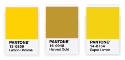
Yellow Color Trends Across the Ages
’90s design was inspired by ’60s design. In the 1990s, yellow evolved into a muddier version of ’60s yellow. (Pantone colors below, used in the very informative 50 Years in Color Infographic).
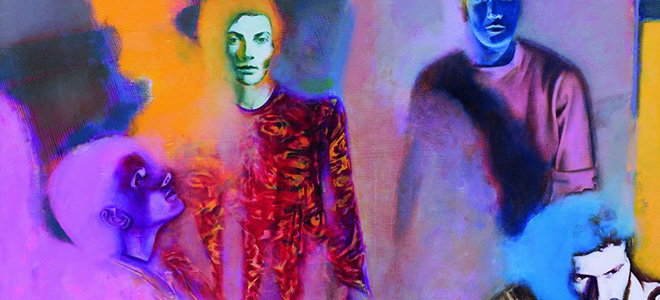
Design Trends 1990: Matthew Barney, Glenn Ligon, Patssi Valdez
The idea of art in the ’90s can be closely linked to the idea of art in the ’60s.
Artists in the ’90s blurred the line between art and life; art is life and life is art. The artist Matthew Barney created a video series on The Isle of Man dealing with identity and equality. “Cremaster 4 deals with the organism’s desire to return to a state of neutral gender as its male identity is formed.” (Read the article, Cremaster 4 Synopsis)
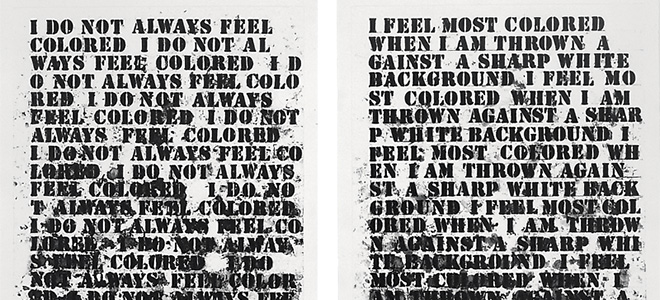
Glenn Ligon, an influential ’90s artist, expressed the “experience of oppression” in his text painting: Untitled (I Feel Most Colored When I Am Thrown Against a Sharp White Background). (Read the full article from Artsy.)
The ’90s saw an outpouring of many different styles of art.
“I love the Nineties because more than any other period of time, there was such an eclectic mix of styles going on. More so than in the Sixties and Seventies, when there was an overriding look and sound.” –Charli XCX
Compare Glenn Ligon to Pattsi Valdez. Pattsi Valdez uses vibrant colors to create movement and express feeling in her paintings.
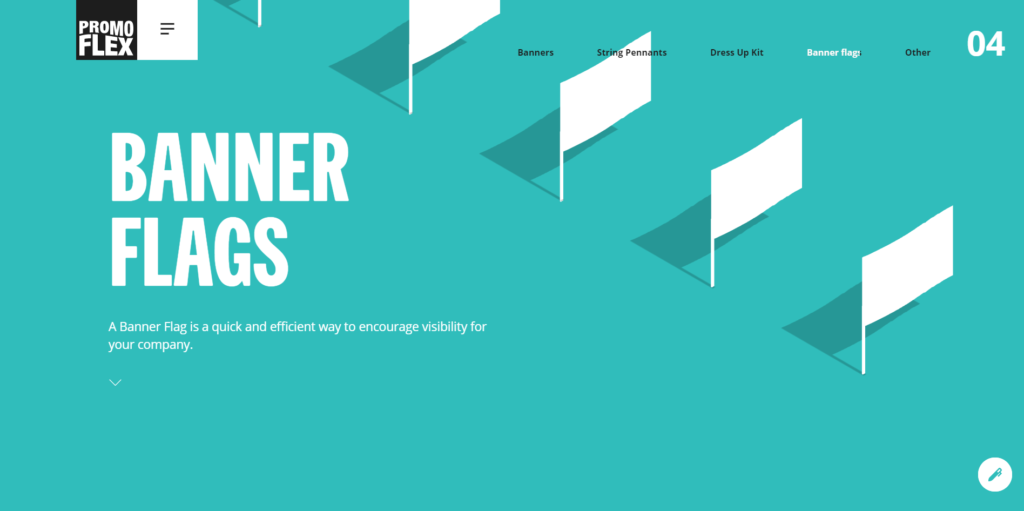
’90s Inspiration Website Design: PromoFlex
This website design’s scuba blue banner channels 1990s zen.
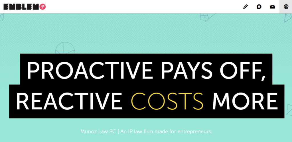
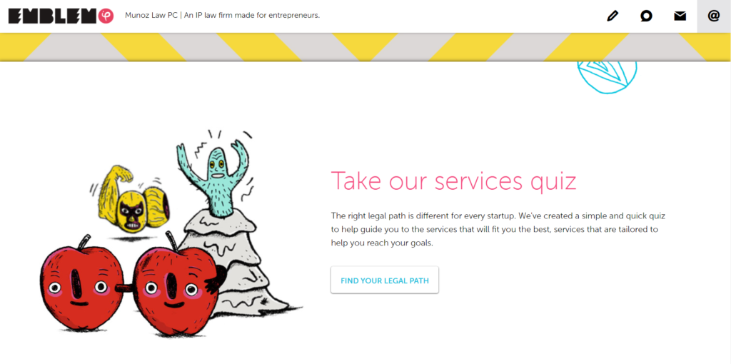
’90s Color Scheme: Emblem
Emblem uses pale green mint, bright lemon, and brick red to infuse playful ’90s colors into its website design. Lots of black and white adds substance to balance the overall feel of the website.

Explore Art in the 1990s
The Most Iconic Artists of the 1990s – Artsy
Patssi Valdez – Artist’s Website
2018 Website Design Color Trends
If you design a website in 2018, keep in mind that COLOR is what’s hot. We’ve seen a range of colors used in website design recently, color palettes from several past eras, from the ’60s to the ’90s.
It’s an exciting time to be a website designer. Color is an excellent tool to use in website design to create interest, movement, and engagement, not to mention beauty.
Say Hello!
Give Artonic a call or email us if you’re interested in website design, development, or marketing.
Michigan, USA