This year we’ll continue to see web design trend away from flat design and embrace the use of gradients. Gradients have been “hot” in all mediums of design for the last several years as part of a growing trend to add depth and 3d elements back into design. In 2018 we expect you’ll continue to see lots and lots and lots of color gradients in web design.
What is a Gradient?
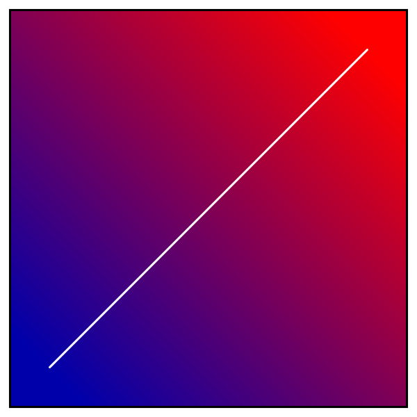
A gradual transition, change, or graded difference from one color/texture/shade/concentration to another.
The Encyclopedia of Pastel Techniques
“Gradation in art is a visual technique of gradually transitioning from one colour hue to another, or from one shade to another, or one texture to another. Space, distance, atmosphere, volume, and curved or rounded forms are some of the visual effects created with gradation.” The reference is to the book The Encyclopedia of Pastel Techniques by Judy Martin, published in 1992, and included in Wikipedia’s definition of the technique of gradation.
Using gradients in web design is not new; artists have worked with gradation for decades.
Gradients in 2018 Web Design
You’ll find several examples of the gradient trend in the website designs below.
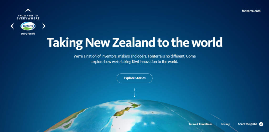
Fonterra’s gRadient Sky
Fonterra’s informational website, “From Here to Everywhere,” about New Zealand employs gradation in its design. This website design uses a blue gradient to create the impression of a sky. Deep navy slowly gives way to a lighter, brighter teal. As the gradient lightens, the user’s eye is drawn to the image of Earth located lower on the homepage. By using a gradient, this web designer is able to guide the user to important elements on the page.
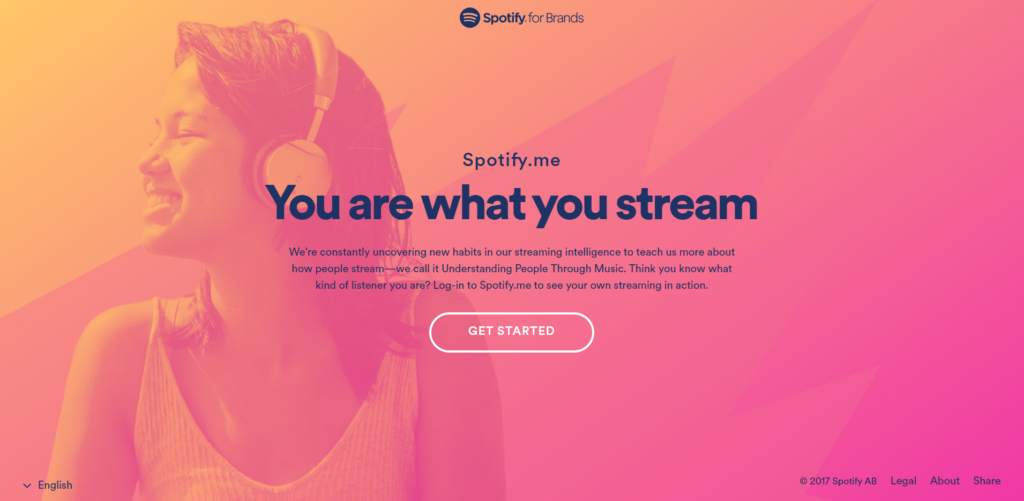
Can You SPOTify a Gradient
The design for Spotify.me uses a gradient that moves from melon orange to berry pink. The lighter color is like sunlight; the designer uses it to effectively highlight the girl’s face in the image on the homepage. The dark text commands attention, and the user’s eye is ultimately drawn to the “Get Started” button located beneath the text. The colors are modern and young, perfect for the target audience that will use the website.
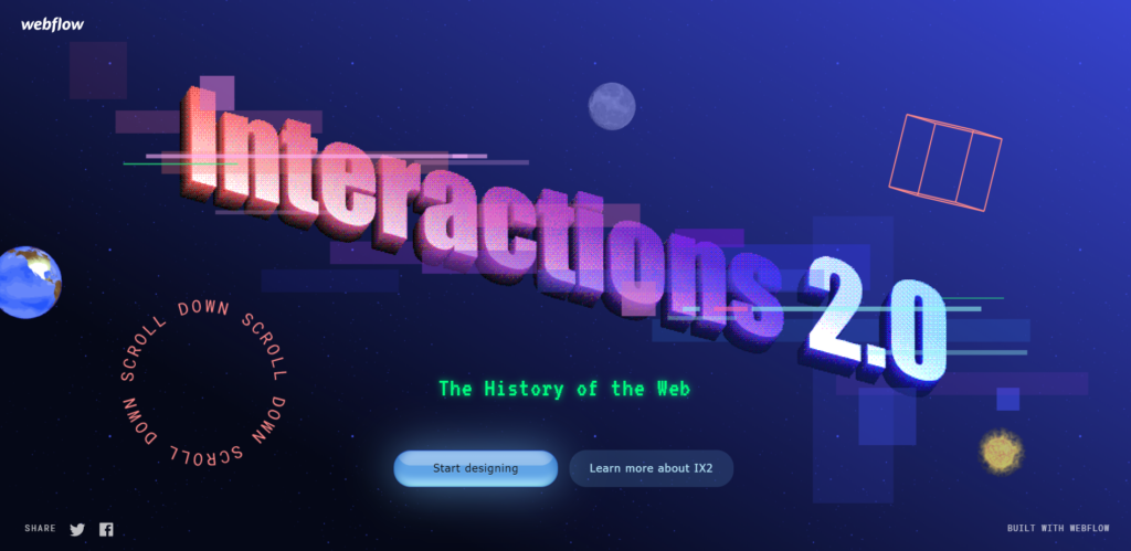
Interactions with Gradients
This web design for Interactions 2.0 also showcases the gradient trend on its homepage. The color transitions from salmon to violet to blue to bring the viewer’s eye across the page.
Gradients Used with Movement
In 2018 many websites incorporate movement into their designs. This video shows three examples of gradients used with movement in web design: Adult Swim, WM Motors, and Qards.
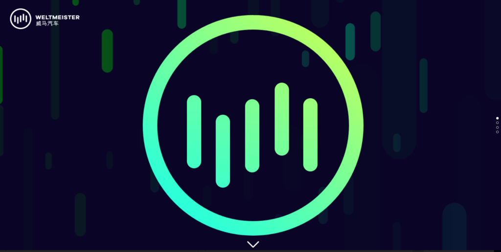
WM Motors Loves Gradients
The video example above is of the current WM Motors website (as of May 12, 2018). Below, you’ll see images of a previous design for WM Motors that also incorporates gradients and movement on its homepage.
In the previous WM Motors design, the designer used shades of green from neon chartreuse and aqua to create movement. If you navigate to the website (click on the image of WM’s website, below), you’ll see even more movement. The gradient brings depth and adds interest to the graphic used. In addition, the gradient supports the subtle movement of the graphic on the homepage.
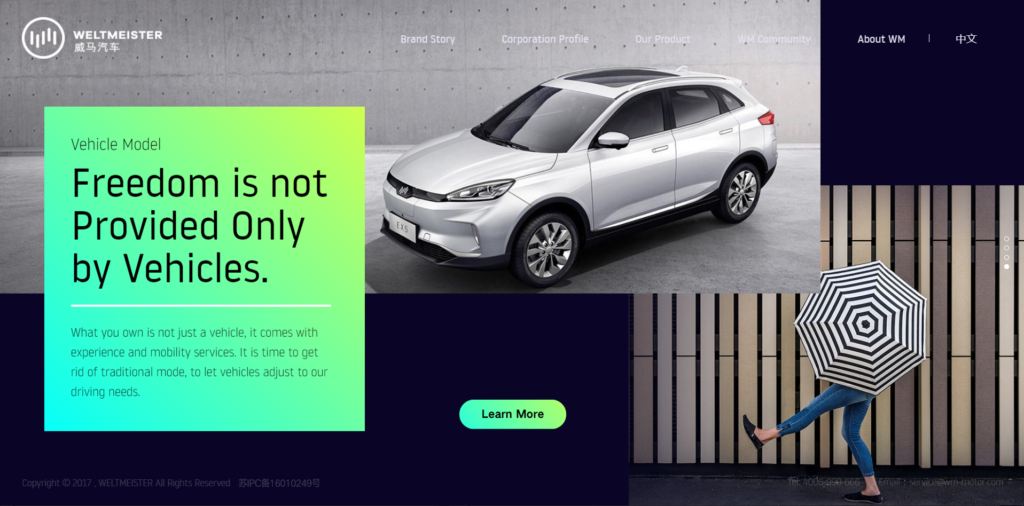
Scroll down the homepage to see more gradients used in the design. The designer uses a gradient behind a block of text to do multiple things, such as pull the user’s eye to important information and to create continuity from one section of the website to another.
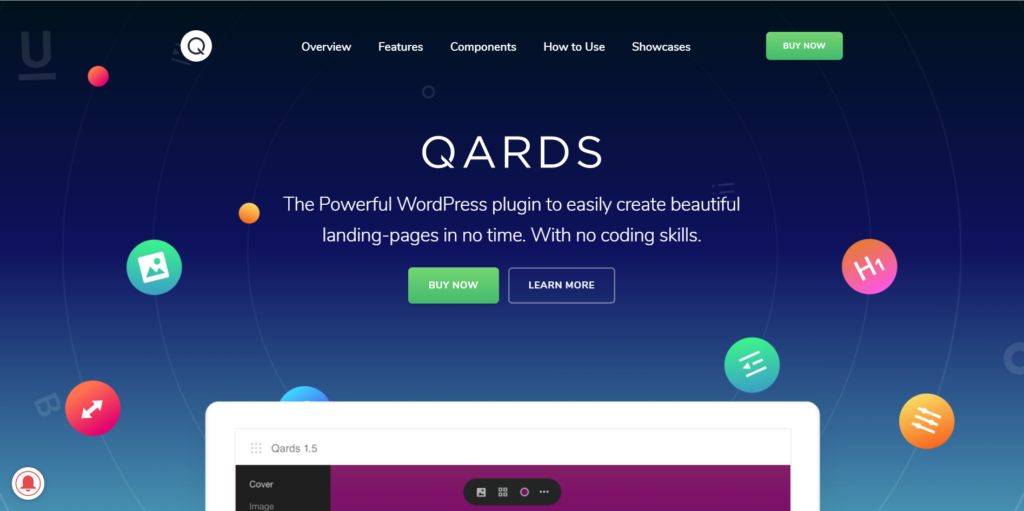
Qards’ Gradient Bubbles
The website to promote Qards by Designmodo uses a blue gradient in the background like the Fonterra website. The Qards design also uses moving bubbles on its homepage. Gradients used against a dark stationary background serve to catch the eye with light-infused color.
Gradients in Web Design & User Experience
An interesting discussion on the website graphicdesign.stackexchange.com titled, What effect do gradient fills have on the eye? contemplates the best way to use gradients in design.
One user says: “A gradient should never take away from a design or distract from the message of the design. In most instances they are being used to mimic a light source in either radial or linear format. Radial provides the best look for more of a spot and can be used to draw attention to a specific area of your application or design.
The best applications come when used in a subtle way to draw attention or provide depth and texture to a design. They are there to make objects or backgrounds seem more realistic as it pertains to light.”
Aside from Martin’s reference to its use in 1992, we see more and more articles pop up online during the 2000’s.
A Modern History of Gradients in Web Design
An earlier reference to the use of gradients in illustration and art is from tuts+ in an article by Sharon Milne titled, Using Multiple Styles of Gradients in Vector Illustration and Vector Art. This article was published in 2010, and notes that gradients “can be used to smooth out areas of an illustration or give that subtle change in color without the hard edges of a solid color shape.”
Butterfly, an Australian design agency, published, UI design – A history of web design trends on its blog. It details modern web design trends from the ’90s to present day. The author discusses gradient use in 2003 – 2010:
“There is no doubt that the flat design trend rebels against the web 2.0 style of design that became popular in the early 2000’s. Think lengthy drop shadows, shiny bubbles, oversized buttons and glares. As designers felt a growing need to educate web users on how to navigate web content, these design trends allowed web users to familiarize themselves with the internet. The oversized graphics trained us to ‘click here’ and ‘learn more’ all the while serving up a feast for our eyes as colour, gradients and graphics tantalised our senses.”
Gradients are referenced as part of the “Web 2.0” trend that was popular in the 2000s. Later, around 2012, the article notes that flat design has become a trend, noting that “Simplicity is key: decorative elements such as gradients, textures and reliefs are avoided.”
Gradation vs. Flat Design
Flat design has been popular in website design for the last several years. Onextrapixel published an article in 2014 titled, Flat Design: A History, Past, Present and Future.
“Flat design is exactly what its name suggests – design that is flat. A term defined by user interface (UI) designers, flat design removes stylistic 3D components like gradients, bevels, drop shadows and textures. Basically anything that would create visual depth so a graphic has the illusion of “popping out”.”
The gradient is a reaction to the flat design trend that has been with web design for the last several years. In the last several months, we’ve seen a lot more web designs utilizing gradients in creative, attractive ways.
The gradient is modern again!
Artonic Uses Gradients in Web Design
Gradients are fun to use – and we love using them at Artonic (a Michigan Web Design agency located on the border of Michigan and Ohio).
Here are a few examples of times Artonic used a gradient as a design element:

Say Hello!
Give Artonic a call or email us if you’re interested in website design, development, or marketing.
Michigan, USA