2-Dimensional design, also called flat design, has been on trend for years now, but lately, we see a growing trend in another direction: depth and 3D elements.
Flat Design
Flat design has been huge in web design for years. Flat design is 2-dimensional, minimalistic design that does not include depth or a third dimension. Flat design became popular years ago – here’s an excerpt from a 2013 article on the flat design trend:
“Flat design – the design community just can’t stop talking about it. And feelings are strong. Most designers either can’t get enough of this trend, or absolutely hate it. ” (Read the 2013 article, Flat Design Principles)
Flat design strips away the elements that create depth and dimension, like shadows, gradients, and embossing. Flat design is simple, minimal, with a focus on typography and color.
Lately, we’ve seen more and more depth and dimension sneaking their way back into design. This web design trend started gaining momentum in 2017 and is still growing.
Why? Because flat design isn’t always user friendly. In fact, depth and 3-dimensional elements can aid users in making decisions and understanding the hierarchy of information on a page.
Almost Flat Design: Introducing Depth
With the focus being on users, web design has veered away from a strictly flat design approach. More and more, web designs have integrated elements that re-introduce a sense of depth and dimension.
Using 3-dimensional elements with flat design is referred to as “almost flat design”. This means that many of the elements of flat design are still present, but the design also incorporates elements of depth and dimension.
Two popular ways to add depth and dimension to your web design are through isometric illustrations and shadows.
Isometric Illustration Adds Dimension
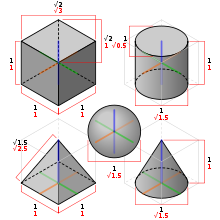
“Isometric projection is a method for visually representing three-dimensional objects in two dimensions…” (Read about Isometric Projection.) Isometric design utilizes geometric shapes with a projection point that suggests a 3-dimensional object. The image below is from Wikipedia.
PikMyKid Illustrates Excellence with Isometrics
The PikMyKid website design uses isometric illustrations on its homepage. The design is colorful and imaginative, perfect for a website in the education sector.
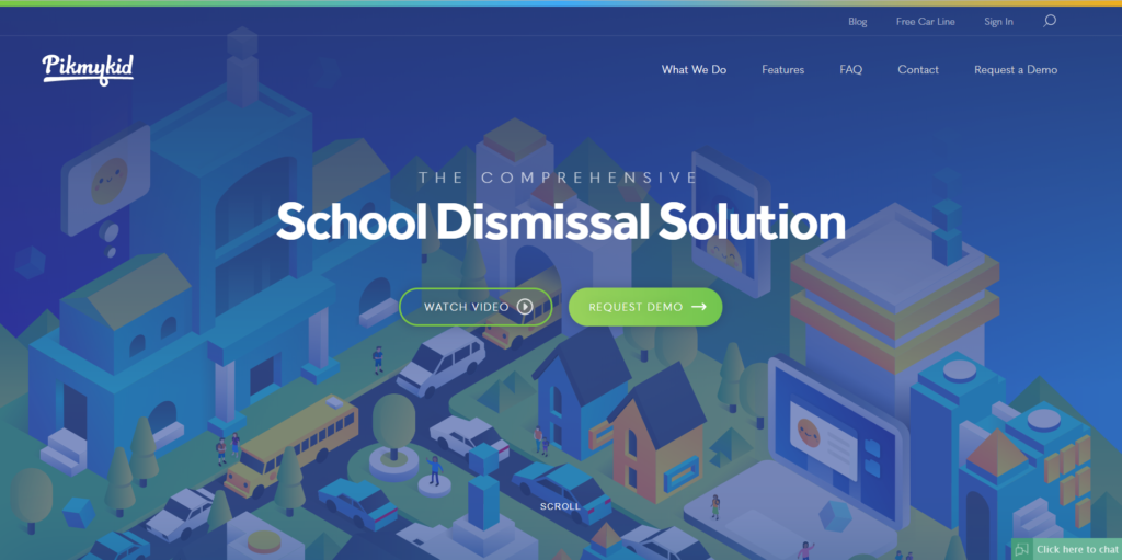
The design shows a detailed map of a school within the context of a city, complete with a school bus and people milling about. Shadows help add depth and dimension to the illustration, upping the interest factor.
London Design Studio is a Hotbed of Isometric Activity
Digital Agency London by Red Snapper, a design studio in the United Kingdom, uses lots of isometric illustrations in its web design.
A dark overlay contrasts nicely with the text on the homepage. Click the large X in the upper right corner to hide the text and view an isometric village (complete with the London Tower Bridge). To see the text again, use the navigation on the left side to select the information you’d like to read.
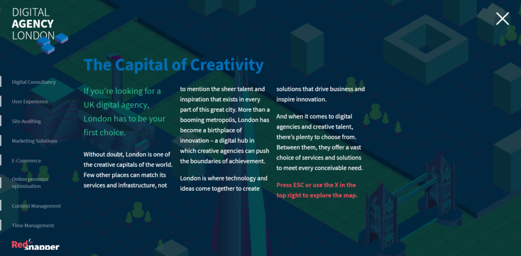
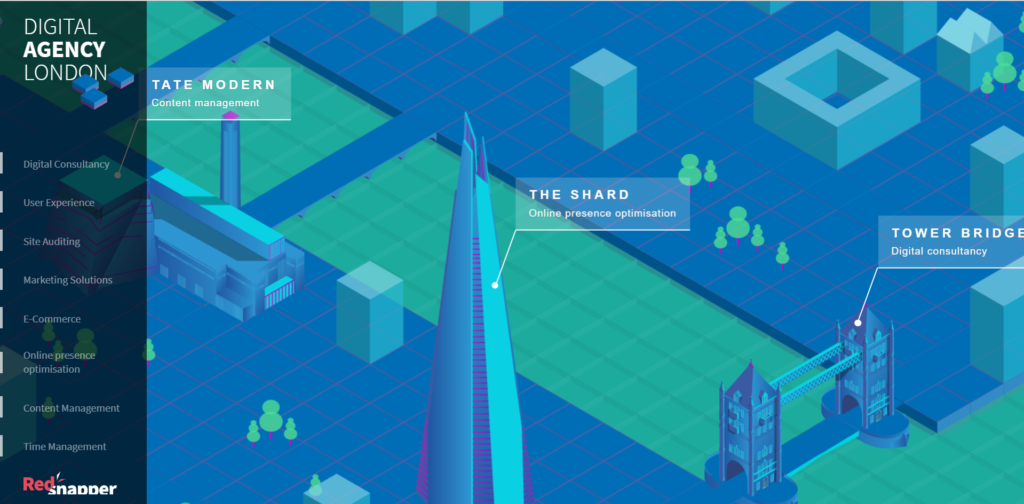
As with the PikMyKid website, the London Design Studio website uses shadows and a 3-D perspective to add depth and dimension.
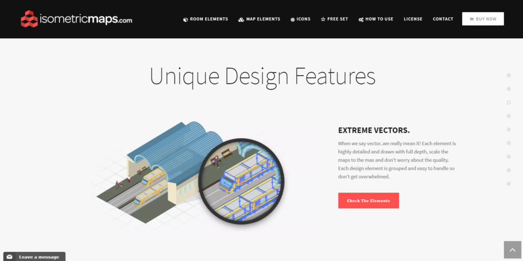
Another Level of Dimension: Isometric Map Builder
This website sells over 250 unique handcrafted isometric map elements in rescalable vectors for designers. You’ll find enough elements to create a map of a house or city. Due to the intricacy of the maps on the homepage, the rest of website design is plain and acts as a dark backdrop. Overall, the design is clean and modern and highlights the product excellently.
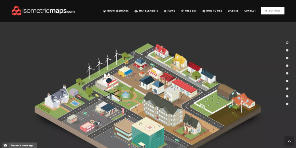
Scroll down the homepage (or use the dots on the right side to navigate) and you’ll see more maps. The subtle arrow in the bottom right corner will shoot you back to the top of the homepage if you click it.
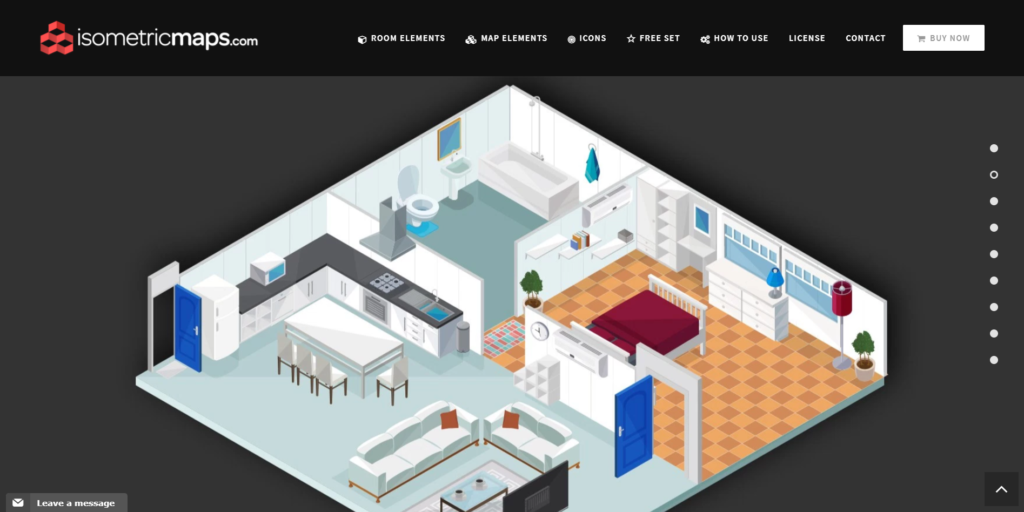
Continue to scroll down the homepage. (The dots on the right side represent the unique sections on the homepage. The images above and the one below are examples of a section. The section below is a wonderful detail image of the vectors for sale on this website. The detail is quite extreme.
It’s an Isometric Party: Dance Tonite
This website design uses isometric design and animation to capture the interest of viewers. The bright colors, simple text, and minimal icons reflect a classic flat design. However, the soft shadows and additional perspective point create both depth and dimension in the design.
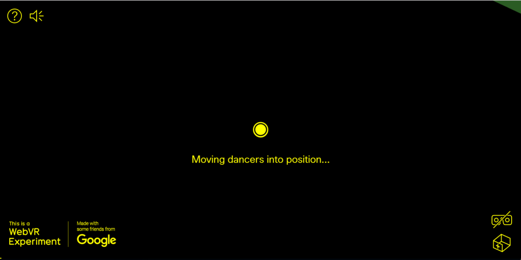
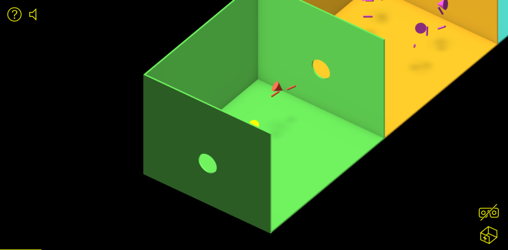
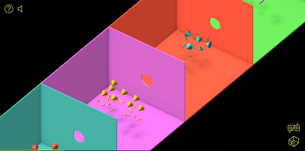
You can’t tell from the static images above, but the website homepage shows colorful isometric designs in motion: not only do the individual shapes move, but the entire dance floor chugs across the page like a locomotive. All this to the sounds of LCD Soundsystem. This is truly an experience.
Created by a designer from the Netherlands.
Shadows Create Depth & Dimension
You can create depth by adding a shadow to an element in your design. A soft, subtle shadow simulates the shadow that’s created behind an object when light is shined on it.
Volkswagon Drives Design with Shadows
Volkswagon’s microsite for the Novo Tiguan uses isolated photography and shadows to add realism to the website design. The rest of the design is extremely flat: a white background, plain black text, ghost buttons, and minimalist icons.
Scroll down the website – and you’ll zoom forward in your Volkswagon Novo Tiguan. You’ll pass trees, pause by a family, then move on to more adventures. (This is another web design trend: scroll-triggered animations.)
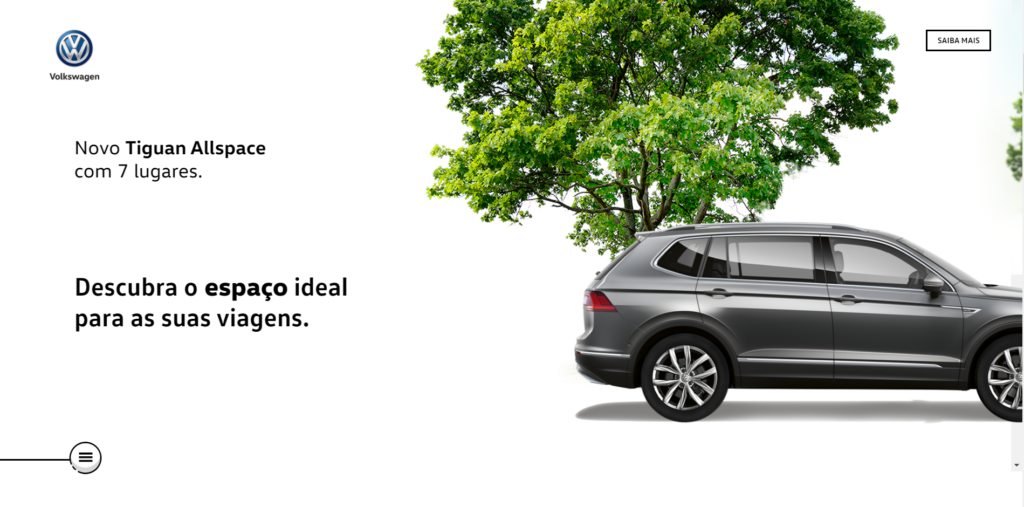
As you scroll (down with your mouse; across with your eyes), you’ll see the vehicle in different positions, all with shadows. The shadow adds depth to the image of the vehicle, a stark contrast to the flat design elements used in the rest of the design.

Each section of this homepage showcases professional photography alongside informative text. Just as with the Isometric Maps website, this website design is also simple in color and design elements. This is to allow the stunning photography to steal the show.
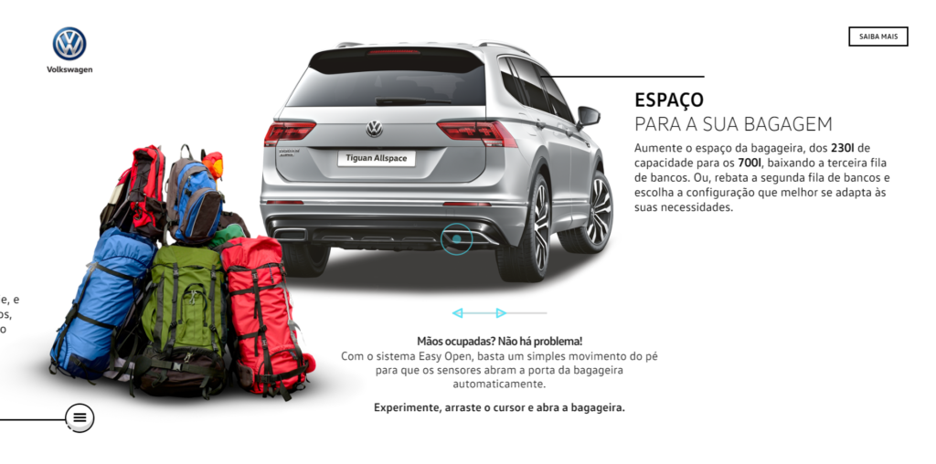
Volkswagon’s microsite was created by a design studio in Portugal.
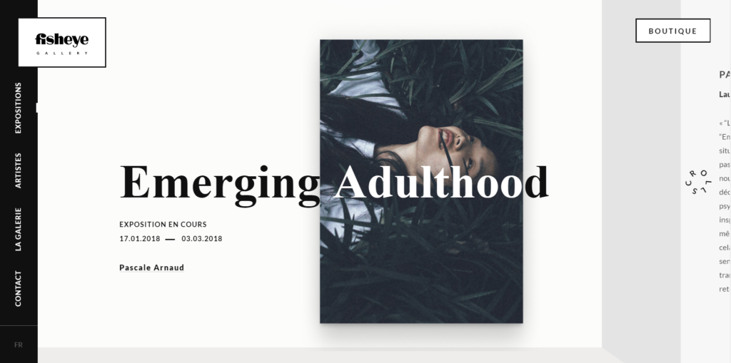
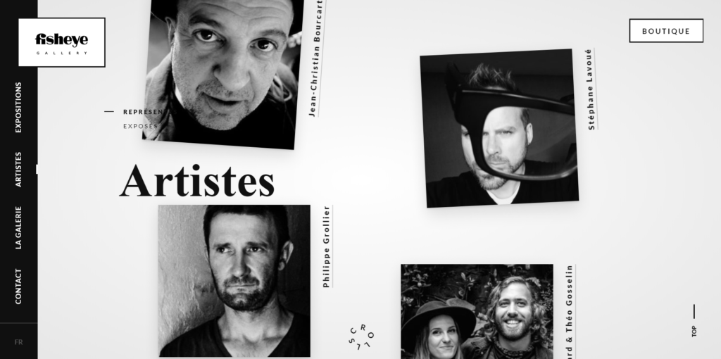
View the Depth of Fisheye Gallery
Fisheye Gallery, located in Paris, France, displays the works of famous photographers. The high-end gallery website is beautiful; its design is minimal to highlight the photography. Shadows are used beneath the photos to create the illusion that the photo is elevated above the background. In the banner below, a drop shadow creates depth and adds authenticity to the image.
Scroll down this website for a delightful display as gorgeous black and white images float up your screen. (More scroll-triggered animations.)
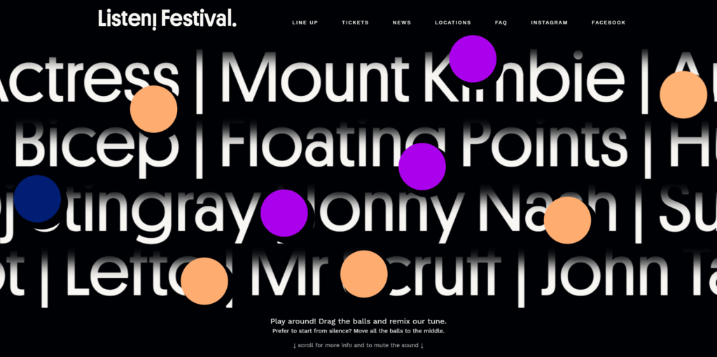
Lovely Layers from Listen Festival
The Belgium web design for Listen Festival uses shadows in a flat design to create layers of dimension. The design is minimal – simple, white text pops against a black background and the only color appears in flat circles. The shadows are a subtle way for the designer to add dimension to an otherwise flat design. It’s both modern and appealing. The shadows pumps up the page’s interest factor, something flat design can struggle with at times.
Weber
The web design for Weber is very minimal – the colors are black and ivory with a deep red accent. Most of the design is flat, but we see a little more dimension in the red icons. The isolated images with soft shadows beneath them add a sense of realism to the design. 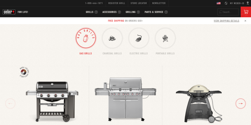
On the product page (below) the flat design elements are apparent: the clean, bold text and a lack of any form of dimension. The photograph of the grill brush is 3-dimensional, and the shadow adds subtle depth to the image.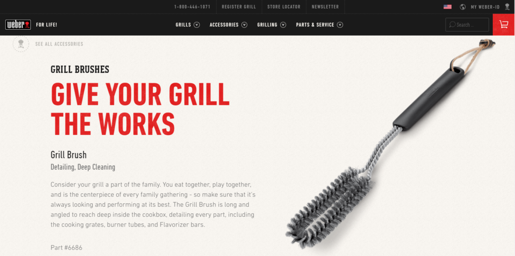
Learn More About Depth & Dimension
2018 Graphic Design Trends by Just Creative
10 inspirational graphic design trends for 2018 by 99designs
Principles of Flat Design by DesignModo
The Rise of the Almost-Flat Design Web Trend by Speckyboy
Your Website Design
Thinking about a website design for your business? Check out Artonic’s portfolio for web design inspiration! View Portfolio