What is a Hamburger Menu?
A hamburger menu is an icon used on a website that, when clicked, opens to reveal a navigation menu. Visually, it’s a stack of three horizontal lines resembling a hamburger – top bun, patty, bottom bun.
Here’s an example of a hamburger menu on Artonic’s website.

A Hamburger by Any Other Name…
A hamburger menu is called many things, including:
- Sandwich
- Hotdog
- Pancake
- Tribar (or triple bar)
- Double Oreo
- Side Menu
- Navigation Drawer
You can call it the Options Button, Hamburger Button, Hamburger Option, or Hamburger Icon, too.
Examples of Hamburger Menus in Web Design
Most – but not all – hamburger menus are found on responsive websites when the viewer’s screen size reaches a certain point. Once this happens, the navigation menu converts into a hamburger icon to save space.
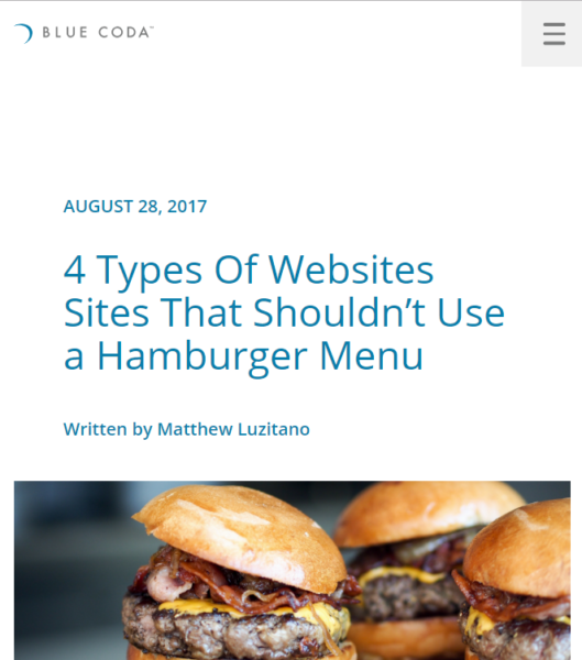
The hamburger menu design varies very little across responsive websites. Here it is on Blue Coda’s website, in the upper right corner. The website is responsive, so this is what the website looks like on a small screen (like your smart phone).
Blue Coda’s hamburger menu is charcoal gray placed on top of a light gray square.
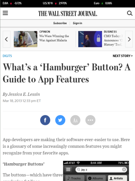
Very similar in design is the hamburger menu for The Wall Street Journal. The design for the WSJ website places the hamburger menu in the upper left corner. It is three black bars against a white background.
Here’s an example of a similar menu design on AGET Manufacturing’s website. This hamburger menu design places black bars on top of a gray square. Unlike the Blue Coda menu design which is flush against the upper corner, AGET’s design floats the menu in white space.

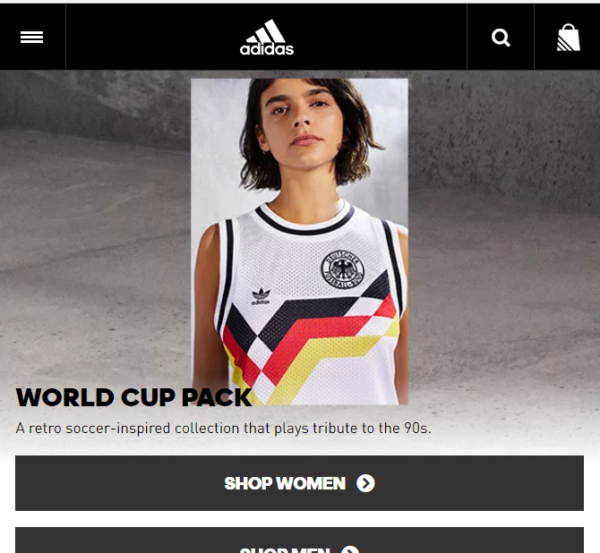
As a comparison, here is a hamburger menu on adidas.com. The white three bars are very slim against black. The menu design fits into the overall look and feel of the brand, but how easy is it for visitors to see? Does it make a difference that there is a navigation bar across the top of the website, to call users’ attention to the menu?
Being able to find it in the website design is only one of the controversies entangled in the hamburger menu.
The Controversy: Is It Good for Visitors?
The hamburger menu isn’t loved universally by designers, and here’s why: website users can’t always find the menu when it’s reduced to a three bar icon. Or, if they do find it, they don’t know what it is.
Nielsen Norman Group Study
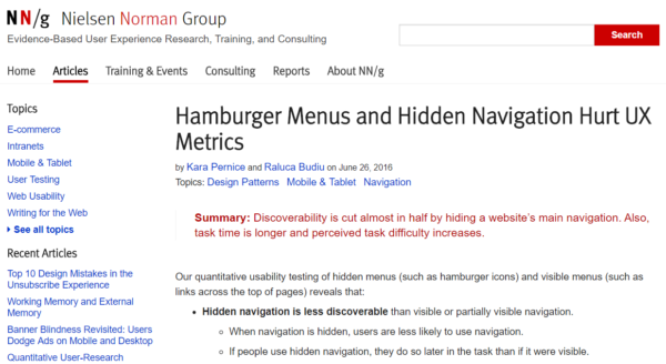
In a much-cited study from 2016, Nielsen Norman Group published its findings:
Discoverability is cut almost in half by hiding a website’s main navigation. Also, task time is longer and perceived task difficulty increases. [4]
Findings on Desktop vs. Mobile Websites
The study did find a distinction between desktop websites with hamburger menus and mobile websites with hamburger menus: visitors used the hamburger menu on mobile websites more than they used the hamburger menu on desktop websites. However, a hidden navigation (hidden = a website navigation menu “hidden” in a hamburger menu) is used less than a visible navigation (visible = a navigation where all pages in the menu are visible) across the board, regardless of whether the website is a desktop version or mobile version.
“Both on mobile and on desktop, people were significantly more likely to use the navigation when all or some of the navigation options were visible (that is, in the visible and combo conditions).”
The lower usage on desktop websites may be due to:
- Visitors being unable to find the menu or not understanding what it is
- Visitors using (or relying on) the search bar to navigate the website
Survey Says…
Either way, the study points out that website visitors are much less likely to use a navigation if it is hidden. The Group recommends using a visible navigation for the desktop version of a website design. For the mobile design, it recommends using a visible navigation if you have four or fewer top-level navigation links.
TechCrunch is Out for Blood
Many times when the Hamburger Menu is discussed online, TechCrunch’s article Kill the Hamburger Button is referenced. This article focuses on usage of the hamburger menu in mobile app interface design.
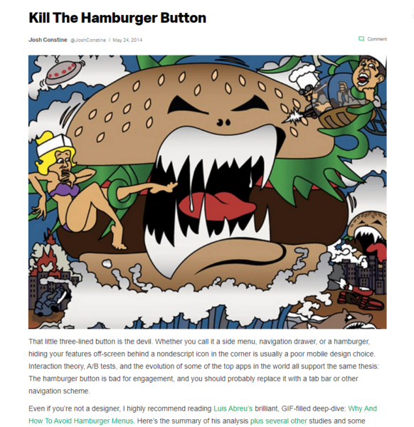
“Essentially, what’s out of sight is out of mind. Any navigation options you hide behind the hamburger will be forgotten, or at least used a lot less. It doesn’t help that the button is often placed in the top left corner — the hardest place to reach when using the phone with just your right hand.”
A History of the Hamburger Menu
Where did the hamburger menu come from? The answer is Norm Cox, user interface designer for Xerox Star in the ’80s. He says, “I designed that symbol many years ago as a “container” for contextual menu choices.”. [5]
The hamburger menu was never meant to confuse website users – quite the opposite, in fact. Cox explains: “Its graphic design was meant to be very “road sign” simple, functionally memorable, and mimic the look of the resulting displayed menu list. With so few pixels to work with, it had to be very distinct, yet simple.” (For the full story, read A Brief History of the Hamburger Icon.)
1981 Birth of Hamburger Menu
Nothing much happens for 28 years…
2009 Facebook Brings Hamburger Back
2014 Tech Crunch Calls It “the Devil”
2016 Nielsen Norman Group Study is published
State of The Hamburger Menu in 2018
“There have been various studies that indicate most users struggle with hidden menus. But this trend may be changing with more people using smartphones and growing familiar with the hamburger icon’s significance.” (Read the article Top web navigation trends.)
Alternatives to the Hamburger Menu
There are many alternatives to using a hamburger menu in your website design, but each should be considered in the context of your design – does it work on all versions of your website? Do your visitors use it?
Combination Navigation: Good Example
The following website design for Entreprenörsgatan uses a combination of navigation options for the visitor to choose from. Note the search bar and hamburger menu icon in the top right corner that serve as the main navigation. The logo holds the space in the upper left corner, social media icons are in the bottom left corner, and an email address in in the bottom right corner.
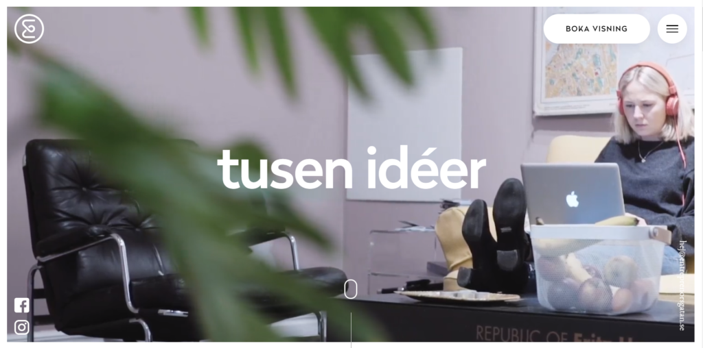
Visually, this design is clean and balanced. The navigation elements – the button, hamburger menu, logo, etc. – are very simple. The round edges create uniformity and the extensive use of white keeps things clean. The colors used in the images are soft to contribute to the lightweight feel.
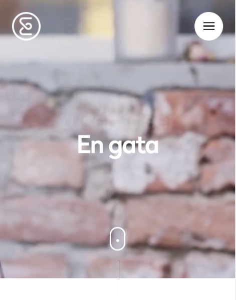
Here is the design when scaled for smaller screens. Notice the navigation elements – there are fewer on the mobile website. The six navigation elements (search bar, hamburger menu, email, social media, scroll button, and logo) are pared down to only three on the mobile version: the logo, hamburger menu, and bottom scroll button.
Combination Navigation: Poor Example
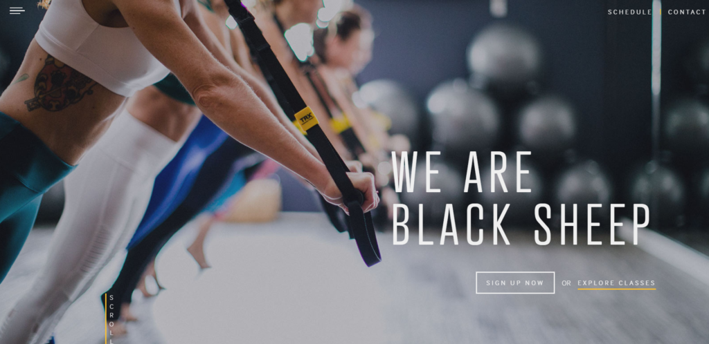
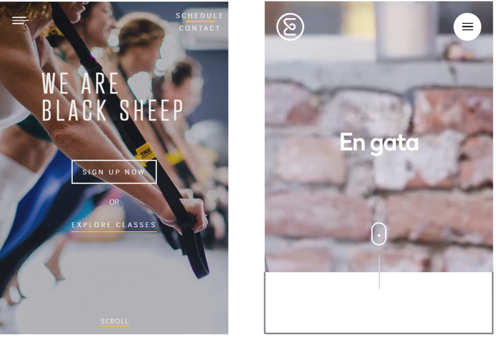
This website design for Black Sheep Studios also uses a combination of elements to highlight its navigation, including a hamburger menu icon in the top left corner, navigation links in the top right corner, a button in the center, and a link beneath the button.
Here is the same website when viewed on a smaller screen. Notice that all of the navigation elements used in the desktop version are also used in the mobile version. Contrast this to the website design above that removes three of the six elements when the screen reduces in size.
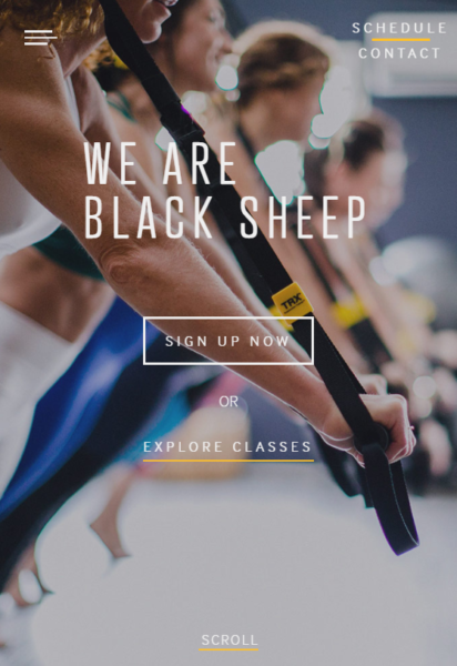
Visually, this design is unbalanced and lacks cohesion. Although the text links (schedule/contact; explore classes; and scroll) are in a white sans serif font with a simple yellow line beneath them, they do not match the hamburger menu design which consists of three uneven white lines. The “sign up” button in the middle of the screen is centered, but the text above it is left aligned.
The heading and sub-headings use different fonts, both sans serif. Using unique fonts for headings/subheadings is appropriate, but it may be better balanced if one font used serifs to add weight and interest.
Additionally, the image used for the background boarders on distracting. In the previous website design example, the image used in the background added texture and interest but did not distract from the navigation elements. This design uses an image that is almost too interesting to be an effective background image, especially when the font is so thin.
Compare the designs side by side. What are your thoughts? Does one design execute a combination navigation better than the other? Which website do you want to use first?
 Responsive Navigation: Good Example
Another alternative to the hamburger menu is the responsive navigation menu – or the menu that responds (or changes) based on the viewer’s screen size.
The adidas website uses a fully visible website navigation on its desktop version, as seen here:
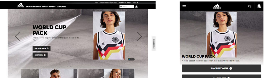
The adidas website is professionally designed to be attractive and easy to use. The colors are neutral in the image above save for the piece of apparel on the model. This draws your eyes to the merchandise and creates a steady, muted background to the image. The navigation elements are designed with a specific set of guidelines to reflect the adidas brand.
Responsive Navigation: Poor Example
The DTO Films website, seen below, is very small with only a few pages. Because of this, the top-level pages are listed on the left hand side, fully visible to users:

In contrast, the mobile version of this website uses a hamburger menu centered at the top of the design. Unfortunately, the light color of the menu against the bright pastel purple makes it difficult to discern. Additionally, there is no need to further reduce a three page menu to a hamburger menu; it’s unnecessary as space isn’t really an issue.

The DTO Films mobile website design is a good example of choosing aesthetic over usability; the design is striking, however, website visitors may not find the menu to navigate the website.
The Multimedia Experience: Good or Poor?
The WDR website below is quite the experience for its visitors. It includes a stunning graphic design, subtle animation, and even music. The navigation links are highlighted in the screenshot below. Note the hamburger menu in the top right corner with MENU beneath it; a start button centered at the bottom, and a full navigation along the bottom.
What do you think of this experience? Is it easy to navigate? Does it matter, since it’s so fun to view? (I added the music to this video.)
Parallax Scroll: Good or Poor?
The Saxx website built for the campaign “No Status Quo” uses parallax scrolling on the desktop version to navigate the user through the website.
Note: I added the music to the video – it isn’t on the website.
This video shows how I navigated through the Saxx website (desktop version) by scrolling with my mouse.
Parallax scrolling is an awesome way to tell a story on a website – but how user-friendly is it?
Side Navigation: Poor Example
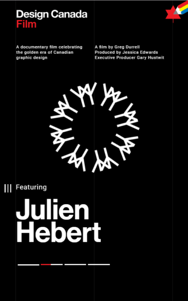
The website for Design Canada’s documentary locates the hamburger menu on the left side in the center:
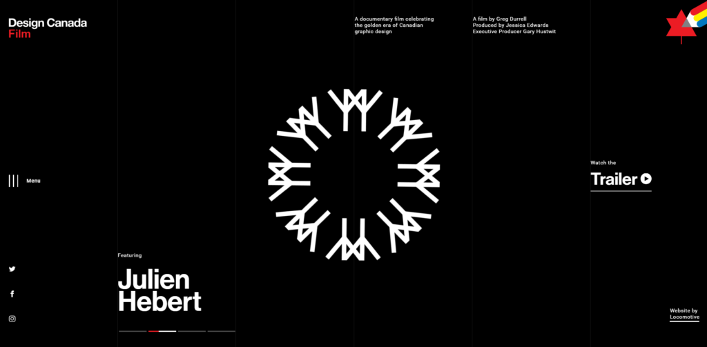
Here is the same website design on a smaller screen. Notice how the banner text – Featuring Julen Hebert – runs into the side menu icon. The desktop design, above, does not encounter this issue.
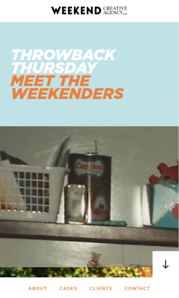
Bottom Navigation: Good Example
The website for this creative agency uses a visible bottom navigation with an arrow instead of a hamburger menu. Here’s what the mobile version looks like:
For the desktop version, the navigation is still found along the bottom – top-level page names are visible to users. There also is a side-navigation on the far right, for users to navigate the different sections of the homepage.
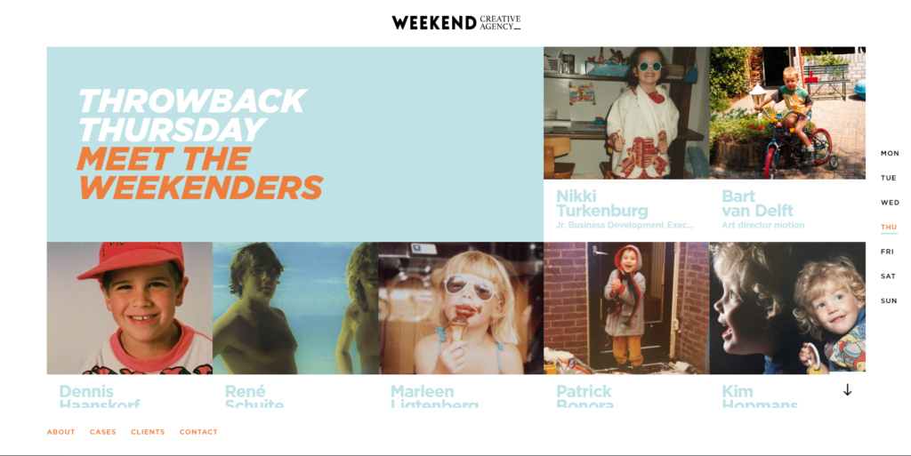
Weekend handles a complicated navigation well, and it’s a tricky thing to pull off. Although the website has two navigation menus – one for the homepage and one for the full website – they don’t distract from one another. It also feels fairly intuitive to use.
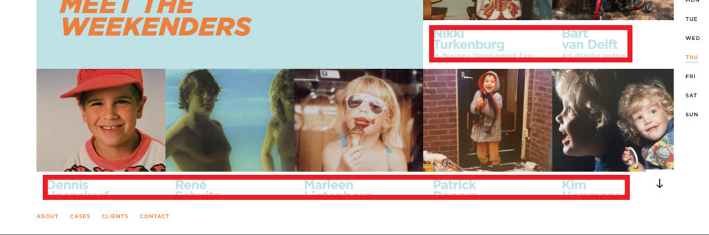
In addition, the design also has a lot of text to work with, another element that potentially pulls users away from the navigation. However, the designer has used a very pale blue-gray for the additional text, making it nearly invisible. The reason this works is because of the hierarchy of the text – the pale blue-gray text is low in priority when it comes to a visitor’s attention, so it’s all right if this text is barely visible.
The blue-gray has weight to it, as does the rusty orange color used as an accent. This design is artistic, eye-catching, and interesting. It’s also a wonderful example of how design works with information architecture and user experience to create an easy-to-use website that is also visually stunning.
Combination Plus Search: Good Example
The Awwwards website uses a combination navigation that includes a a search feature (the magnifying glass in the upper left corner) in addition to a hamburger menu, visible top-level navigation with arrows to indicate subpages, and navigation options in the top right corner. Even with all this going on, the website looks clean and easy to navigate.
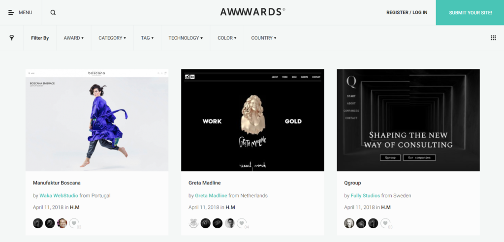
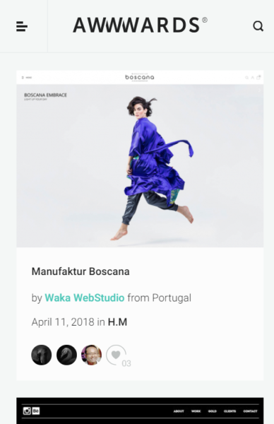
On the mobile version, the navigation is stripped to only the hamburger menu on the left and the search icon on the right.
Combination Navigation: Glorious Example
This website incorporates a large navigation menu into the homepage design – something rarely seen on artistic websites. This design uses one third of the screen space to display the navigation menu. The words are black against white for maximum contrast and legibility. The font is clean and very easy to read. It’s a perfect accompaniment to the saturated image on the right two thirds of the design. The dense colors are balanced with the shot of white next to it.
The mobile version is refreshing for user experience designers – the navigation is front and center, making it extra easy for visitors to find what they want. There is also a hamburger menu icon in the upper left and a search icon in the upper right. They are very small, indicating that they are not as important as the main navigation. A plain black button with white text on top of it catches the eye without overwhelming the design.
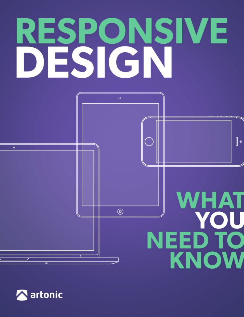
Learn More About Responsive Design
Interested in a website design for your business, corporation, or e-commerce store? You’ll want to check out our free e-book all about Responsive Design:
Say Hello!
Give Artonic a call or email us if you’re interested in website design, development, or marketing.
Michigan, USA
Resources
“Hamburger Button.” Wikipedia, Wikimedia Foundation, 22 Apr. 2018, en.wikipedia.org/wiki/Hamburger_button.
Design Magazine, Speckyboy Web Design Magazine, 27 Apr. 2017, speckyboy.com/analyzing-effectiveness-hamburger-menus-web-design/.
Pernice, Kara, and Raluca Budiu. “Hamburger Menus and Hidden Navigation Hurt UX Metrics.” Nielsen Norman Group, Nielsen Norman Group, 26 June 2016, www.nngroup.com/articles/hamburger-menus/.
Campbell-Dollaghan, Kelsey. “Who Designed the Hamburger Icon?” Gizmodo, Gizmodo, 31 Mar. 2013, gizmodo.com/who-designed-the-iconic-hamburger-icon.
“A Brief History of the Hamburger Icon.” Placeit Blog, Six Revisions, 4 Dec. 2017, blog.placeit.net/history-of-the-hamburger-icon/.
Constine, Josh. “Kill The Hamburger Button.” TechCrunch, TechCrunch, 26 May 2014, techcrunch.com/2014/05/24/before-the-hamburger-button-kills-you/.