This year, we have seen many new trends emerge in web design. Keeping up to date on the latest trends will be beneficial for your website and brand. Let’s take a look at some 2019 web design trends.
Micro-Interactions
Similar to interactive scroll, many websites have what is called micro-interactions. As your mouse hovers over text or an image on a website, there is a response from your action. Take a look at Collage’s website, a contemporary product design boutique.
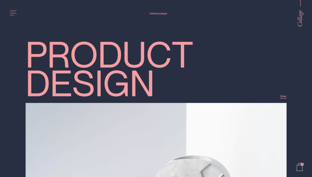
It does have an interactive scroll like we talked about before, but as you scroll down and hover your mouse over the product list, images of the products appear, and the text moves from side to side. These are called micro interactions.
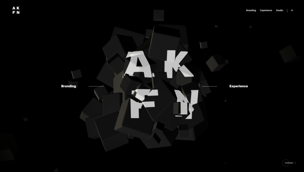
This example, a studio website, also has micro-interactions. The homepage has a pile of blocks, and when you move your mouse over it, they shift. This is a growing trend in website design because of the interaction aspect. The website responds to your decisions and movements, like a game. It draws viewers in and makes website viewing an enjoyable experience.
Asymmetrical Layouts
Gone are the days of symmetrical grid layouts. They are neat and easy to read and navigate, but not very interesting. Recently, there is a trend in unique or asymmetrical layouts in web design. It pulls away from the classic square and rectangle grid that we have seen in the past. Even though the layout does not have two identical sides, the elements in the design are still balanced and visually pleasing. This adds an element of excitement because visitors don’t know what they are going to see next.
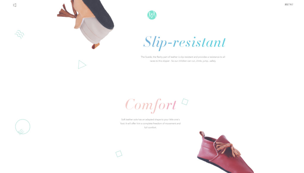
An example of a website with an asymmetrical layout is Melanie F. Look Book. As you scroll, the images appear on opposite sides. Under the design heading, shoes are floating in midair on the page, but placed in a way that balances out the space.
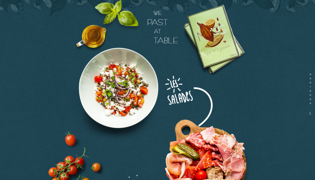
Another great example is Mugs, a restaurant website. The text and images used throughout the website are positioned in an asymmetrical way and balance each other out. For more examples of websites with unique and asymmetrical layouts, visit https://www.awwwards.com/20-extremely-creative-web-layouts.html.
Vibrant Colors
Color is a very important piece in web design. It is a powerful tool that grabs the viewers’ attention, sets the mood, and influences their emotions and actions. According to uxplanet.org, “Over 90% of our assessment of a product is made on color alone.” So it must be pretty important right? Right. Vibrant colors have taken over web design, and we are here for it. Bright colors invite viewers to focus on important elements of the website. Let’s take a look at some examples.
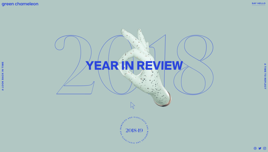
Green Chameleon is a creative studio that designed a portfolio website showcasing all of their work from the past year. The homepage invites us in with a nice mint green background and blue text. As you scroll your way through each month of their portfolio, the background and text colors change. January is green and a soft yellow, February is dark blue and orange, and so on. The bright change of colors captivates the viewer and invites them to navigate further into the website. Having a change in color for each month is also a smart design choice, because it surprises the viewer as they scroll their way through. Let’s take a look at another example.
MakeMePulse is an interactive production company, and their website is beautiful. It tells their story through colorful, interactive animated illustrations. The soft color palette leaves the viewer in awe, drawing them in and capturing their attention.
Hero Video Headers
Another growing trend in web design is hero video headers. We are all familiar with a hero image; a large banner image used in web design. A hero video header is very similar. These video banners have become more popular because it captivates the viewer and holds their attention. A person is more likely to watch a video than view a picture. Video banners also give the viewer better insight into the brand, because videos provide more information than an image. Let’s look at some examples of video headers in web design.
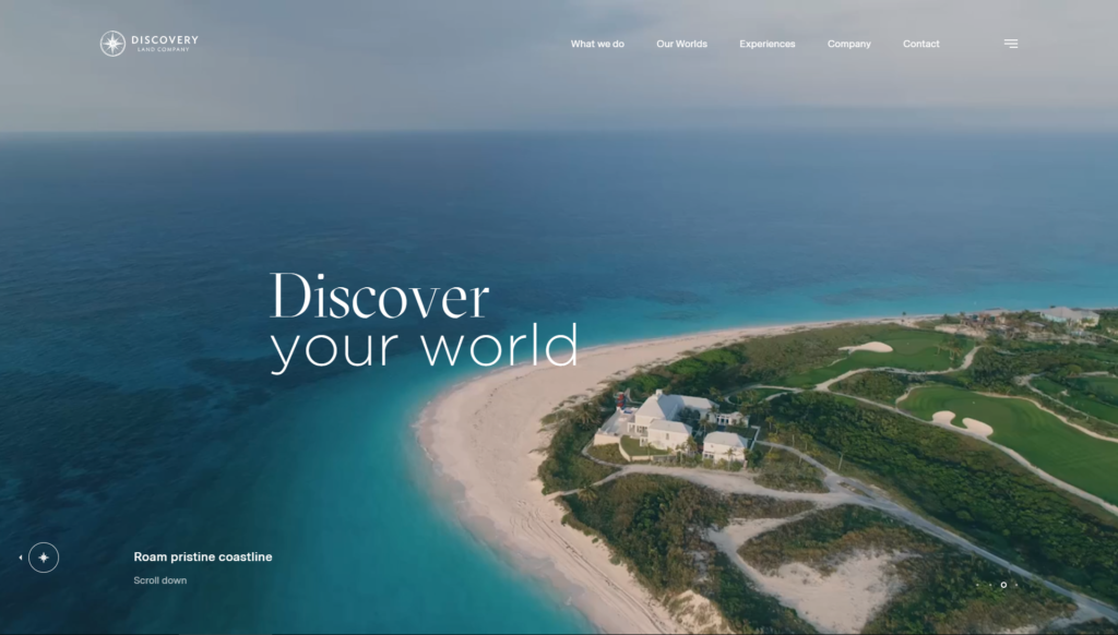
Discovery Land Company offers private residential club communities, and their website is eye-catching. Their video header shows people experiencing the world and everything Discovery Land Company has to offer. As people watch the banner, they imagine themselves in their shoes. The landscapes and scenery are stunning and beautifully shot.
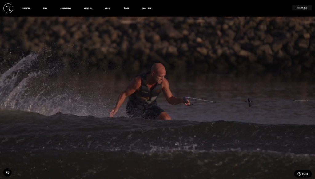
Another example of a video header is Hyperlite Wake’s website, a wake board manufacturer. The video shows a man wake boarding and doing tricks on the water. The banner also includes optional sound, if you want the full experience. The man also gives a short introduction and shows the equipment up close. The video shows what you can do with their product, what it looks like, and meeting the people behind it. It builds a sense of trust in the company, making people more likely to purchase their products.
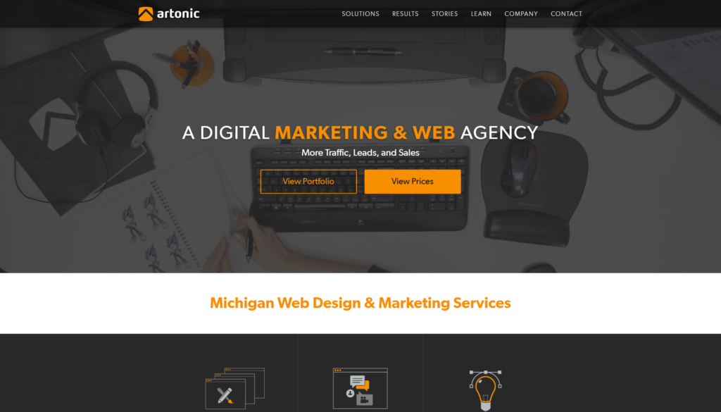
Last but not least, we have Artonic’s website! We filmed a video for our website banner showing an average day at our desks, working hard for our clients. Check it out!
Geometric Shapes
Everybody loves a good geometric shape. They have been a popular trend in web design for awhile. We are used to seeing the basic rectangle or circle across many websites, but what about the others? Rhombuses, triangles, and hexagons are making their way into the web design scene, and we are glad they are here. Here are some examples of geometric design in websites.
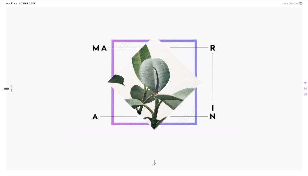
Marina Tureczek is a product designer and art director, and her website is filled with geometric shapes. The home page has an interactive geometric design, consisting of a square border and an image cropped into a diamond. As you scroll down, you can see squares, rectangles, and triangles. She also includes line work alongside the shapes. The many straight lines makes the website look clean and crisp.
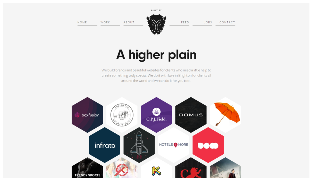
Built By Buffalo is a small web design and development agency, and their website is also geometrically based. Each page of their website has a hexagonal layout, showcasing their projects and employees. Each shape fits together like a puzzle, and it is very satisfying.
Organic Elements
On the other hand, we are also seeing the opposite of geometric shapes, organic shapes. These shapes are uneven and irregular, appearing more hand-drawn than geometric shapes. They can be used to draw attention to an area of the page, and it gives the site a more personal feel. It makes the design more human, because the shapes are inspired by life and nature. It gives a sense of comfort instead of structure. Here are some examples of organic shapes in web design.
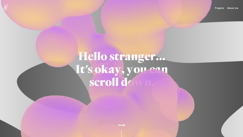
Julie Bonnemoy is a graphic designer and her website is a perfect example of organic shapes in web design. Her homepage has giant, colorful floating blobs, like a lava lamp. The shapes float in front of and behind the title text. It is a very relaxing and amusing page that has a personal feel.
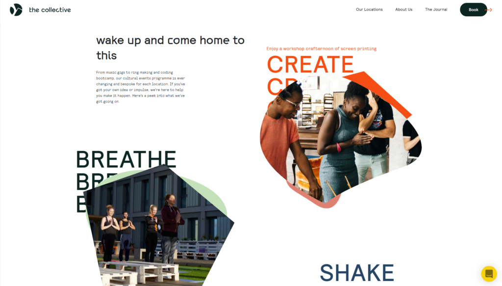
The Collective is a business with the mission of building and activating spaces to foster human connection. Their website has a mix of geometric and organic shapes. There are many rounded edges in the design, which imply comfort, an important part of their brand. The shapes frame pictures and some accent the page and serve as a background.
Extra White Space
Another web design trend is extra white space. Designers use white space as a tool to bring attention to areas that are filled with content. Because there is more empty space, it makes the content the focal point. It makes it very clear from the beginning what the website is.
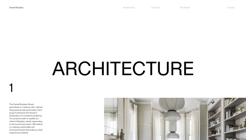
Daniel Boddam’s studio website is an example of white space in web design. The abundance of white space immediately draws the eye to the text and images. We can easily see the website contains architecture and furniture, so it must be an interior design studio.
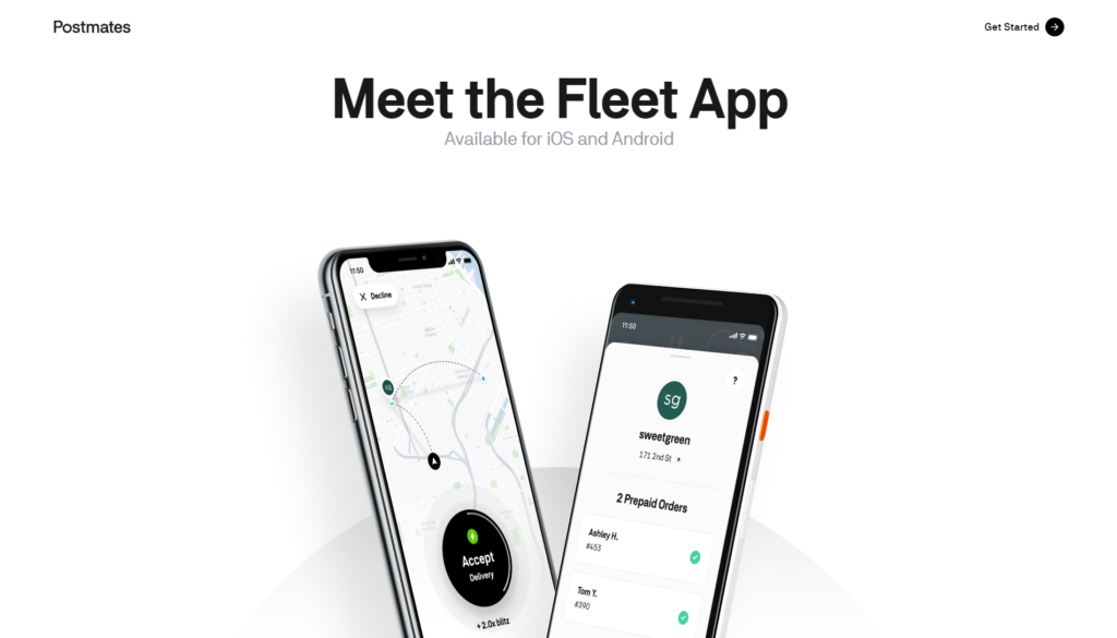
The Fleet App has a website with extra white space as well. Our eye is drawn directly to the images of the phone and the title text. White space makes websites clear and easy to read.
Those are some of the current design trends we have enjoyed in 2019. We hope you are enjoying them too. For more articles on Web Design Trends by Artonic, visit the links below.