You’ve seen them many times on websites across the Web: the rotating banner. You’ll find them everywhere, from large retail websites to niche dental websites.
A rotating banner looks like this:
You may have visited a website with a rotating banner and thought, “I want this on my website!”
BUT before you jump on the rotating banner website design trend, ask yourself, “Is this a good idea for my website?” You may think that a website banner that rotates is the best thing for your website design, but you may be wrong. Not everyone in the web design industry shares the same opinion on rotating banners.
A graphic designer looks at a banner as a visual element. Is it attractive? Is it properly branded? The graphic designer considers the banner a piece of the overall design and usually looks at it as such. In contrast, a user experience designer looks at a front-page carousel as an element of the web design experience. Will the banner help visitors find information? Is the banner useful? Yet another point of view comes from digital marketers who must consider optimization for Google as well as conversions.
With all these opinions flying around, how are you supposed to decide whether you want a rotating banner on your web design? Not to worry – we’ve put together a comprehensive article that looks at a front-page carousel from multiple viewpoints. We’ve also included industry studies and statistics to help you make your choice.
What is a Rotating Banner?
A rotating banner, also called a front-page carousel, is a series of images that rotate on the homepage of website.
The term rotating banner is just one of many used to describe this website design element. It’s also referred to as:
- Front-page Carousel
- Image Slider
- Ad Rotation
“Ad rotation is the practice of showing multiple advertisements in a single location on a web page. Ads may be rotated with each new page load, within a single page load, or both. Because the ads are placed in the same location, they are typically the same format.” (Wikipedia)
Why Do Some Website Designs Feature Rotating Banners?
Many business owners add a rotating banner to their company’s website to catch the attention of their visitors. The goal of each slide or image is to direct and alert the visitor to various products, services, articles, or anything else the website owner desires to highlight.
The Retail Website Example
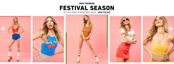
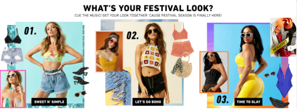
Check out the designs for three banners from a popular women’s clothing website.
Banner design number one advertises a clothing sale. The design includes five images, a large text heading, a sale code, a button, and a circle with text inside.
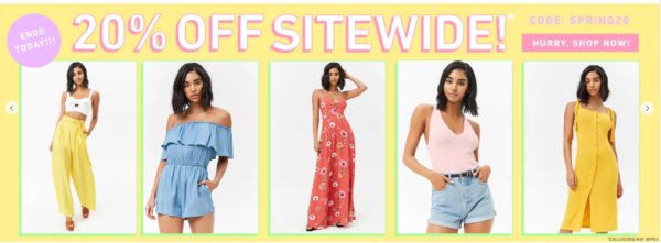
Banner design number two features trending styles for the spring festival season. This banner design also includes five images, text, and a text link.
Banner design number three promotes clothing pieces. This banner design uses a question in the heading with a subheading beneath it. There are multiple images, text, and three buttons.
The Rotating Banner Trend
This trend has been around for a while and can be found integrated into websites related to almost every industry.
Rotating banners started making the news around 1997, when they begin to appear in articles online. Check out this article excerpt from that year:
“…the ad banners were part of a practice commonly used in the Internet business called “rotating banners. The banners are exchanged, often for free, between companies with Web sites. The idea is to increase the number of hits each Web site enjoys.” (Dallas Business Journal)
Why Are Rotating Banners a Popular Web Design Trend?
This design trend is popular with business owners who want to display multiple ads on the front page of their website.
For example, a retail website may feature multiple sales in its rotating banner.
The screenshots below show designs for a rotating banner. Each banner features a unique advertisement with an image, message, and CTA (call-to-action). The banner scrolls automatically after a few seconds.


Many business owners think that more is more when it comes to featuring information on their website’s homepage, so they load up their carousel with multiple banners. However, a rotating banner is not always the best option for your website design.
Good or Bad Web Design Trend?
It’s not always easy to point to a website design trend and label it “good” or “bad.” When it comes to website design, it’s important to see every side of the argument, so you can make the best decision for your website.
The Graphic Designer’s Point of View
As a website design element, a graphic designer considers whether the rotating banner fits into the visual design of the project.
Attractiveness – Is the banner an appealing element of the website design?
Harmony & Balance – Does it mesh well with the rest of the website? Or is it a visual distraction? Does the banner design harmonize well with the header, footer, and content on the website? The banner should be balanced within the design. It should not call unnecessary attention to itself.
Brand – Is the brand clear and consistent?
The User Experience Designer’s View
The user experience designer looks at a rotating banner and asks whether or not it is a positive part of the website experience or not.
Useful – Is the rotating banner useful to website visitors? Does it help them find the information they’re looking for?
Distraction – Is the rotating banner a distraction?
Overwhelming – Are there too many CTAs commanding the user’s attention? Too many choices?
The Digital Marketer’s View
A digital marketer looks at a rotating banner and questions whether it is an effective marketing tool.
Goals – Does the banner support the marketing goals for the website?
Optimization – Does the rotating banner affect the rank of the website? How can we optimize the banner for search engines like Google?
Message – Is the message consistent with all our other marketing and advertising messages?
Customer’s Journey – If a visitor comes to the website from an AdWords ad, will it make sense?
The User’s View
What do website users think about rotating banners? Surprisingly, not all business owners consider the user’s point of view before they add a rotating banner to their web design.
Users are likely to be distracted by the movement of the banner as it changes from one image to another. This “could be distracting your visitors and making it more difficult for them to complete the task they came to accomplish.” (Marketing Land)
The Downside to Rotating Banners
Before you add a front-page carousel to your website, consider the downsides to this website design trend.
#1 Slows Down Your Website
Large, high-res images may slow down the performance of your website. This means that your website may load slowly for users. A slow website is something to avoid at all costs. Check out these stats about website visitors and slow websites:
47% of consumers expect a web page to load in 2 seconds or less
40% of people abandon a website that takes more than 3 seconds to load
A 1 second delay in page response can result in a 7% reduction in conversions
If an e-commerce site is making $100,000 per day, a 1 second page delay could potentially cost you $2.5 million in lost sales every year
(stats from Kissmetrics)
#2 Takes Up Important Real Estate
When you create a large rotating banner, you’re using up all your front-and-center real estate with ads that rotate. Ask yourself who you’re creating the rotating banner for. Are you adding banners to your website because of internal pressure from shareholders? Or are you adding a rotating banner for your website visitors?
“Carousels allow multiple pieces of content to occupy a single, coveted space. This may placate corporate infighting, but on large or small viewports, people often scroll past carousels. ” (Nielsen Norman Group)
#3 Not Effective Marketing Tactic
Users have short attention spans. Chances are, slides beyond the first images are often over-looked, never to be clicked.
One study that is repeatedly referenced by many usability experts is from Erik Runyon of Notre Dame. In his updated article Carousel Interaction Stats – June 2013 Update Runyon references five websites with rotating banners. He found that visitors clicked the first banner with the most frequency and clicks fell drastically after that. Plus, users only clicked the first banner 1% to 2% of the time on some websites.
#5 Banner Blindness
“Banner blindness is a phenomenon in web usability where visitors to a website consciously or subconsciously ignore banner-like information, which can also be called ad blindness or banner noise.” (Wikipedia)
If you must have rotating banners on your website, ask yourself, “Are visitors clicking on the banners or do they ignore them?” If your users are ignoring your banners, consider why. (Better yet, ask some of your visitors or customers why they ignore the banner.)
#6 Distraction
Many user experience designers consider movement in the banner area to be a distraction. There are numerous studies indicating that users are distracted by movement on a website and will likely ignore the message.
Consider the following:
“Animated user interface elements are tempting and powerful tools, yet they can easily waste a precious currency: users’ attention and time. Employ animations sparingly and only when they add meaning to the interaction.” (Nielsen Norman Group)
Rotating Banner Best Practices
In Runyon’s study, virtually all rotating website banners were clicked by 1% to 2% of the population. There were two instances where the rotating banner was clicked more than 2%: (1) a department store website, and (2) a news aggregate website.
The rotating banner on the department store website was clicked by almost 3% of the total number of website visitors.
The rotating banner on the news aggregate website was clicked by over 9% of the total number of website visitors.
Test It Out
If you want a rotating banner on your website, test it. Track banner clicks as well as conversions.
Rotation in Moderation
It’s important not to exceed more than 3 slides on the homepage. As mentioned earlier, many users won’t stick around for slide 2-3, unless they are invested in digging into your website.
Automatic Scroll vs. User-Controlled Scroll
Using automatic scrolling, in addition to relying on the user to click the advance arrow, will make visitors aware of slides beyond the first.
The alternative to automatic scrolling allows the website visitor to move to the next slide as she wishes. Instead of forcing the user to view each banner for a set amount of time, this option allows the user to view only what she wants to view and change the banner when she’s ready.
Visuals Help
In addition to arrows on either side of the slide content, it is best to use labeled or numbered buttons somewhere on the slide. Make it easy for the user to see that there is more content.
Alternatives to a Rotating Banner
Instead of using a rotating banner on your website, consider the following:
- One static banner image with one CTA
- Multiple banners that do not automatically scroll
- Video
Follow Best Practices
Need a website for your business? Check out our free e-book, “E-commerce Website Design Best Practices.” In it you’ll learn the basics to creating a website design that’s effective and attractive.

Say Hello!
If you have questions about web design or digital marketing, let us know!
Michigan, US
References
Carousel Interaction Stats – June 2013 Update by Erik Runyon
Carousel Usability: Designing an Effective UI for Websites with Content Overload by Nielsen Norman Group (2013)
Animation for Attention and Comprehension by Nielsen Norman Group (2014)
Rotating Banners: Why Image Sliders Kill Conversions by Marketing Land (2014)
Ad Rotation on Wikipedia
How Loading Time Affects Your Bottom Line by Kissmetrics (2015)